LOGO DEISGN | BRAND IDENTITY | PACKAGING DESIGN | PRINT DESIGN | WEBDESIGN

Crane Constancy Capital: A Trusted Identity for International Growth

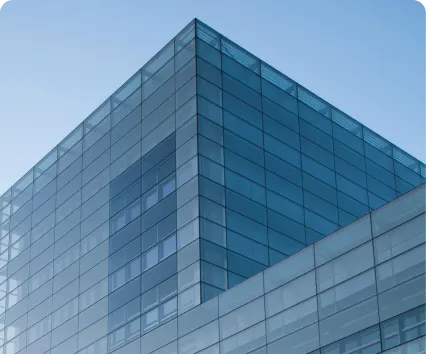
The Challenge: A New Identity for Confident Takeoffs
Crane Constancy Capital isn’t just about deploying capital—it’s about standing beside promising businesses as they grow, transform, and enter their next stage. The previous, more traditional identity no longer matched the firm’s international ambitions, credibility, and human, partnership-driven approach to value creation. The new brand, built around the crane symbol, combines stability with a sense of uplift—signalling a private equity partner that is serious, long-term oriented, and focused on helping companies move confidently into the future.
Step 1:
Uncovering the Human Side of Capital
We began by clarifying how the firm should be perceived: as a serious, trustworthy investment partner for both investors and founders. Instead of only repeating hard facts and numbers, we focused the brand on its emotional value – a capital partner that stands beside companies, supports them through change, and helps them grow in a sustainable way.
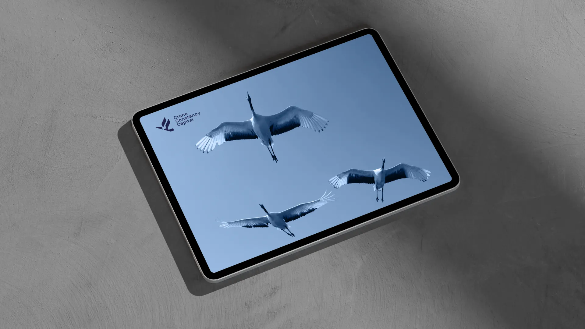
The crane symbol became the key to expressing this: a bird associated with balance, long life, and uplift. It represents guidance, perspective, and the idea of helping businesses reach a higher, more stable phase of their development.
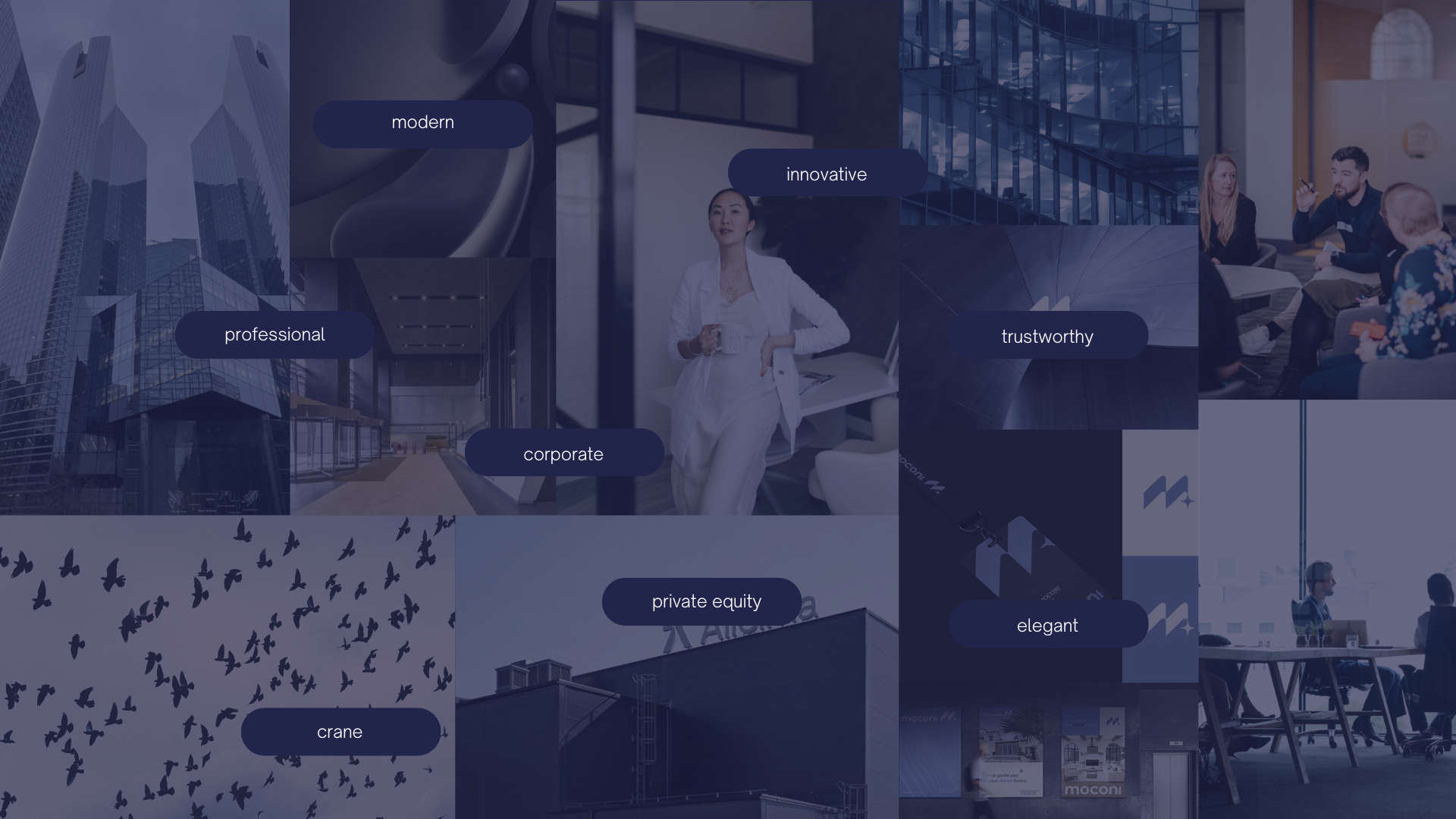
Core Brand Pillars Identified:

PROFESSIONALISM&TRUST
The visual identity reflects the firm’s experience, professionalism, and highlights its “out-of-the-box” approach to investments.

MEMORABILTY&UNIQUENESS
An identity rooted in the founder’s vision and unique crane symbol ensures memorability and strong brand recognition.
TIMELESSNESS&CONSISTENCY
The classic design of the logo and visual elements resists short-lived trends, ensuring the long-term, timeless value of the visual identity.
This defined the role of the brand: to be a reliable, long-term capital partner that supports promising companies from early growth through to mature, future-ready businesses.
Speaking to All Sides of the Table
Crucially, the Crane Constancy Capital brand needed to speak clearly to three distinct target groups at once:
Institutional Investors: Large financial players such as pension funds, insurers, and investment funds looking for stable, long-term returns and a partner they can trust with significant capital.

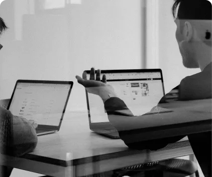
Consulting Professionals: Strategy and management consultants seeking reliable investment options they can confidently bring to their clients as part of broader advisory work.

Business Partners: Companies and entrepreneurs searching for growth capital and a long-term, ethical partner who will support expansion, transformation, or succession.

The old CCC identity didn’t fully speak to any of Crane’s three key audiences—too generic for institutional investors, too bland for consultants, and too distant for founders and business partners.
The new brand had to feel expert, memorable, and human at once, earning trust in the boardroom while still feeling like a true partner on the founder side of the table.
Step 2:
Designing a Clear, Confident Identity System
From Initials to a Living System
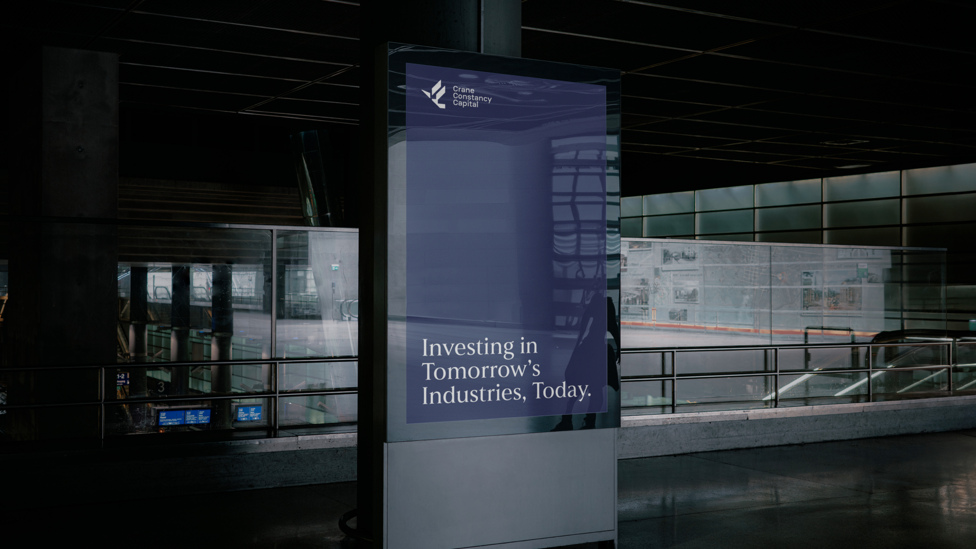
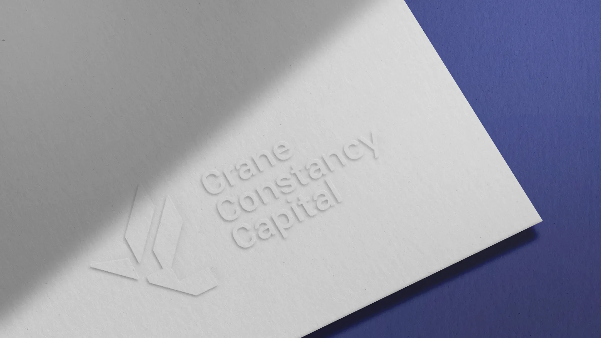
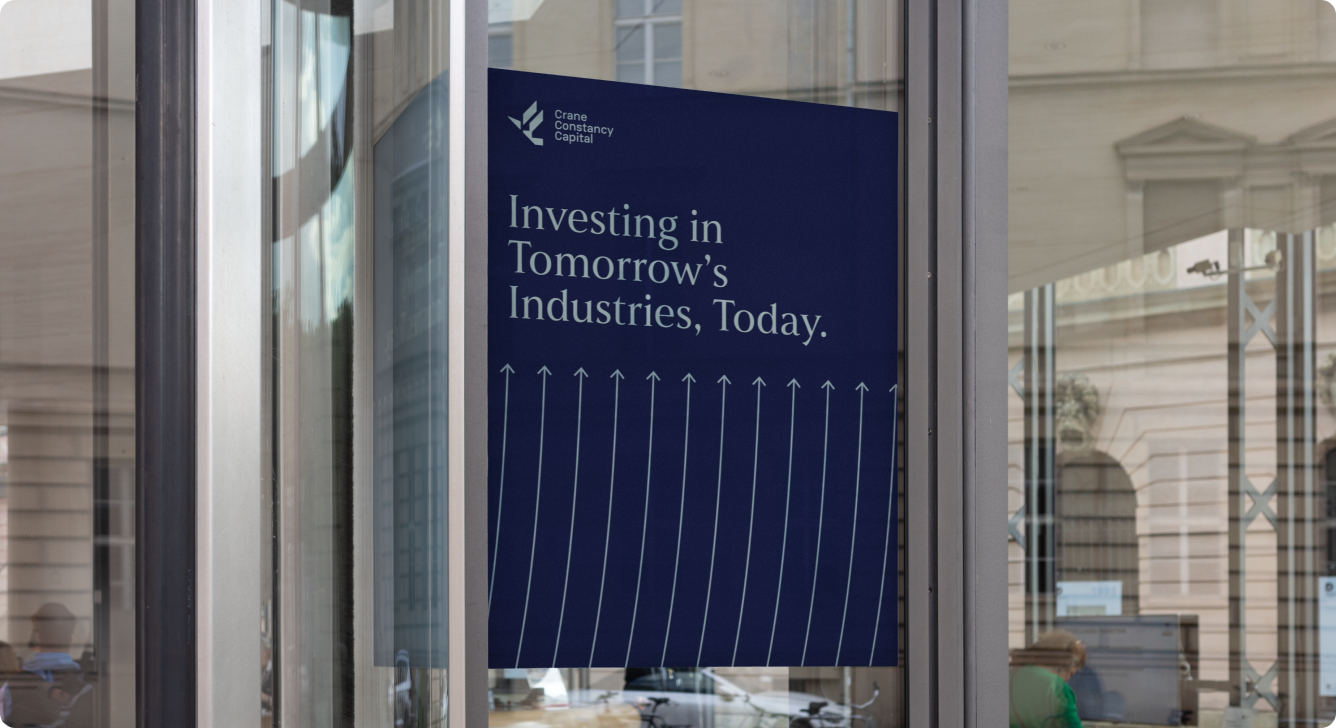
Instead of erasing the past, we kept the Crane Constancy Capital name and elevated the old CCC monogram into a clear, crane-led story. At the centre sits a stylised crane in motion—its wings suggesting growth, reach, and long-term perspective. Around it we built a usable visual language: a timeless symbol, a confident yet distinctive blue palette, and a serif–sans type pairing that feels both financial and human. Together, these elements form a compact kit of parts that anyone can use to create materials that instantly read as Crane Constancy Capital—grounded in expertise, oriented toward future growth.
Building a Timeless Visual Language
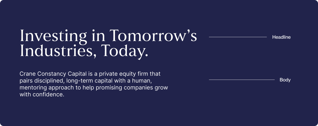
Logotype
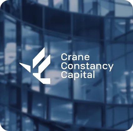
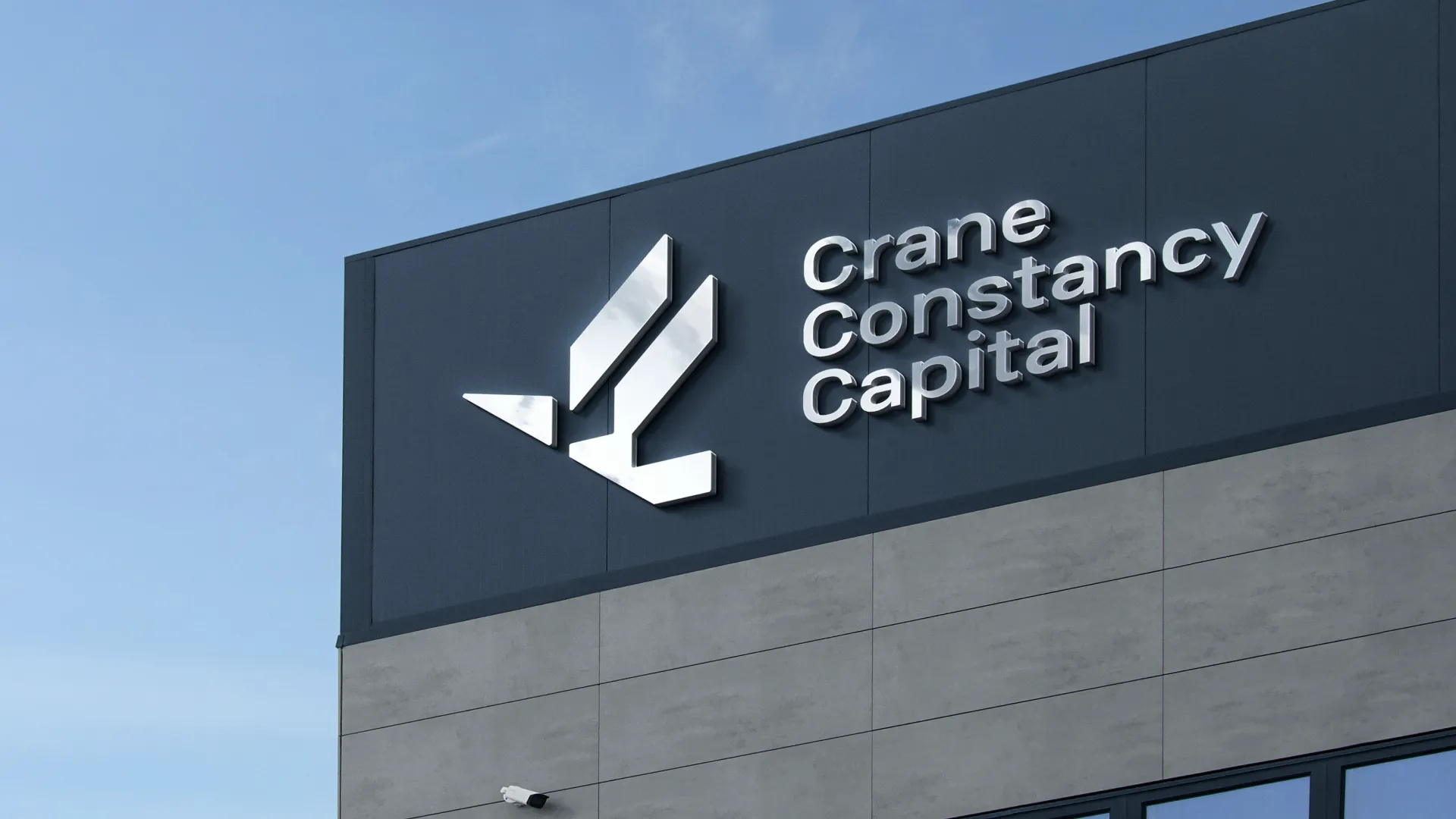
The Crane Constancy Capital logotype is designed to feel stable, clear, and composed—matching the role of a serious, long-term investment partner. The crane symbol is drawn so that its body and wing form a clear “C”, directly echoing the name. Together, the wordmark and symbol create a timeless signature that works just as well on formal documents as it does in digital use, and quietly carries the emotional, uplifting spirit of a partner that helps businesses rise to their next stage.
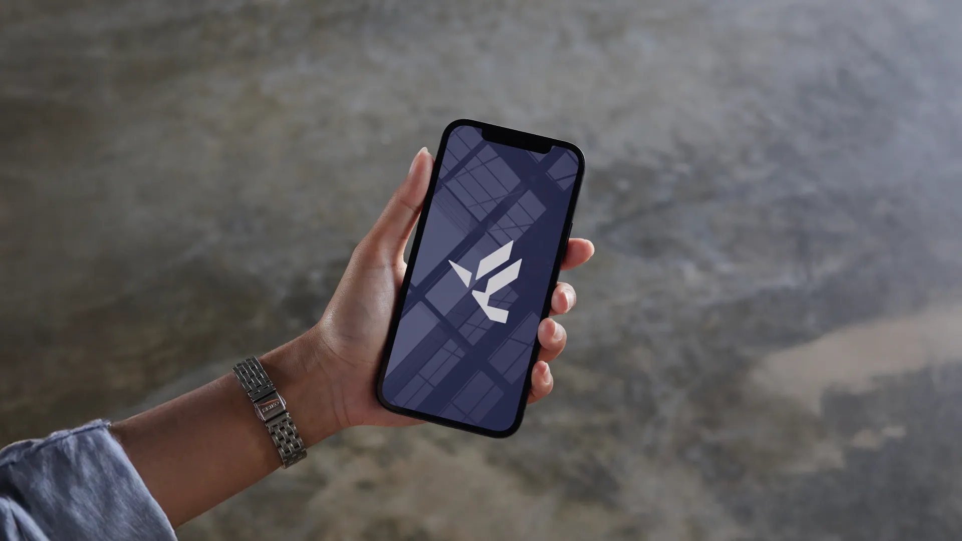
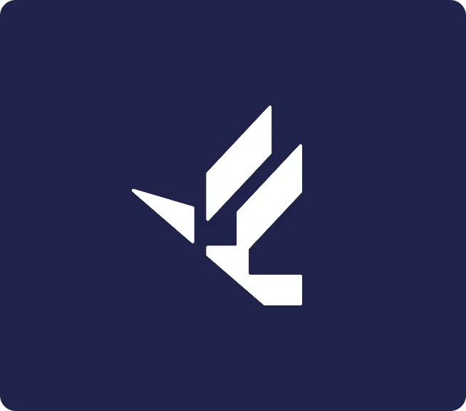
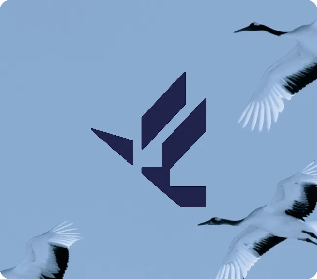
Logo Symbol
The Crane Constancy Capital symbol abstracts the crane into a minimal, upward-leaning form—its body and wings reduced to clear geometry that also hints at a rising graph. Beyond finance, the bird itself carries the story: in many cultures cranes represent longevity, balance, and good fortune, which reinforces Crane Constancy Capital’s role as a steady, forward-looking partner for growing businesses.

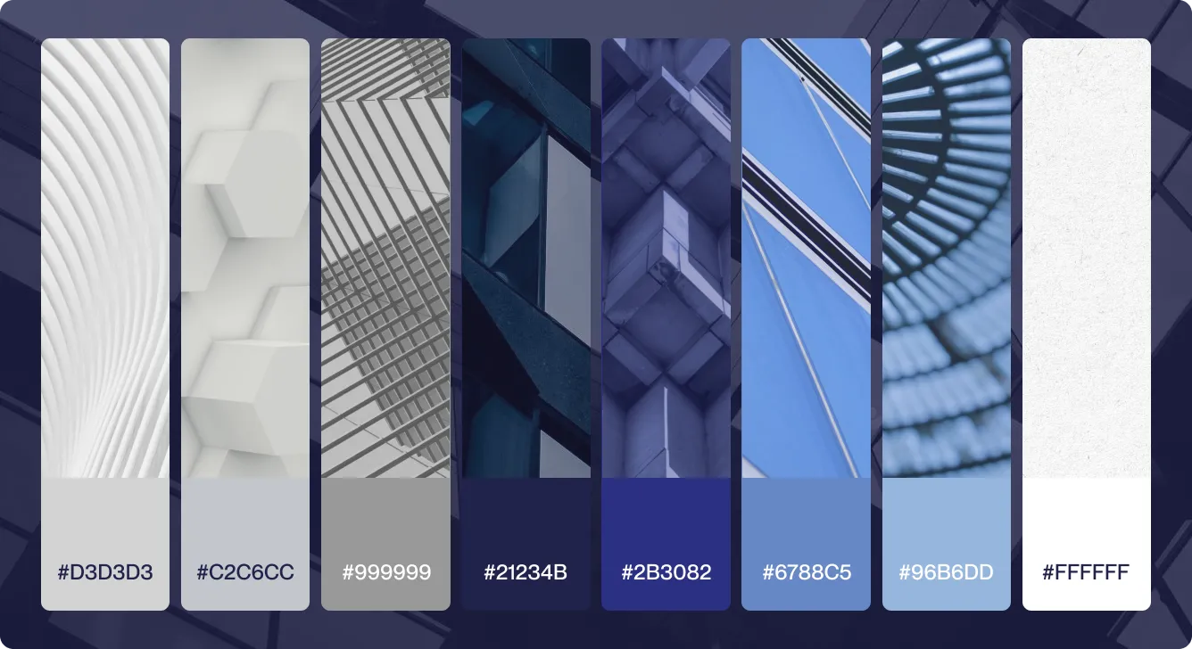
Color Palette
Crane Constancy Capital’s palette is built around deep navy and layered blues, supported by soft greys and white. The combination feels reliable yet confident—signalling stability, trust, and long-term perspective across everything from pitch decks to digital touchpoints.
Typography
Crane Constancy Capital’s typography pairs a confident, classic serif for headlines with a clean, modern sans-serif for body copy. Together they balance heritage and clarity—giving key messages a sense of gravitas while keeping all investor-facing communication precise, readable, and contemporary.
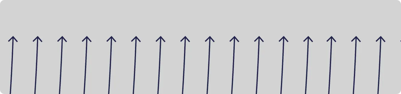
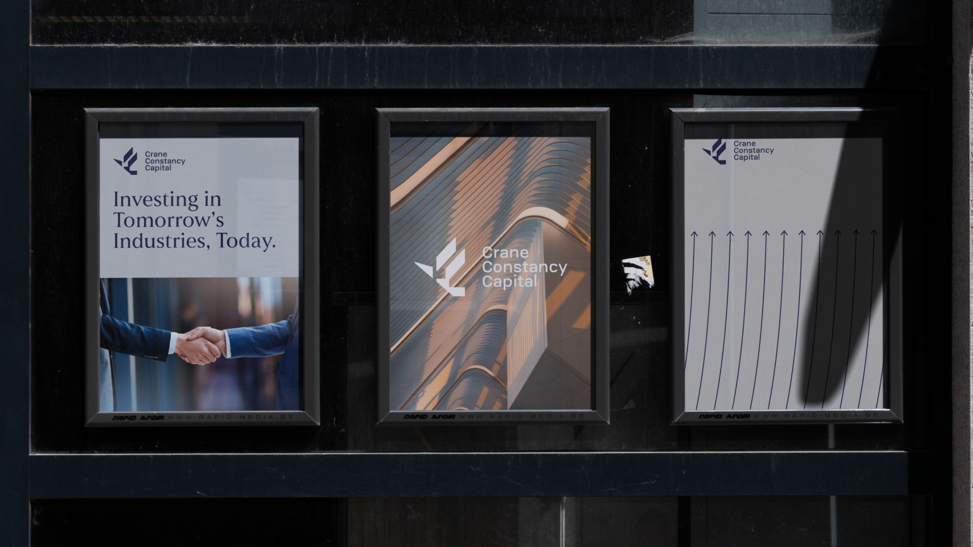
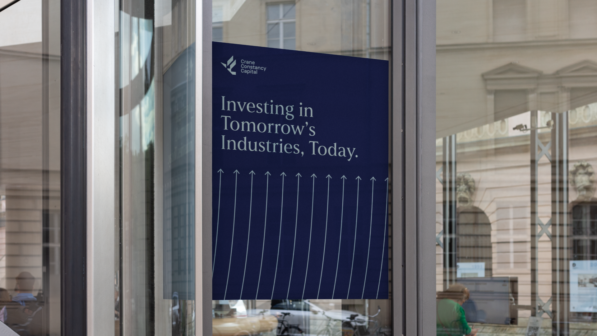
Patterns: Growth Arrows
Our key pattern is a field of fine upward arrows—suggesting uplift, momentum, and confident expansion, with many companies moving into their next stage of growth at once. Used across print and digital, it quietly reinforces Crane Constancy Capital’s focus on long-term growth and makes any piece instantly feel like part of the Crane visual world.
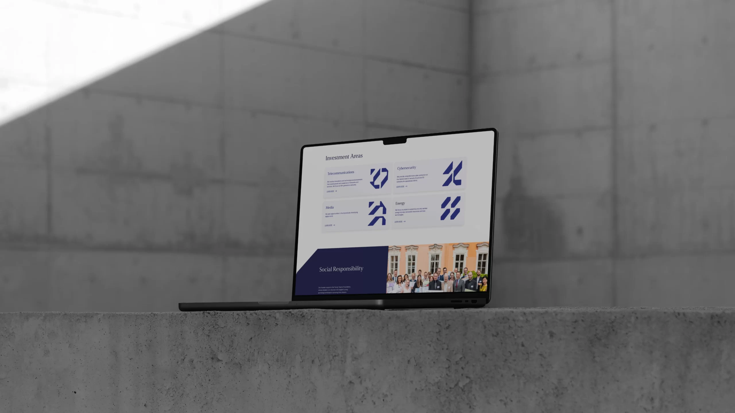
Iconography
A custom icon set extends the crane’s geometry into clear sector marks, each built from the same precise angles and cuts as the main symbol. They make investment areas easy to read at a glance, while ensuring that every slide, chart, and webpage still feels distinctly like Crane Constancy Capital.

Step 3:
Making Every Touchpoint Consistent
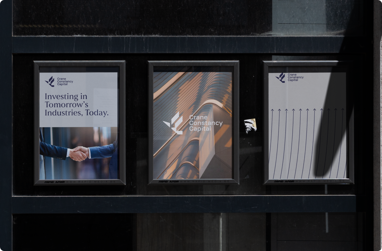
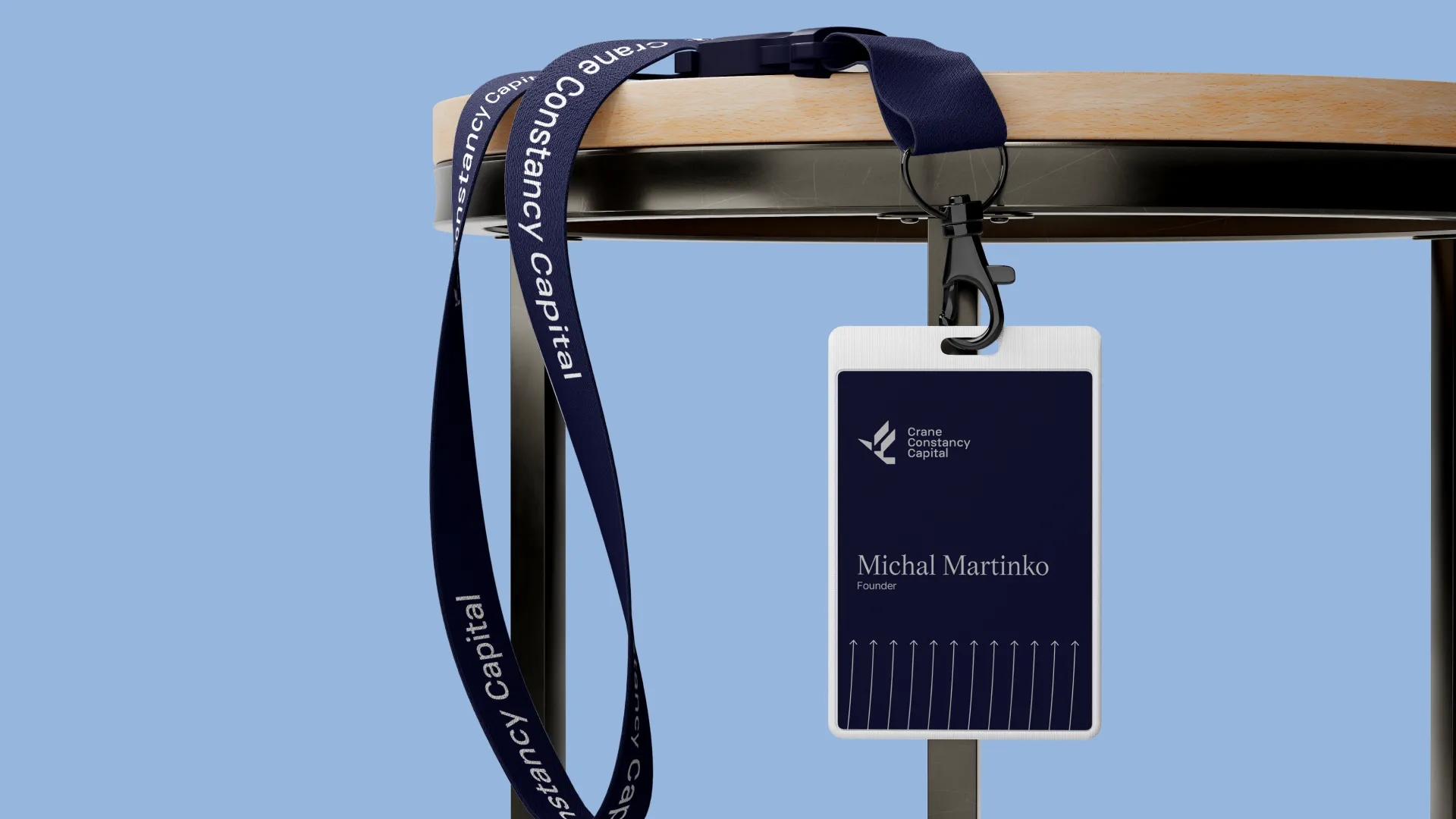
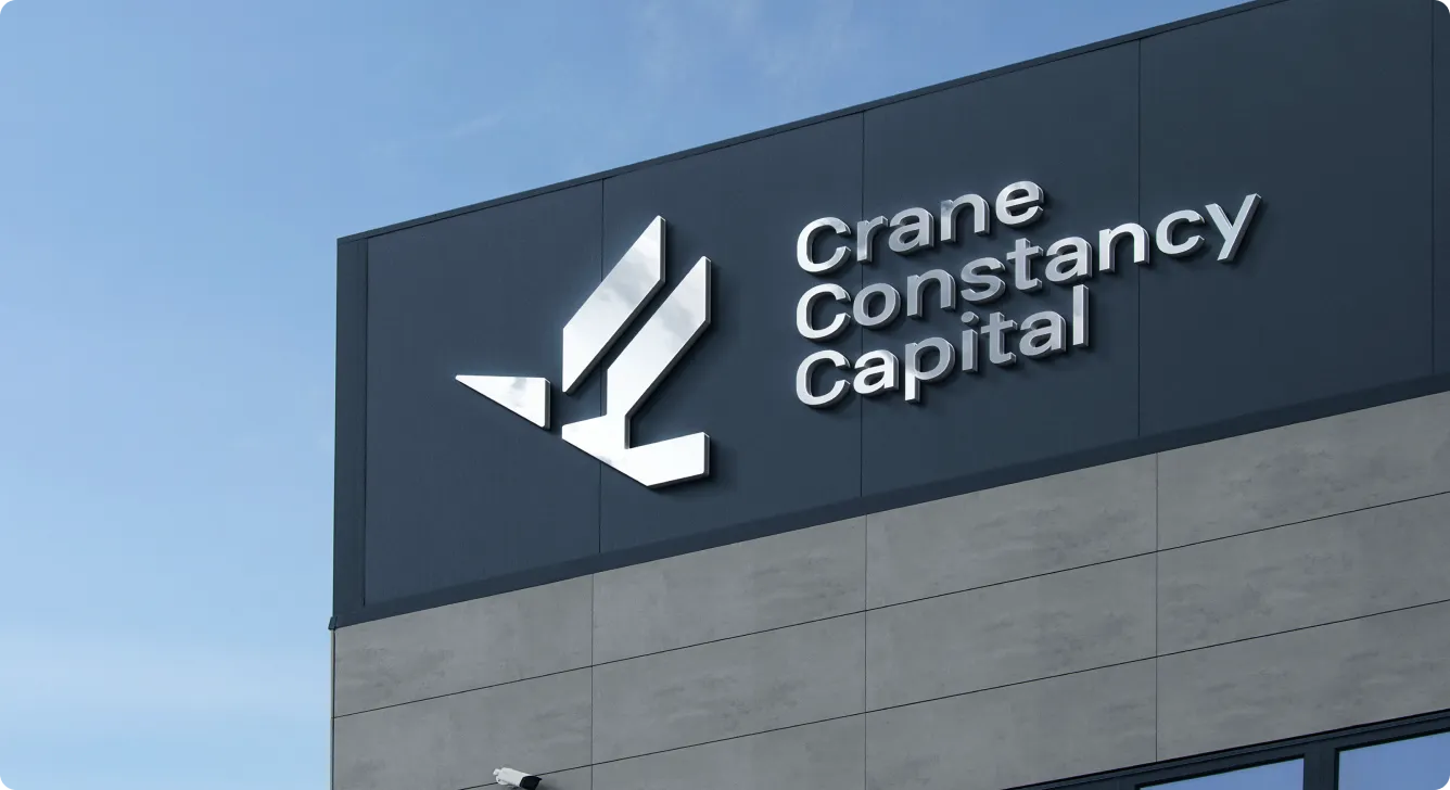
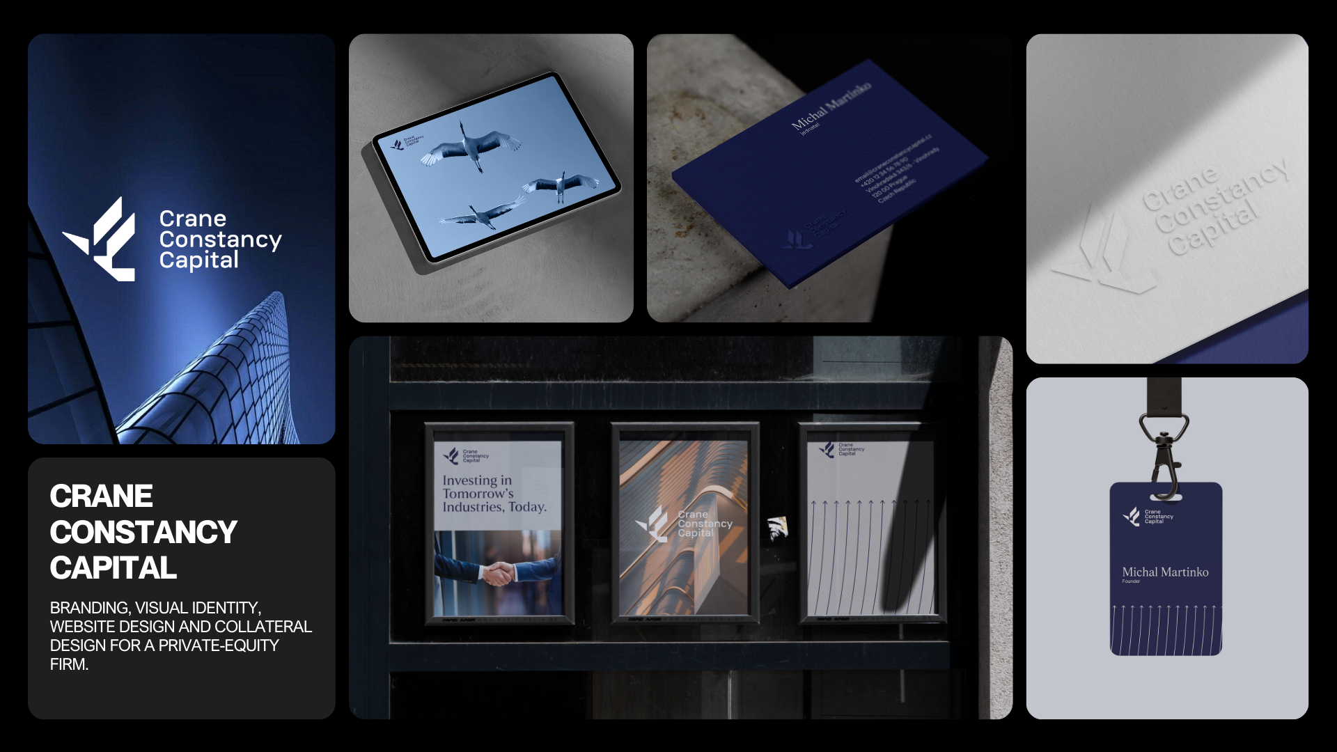
We rolled the new identity out across all key touchpoints— from stationery and investor decks to the website —so it didn’t stay as a brandbook on a shelf, but became an everyday tool. Every asset was designed for real use in finance: clear in numbers-heavy documents, confident in pitch meetings, and consistent wherever Crane Constancy Capital shows up.
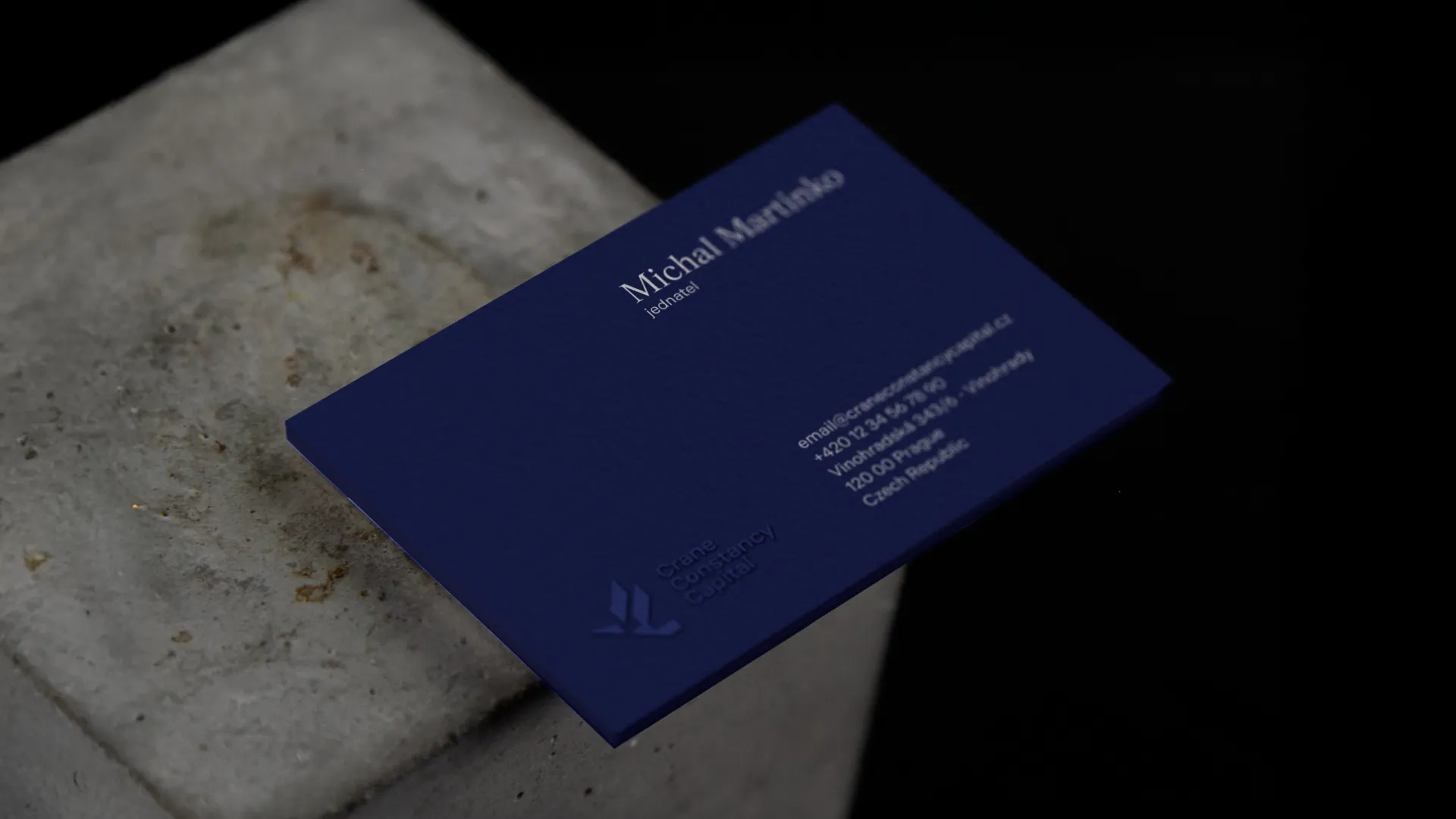
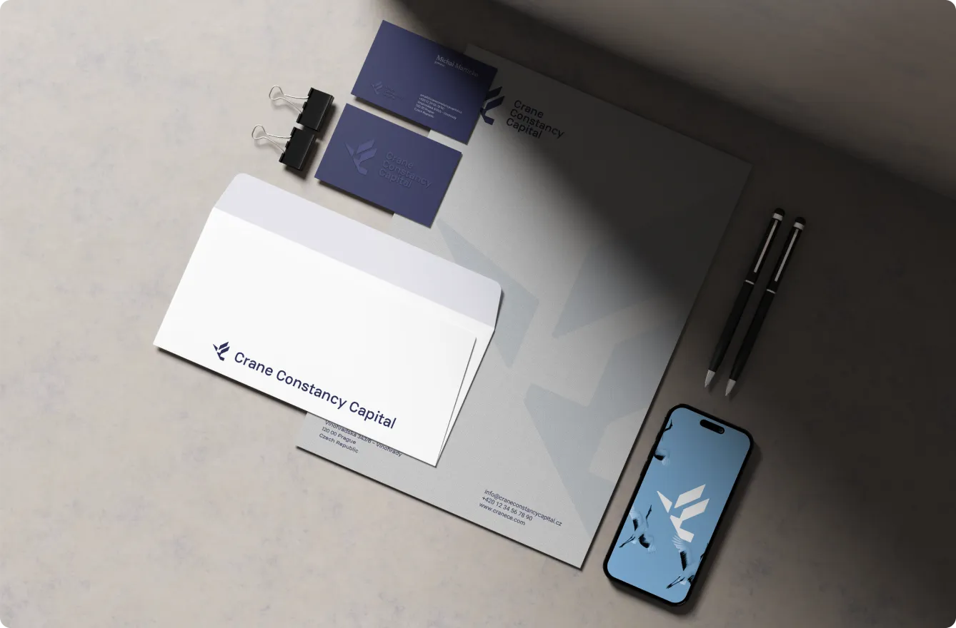
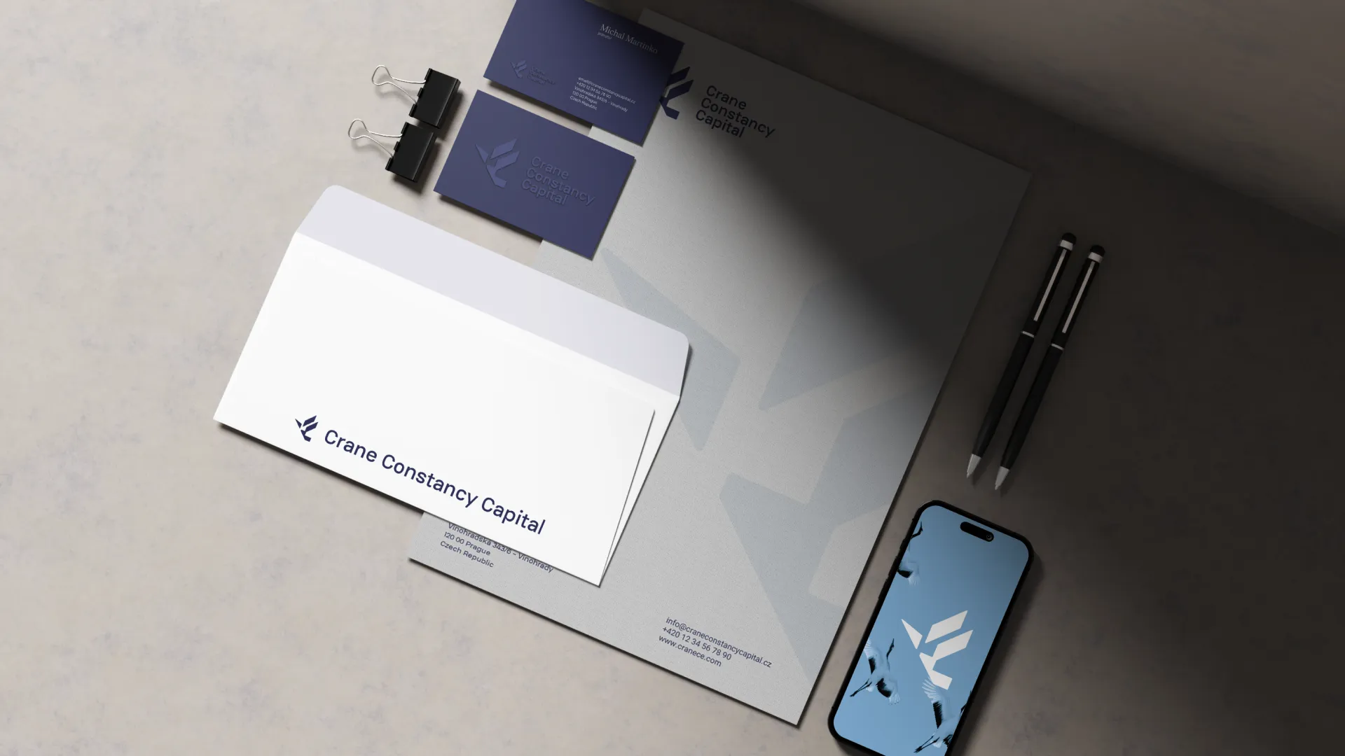
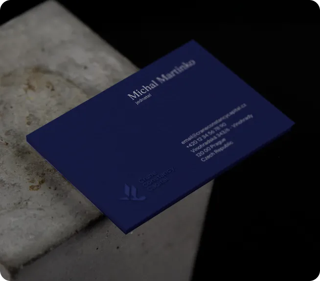
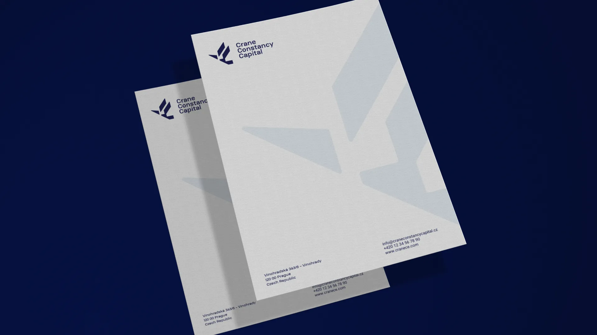
Business Cards & Letterhead: Crane’s cards and letterhead were redesigned as quiet statements of confidence—clean typography, deep navy, and the crane mark working together so that even a signed document or quick card handover feels precise, trustworthy, and unmistakably Crane Constancy Capital.

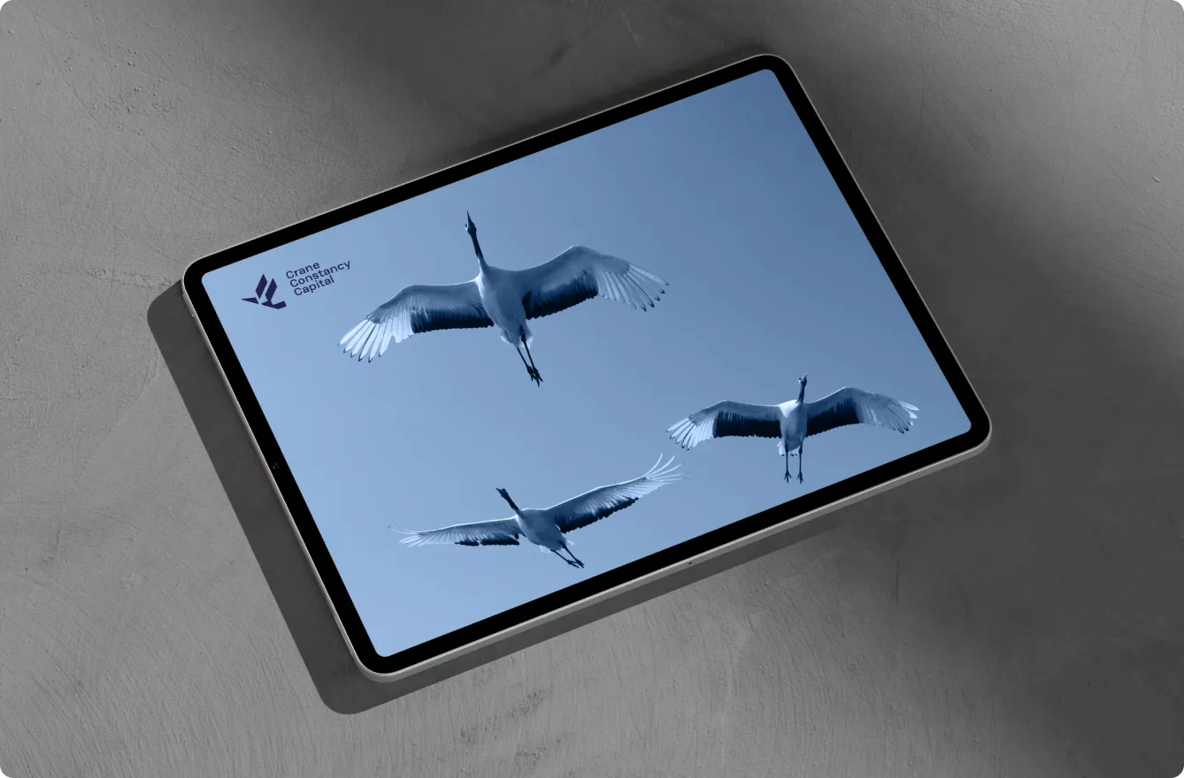
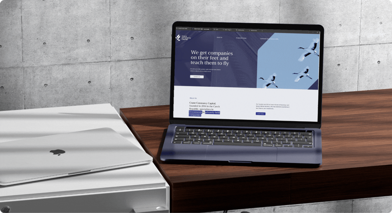
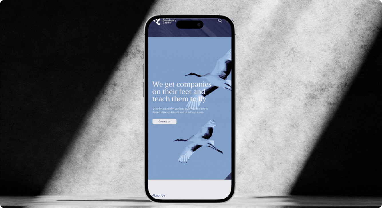
Website — Desktop & Mobile: The new site translates the identity into a clear, investor-ready experience—deep blues, precise typography, and the crane symbol guiding navigation—so whether viewed on a large monitor or a phone screen, Crane Constancy Capital feels focused, trustworthy, and ready for serious conversations.
Impact: A Clearer, More Human Investment Partner
Sharper First Impressions
With the new identity in place, Crane Constancy Capital now comes across as a serious, confident partner from the very first touchpoint. Whether it’s a business card, a letter, or the homepage, investors and founders can immediately read them as a trustworthy, long-term ally.
Stronger Investor Confidence
The cohesive visual system—symbol, colors, typography, and layouts—gives every deck and document a consistent, professional tone. That consistency quietly reinforces what matters most in private equity: trust, discipline, and a long-term view.
Clearer Story for Founders
For business partners and emerging companies, the brand now mirrors the promise: steady on the ground, built to help them take off. The crane symbol, growth arrows, and tone of voice make the firm feel human and accessible without losing financial gravitas.
Tools the Team Can Actually Use
Templates, patterns, icons, and web components make it easy for the team and partners to stay on-brand without extra effort. From pitch decks to investor reports and everyday documents, Crane can show up the same way everywhere—recognizable and consistent.
Positioned for the Long Term
The result isn’t just a nicer logo—it’s a timeless system that can grow with the fund. As Crane Constancy Capital develops its portfolio and enters new markets, the brand gives them a stable, recognisable platform to build on—steady capital with a clear, visible sense of upward momentum.


For companies in finance, building a strong brand is an asset that compounds. A clear, trusted brand lifts valuation multiples and turns first meetings into actual human connections clients stay for.

Ready to turn your brand into the hell-yes choice?
Join 100+ brand leaders who stopped waiting for “someday” - and built brands people obsess about today.

Ready to turn your brand into the hell-yes choice?
Join 100+ brand leaders who stopped waiting for “someday” - and built brands people obsess about today.
Year: 2025
Creative direction: Katerina Horka, Sabina Samuel
Designers: Tereza Kopečná, Viktoriia Safonenko, Polina Petryshyna
Studio HEELS MAKE DEALS
Smart brand moves, straight to your inbox.

Smart brand moves, straight to your inbox.