LOGO DESIGN | BRAND IDENTITY | PACKAGING DESIGN | PRINT DESIGN | WEBDESIGN
ENII NAILS: From cluttered brand image to modern pro beauty brand.
The Challenge: When a great formula gets lost in the noise
ENII NAILS had everything going for it on the inside: a family brand with over 20 years in the market, lab-driven formulas, its own academy, and a loyal base of professional nail technicians - plus a growing crowd of at-home users discovering the brand online. They'd grown steadily over the years. But somewhere along the way, the brand foundation hadn't kept up with any of it.
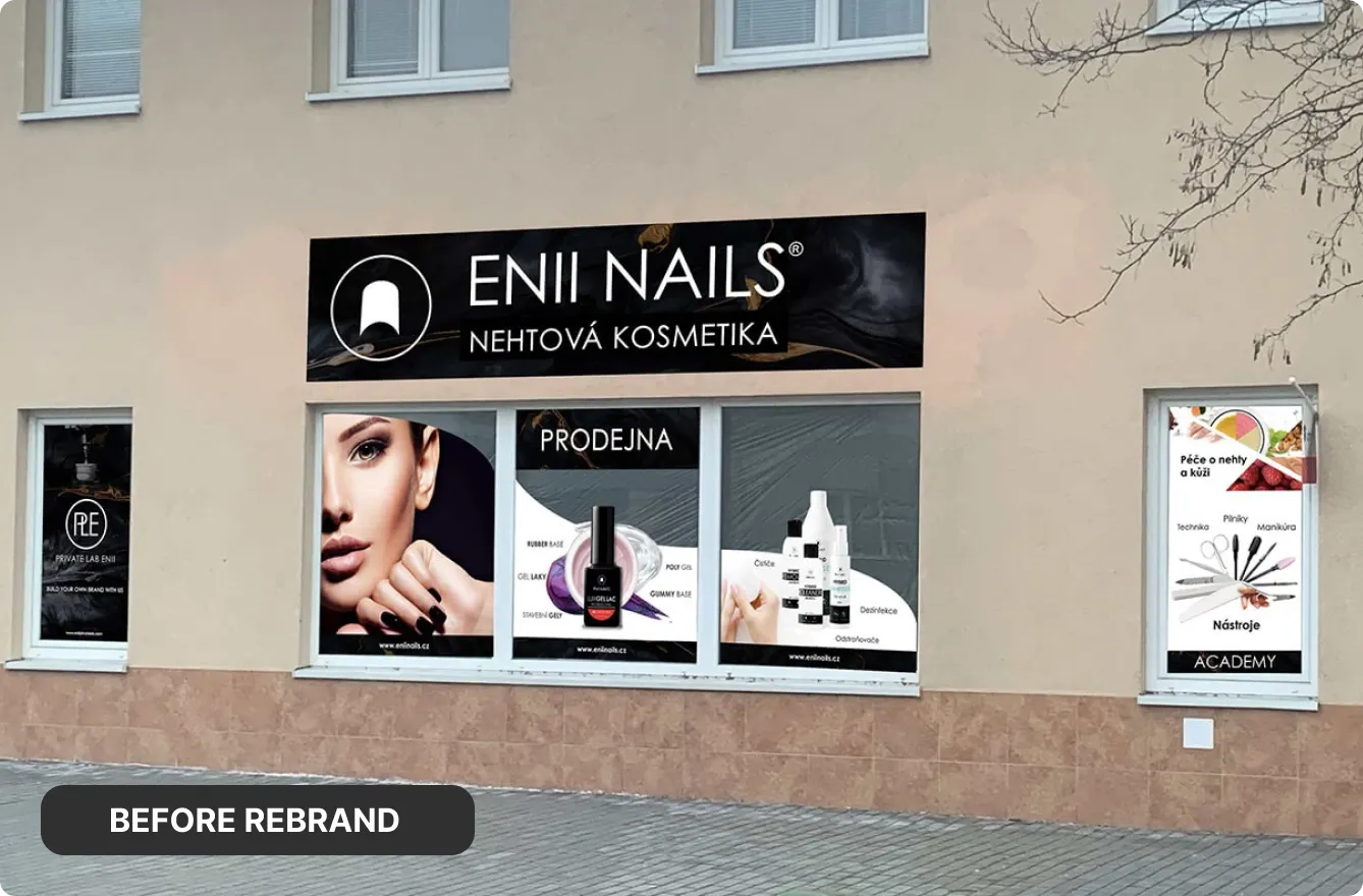
On the outside, the story didn't match. An overused pink palette, mixed styles, and inconsistent packaging, storefronts, and web visuals made ENII NAILS easy to overlook and hard to recognise at a glance. Without a clear system, the brand felt generic - far from the focused, professional beauty player it actually was.
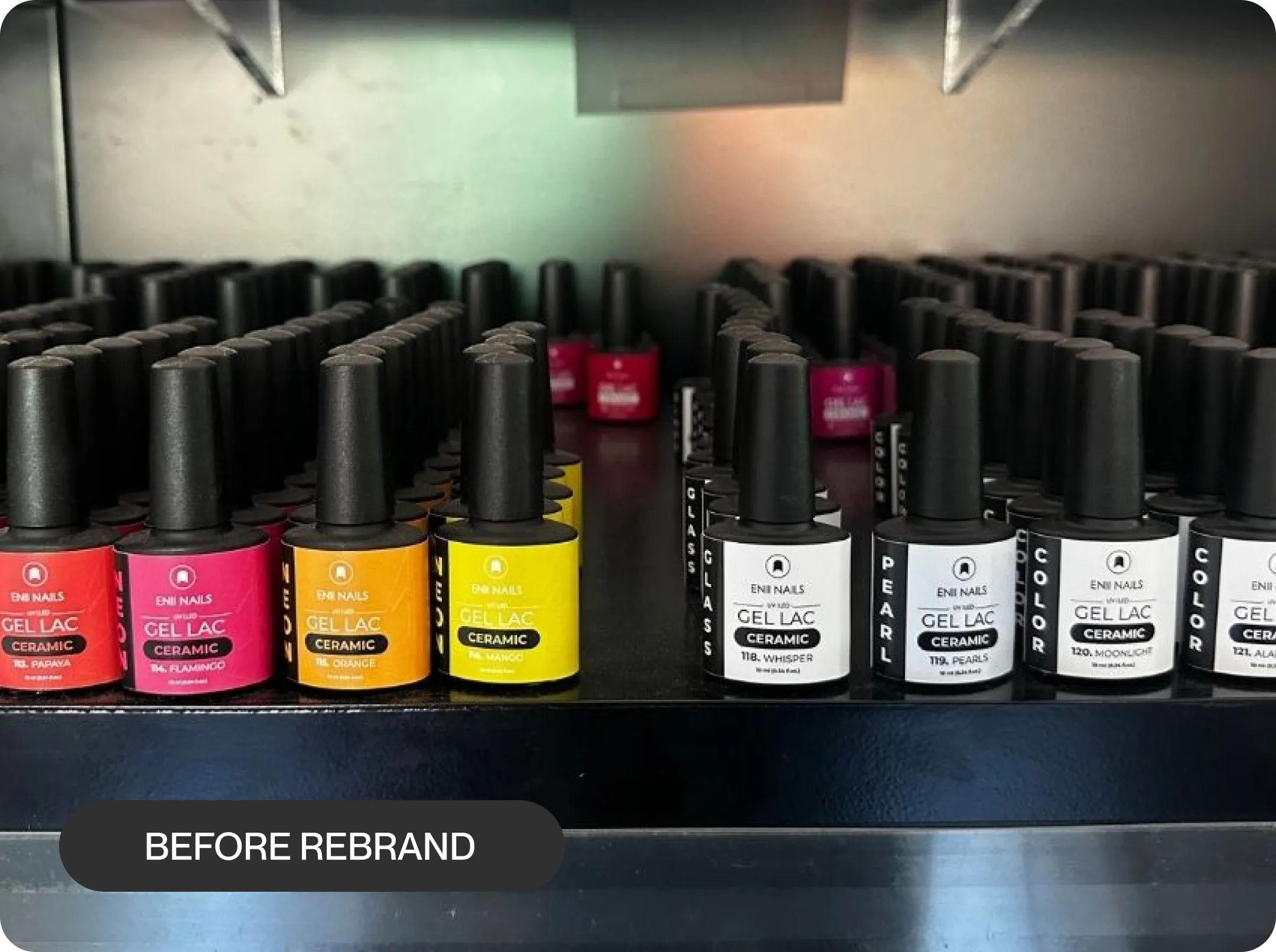
On the outside, the story didn't match. An overused pink palette, mixed styles, and inconsistent packaging, storefronts, and web visuals made ENII NAILS easy to overlook and hard to recognise at a glance. Without a clear system, the brand felt generic - far from the focused, professional beauty player it actually was.
Step 1:
Finding the brand beneath the polish
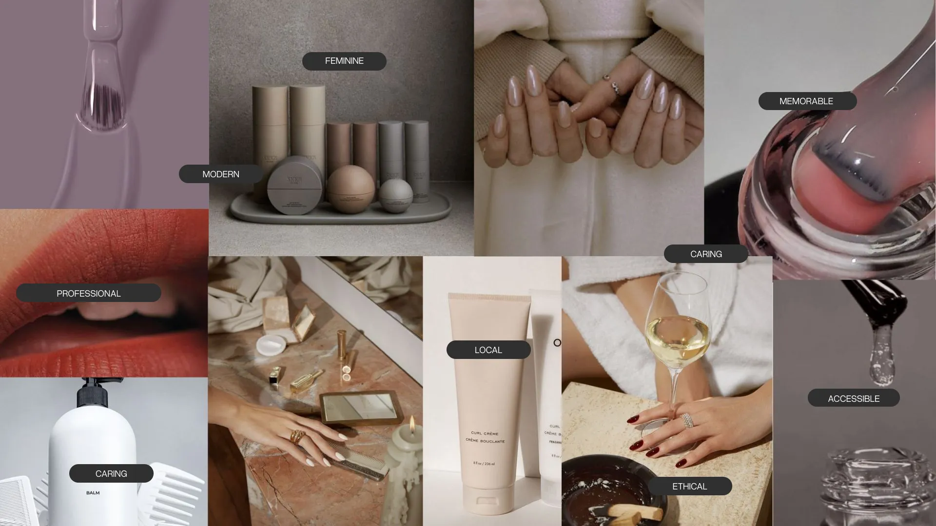
We mapped how ENII NAILS showed up in the world - on shelves, in salons, online - and compared that with how founders, nail techs, and customers talked about it. What surfaced was clear: ENII's true strength wasn't "cute pink nails," but pro-level, lab-backed quality wrapped in a warm, independent family approach - trusted by technicians and still surprisingly accessible for everyday users.
Four pillars anchored everything that followed:
Core brand pillars:
PRO-PERFORMANCE:
Salon-grade formulas designed for real nail professionals
FAMILY ROOTS:
Independent local brand built on experience and care.
ACCESSIBLE QUALITY:
High performance without luxury-attitude pricing, for everyone.
FAIR & CLEAR:
Clear ingredients, fair standards, no bullshit beauty.
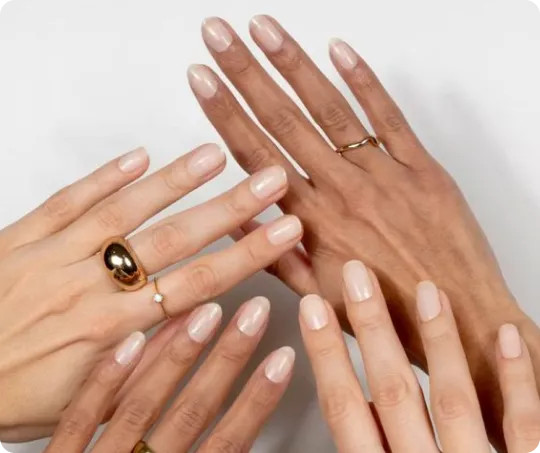
Understanding the two core audiences
Crucially, the brand needed to speak just as clearly to professional nail technicians as to everyday beauty lovers doing their nails at home.
Professional nail technicians and salons: expecting lab-grade performance, reliability, and a brand that understands real work at the nail table.

Everyday beauty lovers at home: want easy, trustworthy products that feel professional and fit real-life budgets.

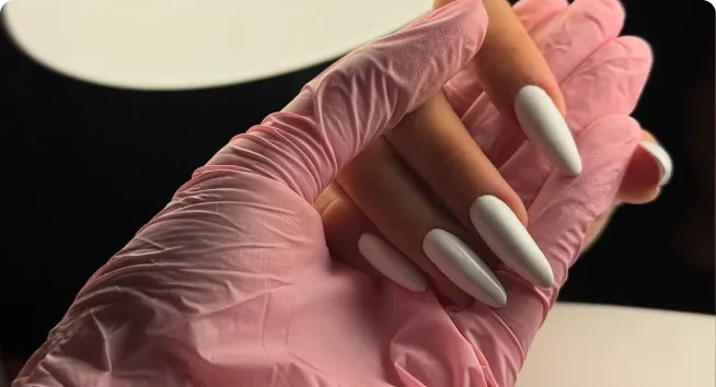
ENII NAILS needed an identity that could live comfortably in both worlds at once. The new look is clean and professional enough for salon desks, but softened with warm tones and minimal details so it still feels friendly and wearable at home. It signals pro quality without shouting, and femininity without cliché pink overload.

Step 2:
Designing the visual system
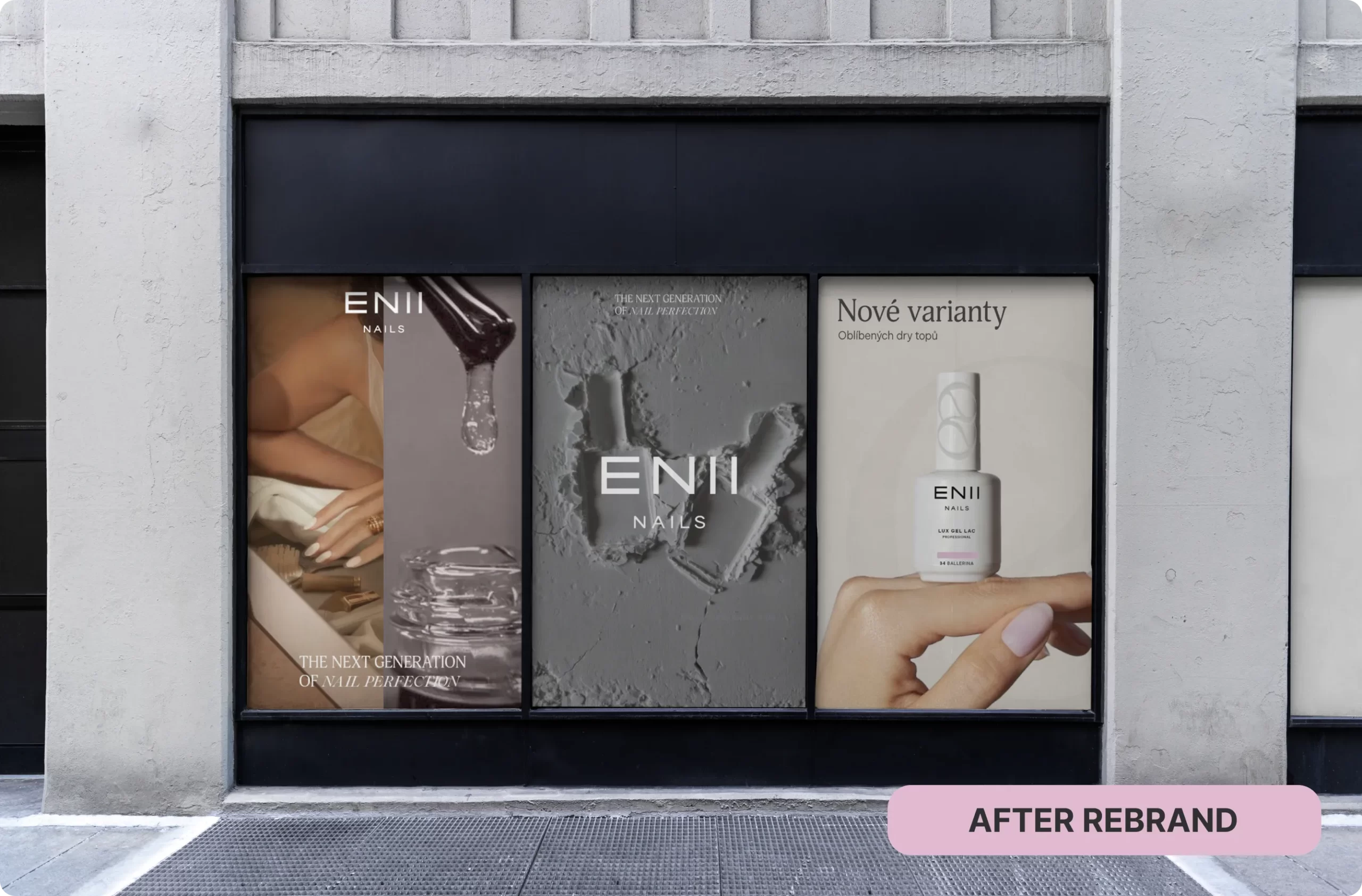
From pink chaos to calm confidence
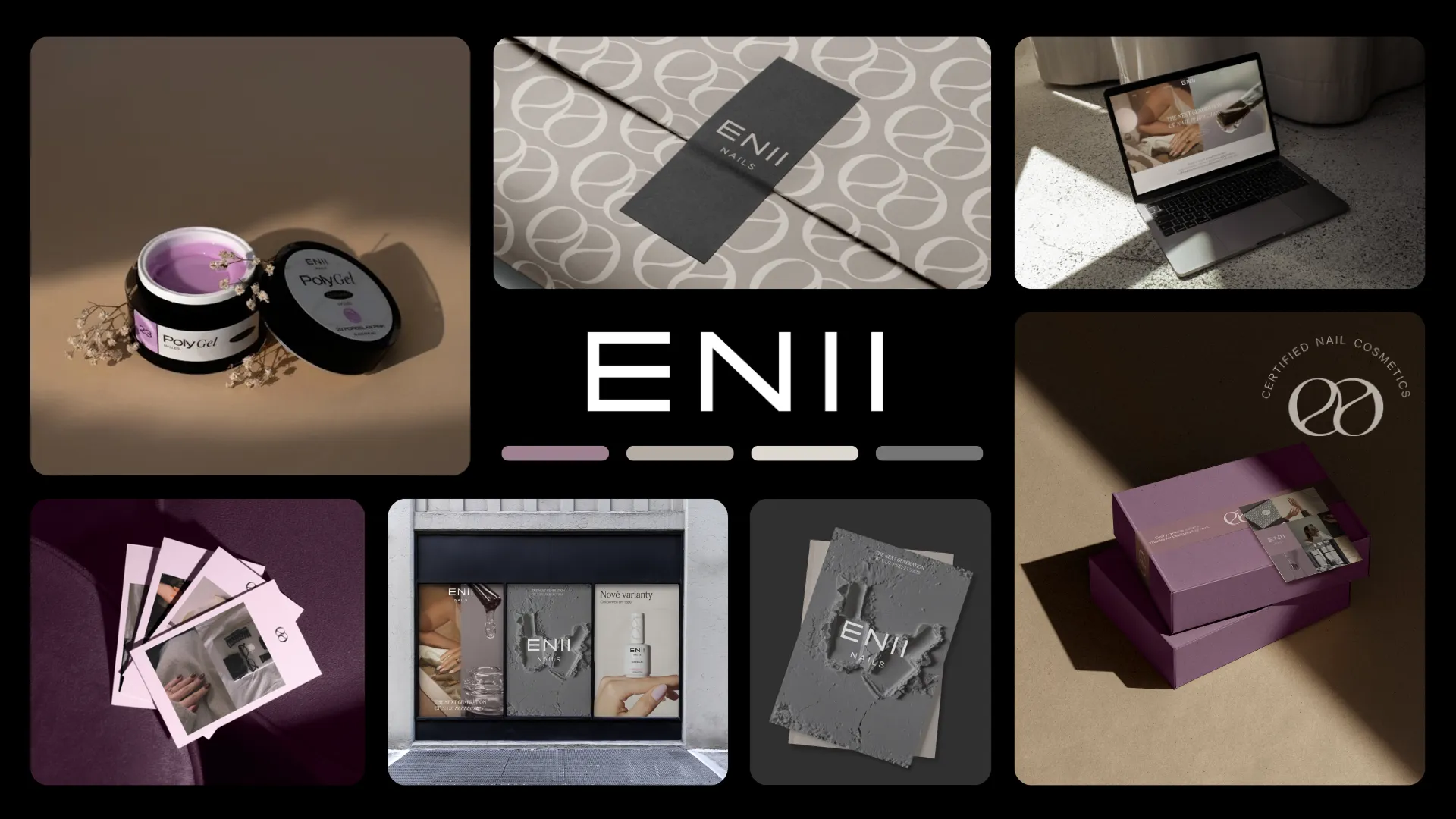
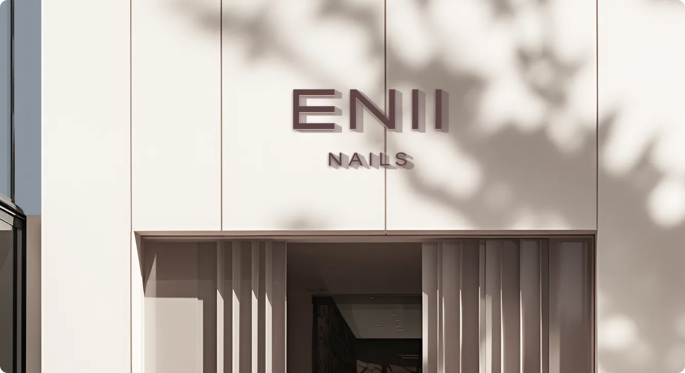
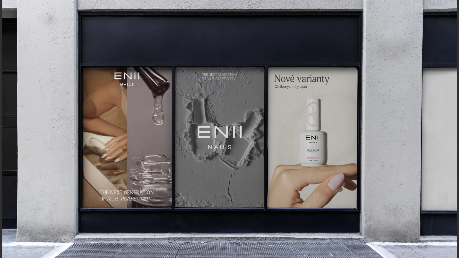
We shifted ENII NAILS from loud, scattered pinks to a clear, modern system-refined wordmark, confident typography, a calmer yet distinctive color palette, and visual elements that work together across packaging and online. The new identity makes every bottle, banner, and page instantly feel like ENII: professional, feminine, and under control.
A new face for ENII
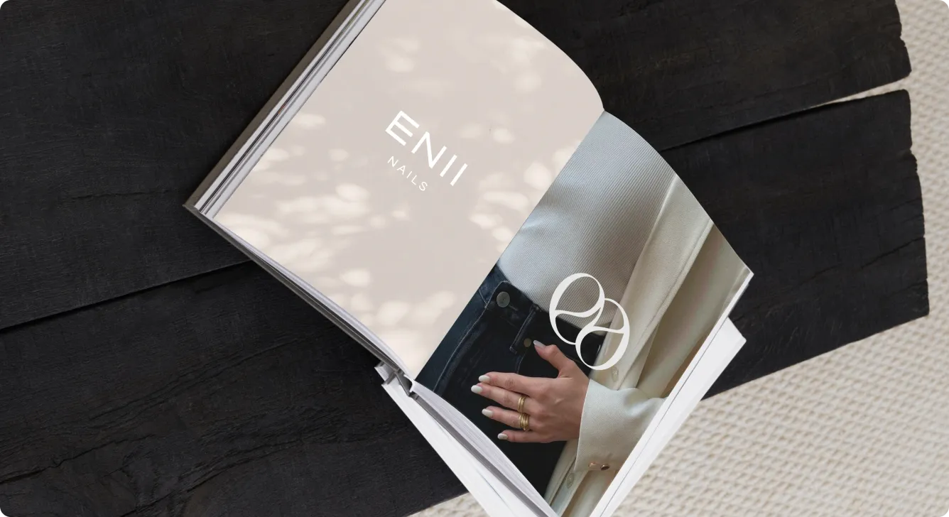
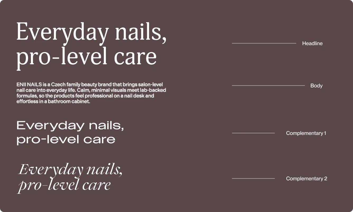
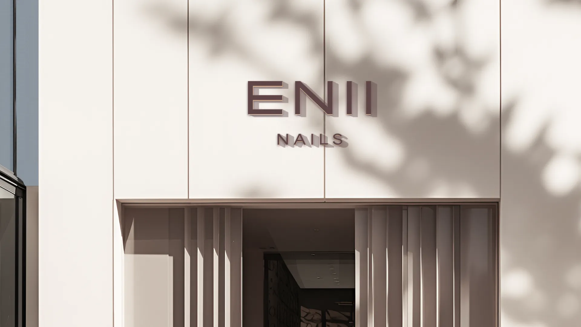
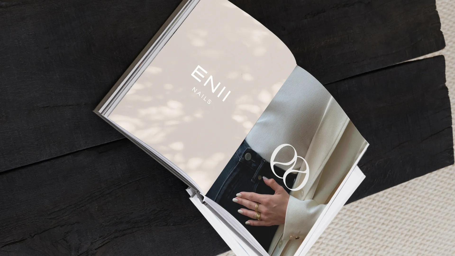
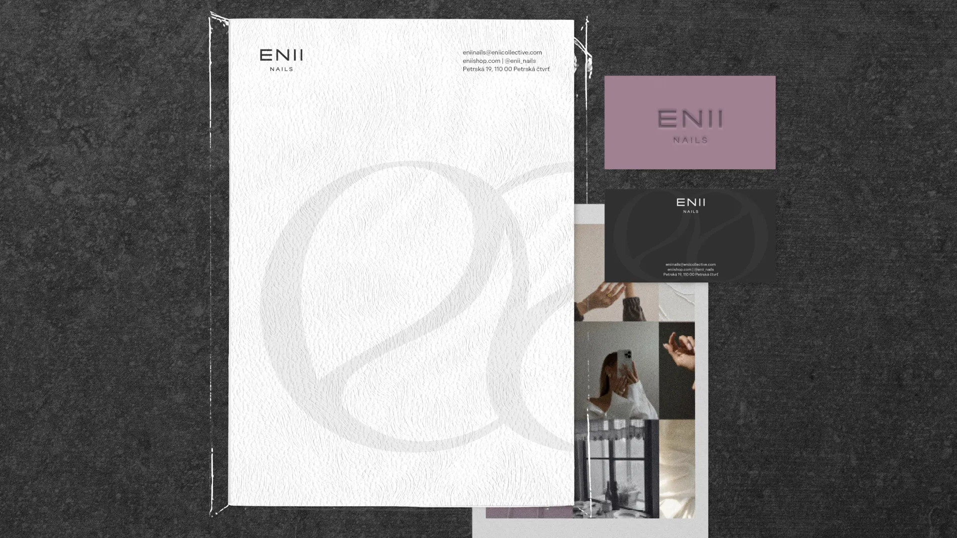
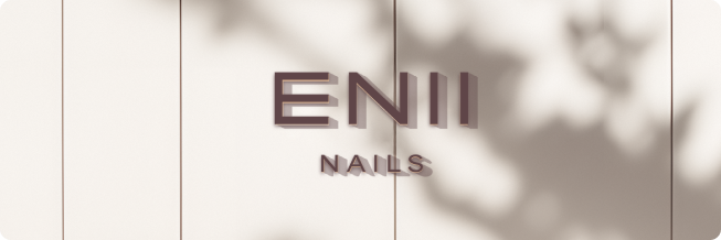
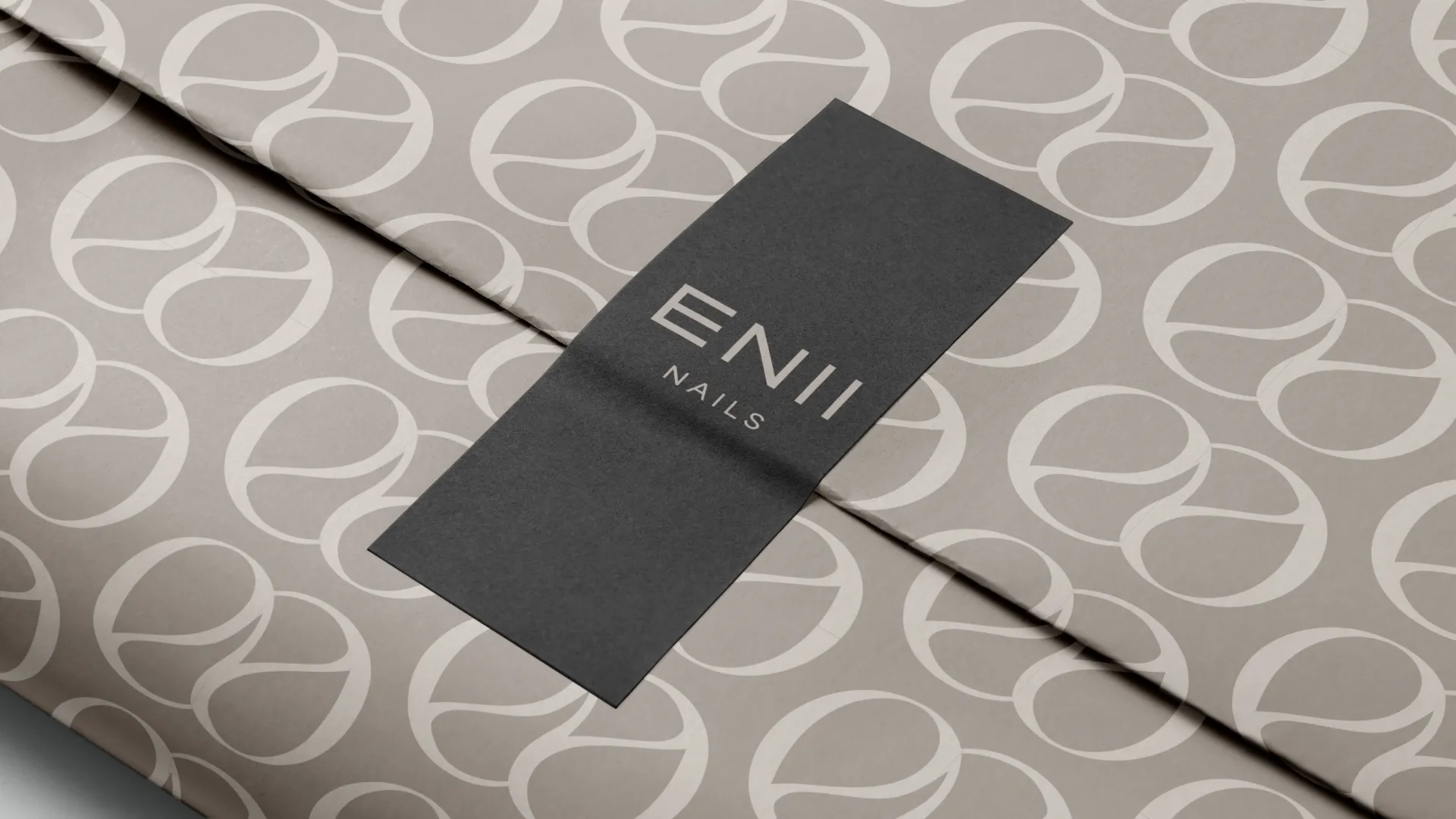
Logotype
Clean, uppercase, built on precise vertical rhythm and generous spacing. Every stroke, every proportion deliberately considered - the result is a wordmark that feels geometrically balanced and quietly harmonious. The extended "E" gives it architectural structure without heaviness, while the weight contrast between "ENII" and "NAILS" creates a natural, effortless hierarchy.
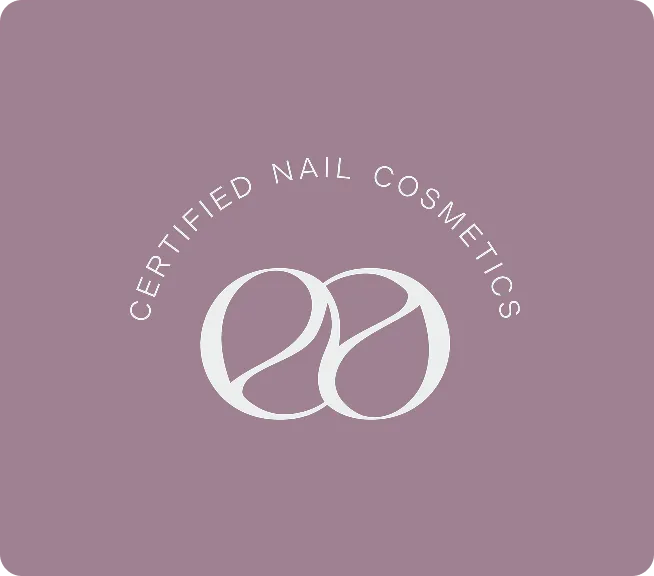
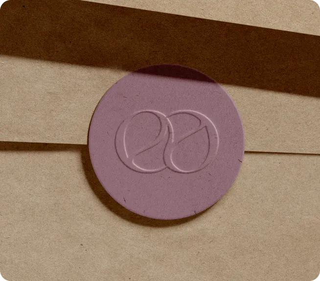
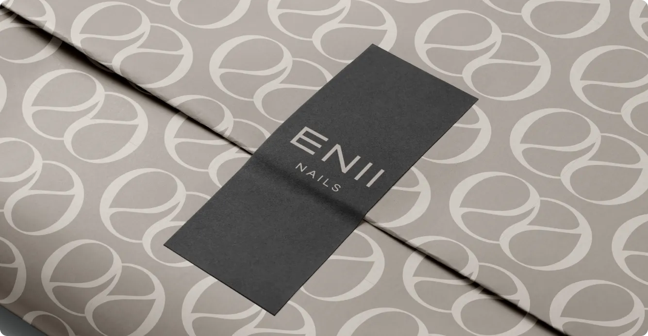
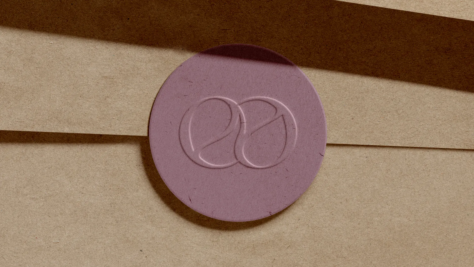
Logo symbol
The ENII symbol turns the double “E” into two soft, interlocking loops - part monogram, part abstract drop of polish. Drawn with smooth curves and balanced proportions, it feels gentle yet precise, reinforcing ideas of care, continuity, and certified quality. As a seal, stamp, or small badge, it works on its own as a quiet mark of trusted nail cosmetics.
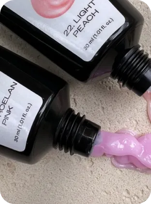
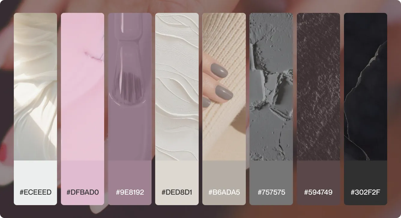
Color palette
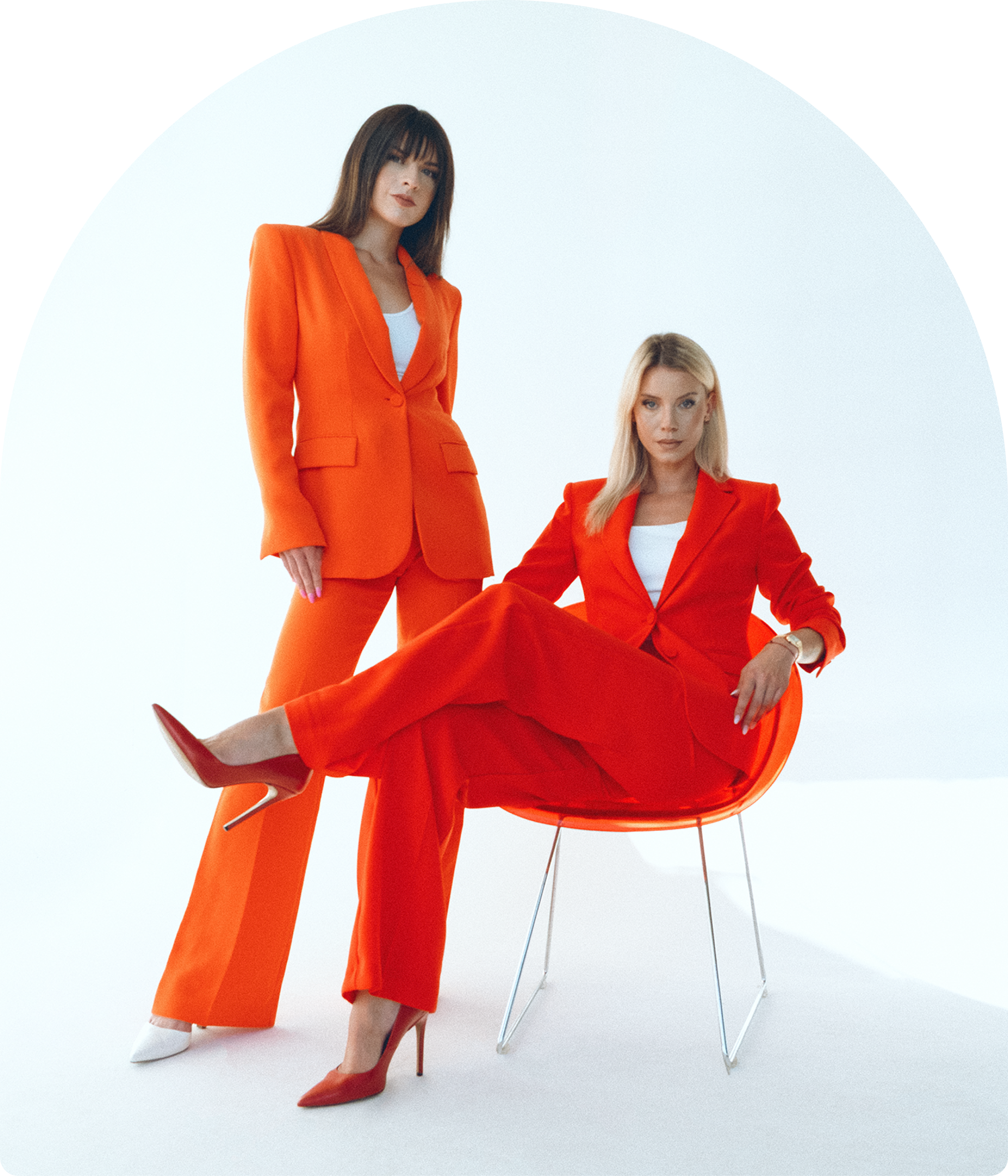
In a category drowning in pinks, we chose mauve as ENII's signature shade. Still feminine, still warm, but distinctly theirs. Mauve carries a maturity that pink doesn't: it signals a brand that knows exactly where it stands, not a newcomer trying to fit in. Anchored by soft neutrals and cool greys, the palette feels calm, premium, and instantly recognisable - a deliberate step away from the crowd.
Typography
The chosen typefaces balance professional clarity and soft femininity - a clean, modern sans-serif for structure paired with lighter, airy weights for detail. Together, they keep product names, claims, and education easy to read, while supporting the brand’s calm, minimal, beauty-first feel.
Pattern
The ENII pattern repeats the soft double-“E” symbol into a flowing all-over print, turning the monogram into a subtle beauty texture. Used on tissue, bags, and packaging, it adds a gentle, premium layer while making every parcel instantly recognisable as ENII.


Step 3:
Putting the identity in her hands
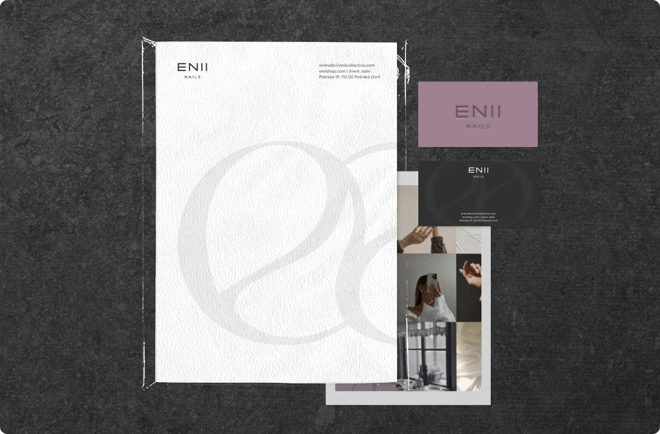
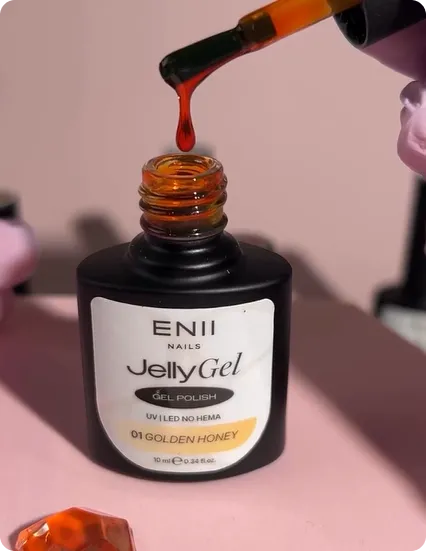
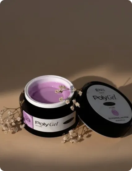
We translated the new ENII look into tangible pieces - bottles, jars, boxes, labels, order packaging, and print materials - so the brand feels consistent from the moment she opens a parcel or picks up a product in the salon.
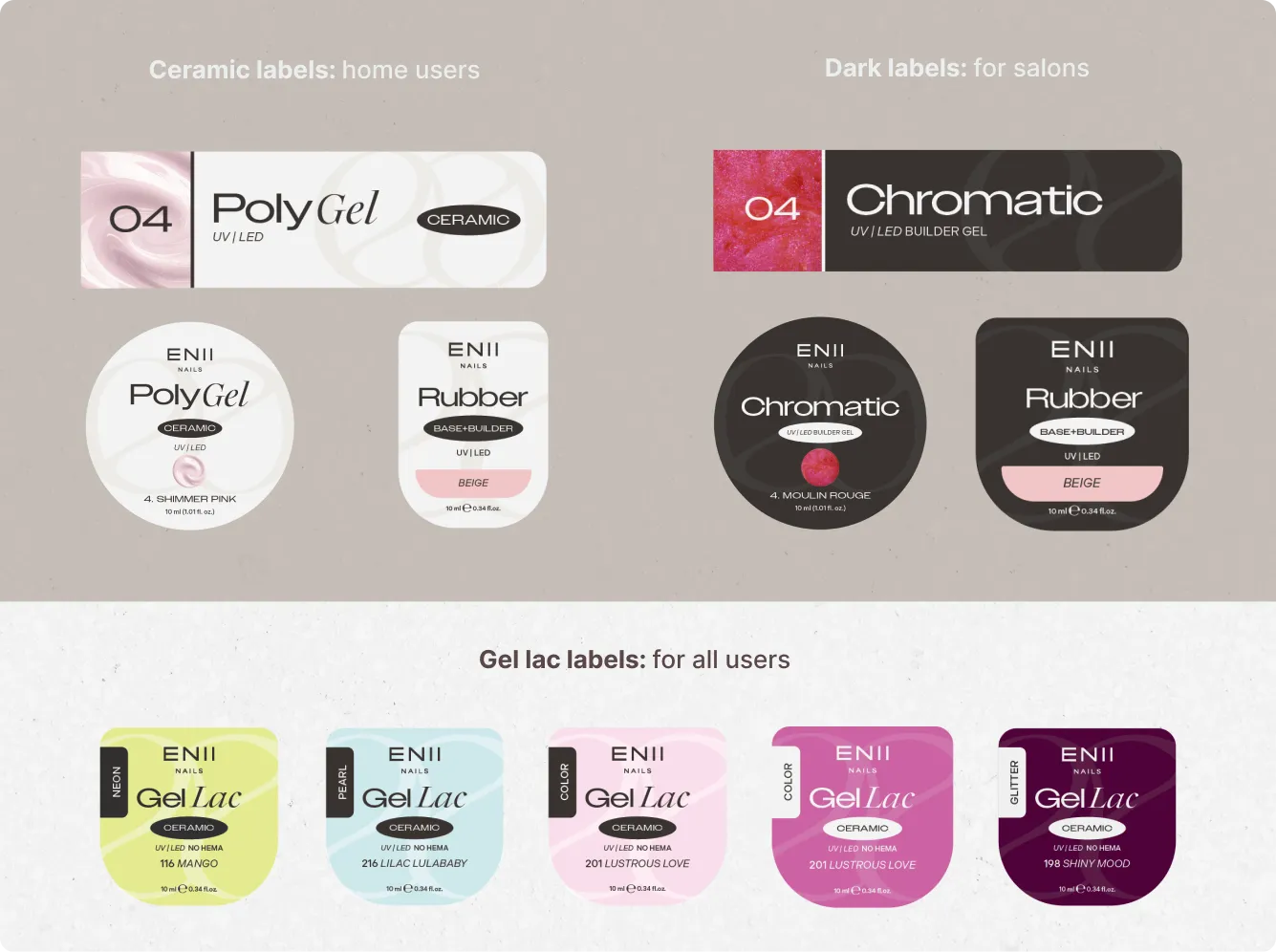
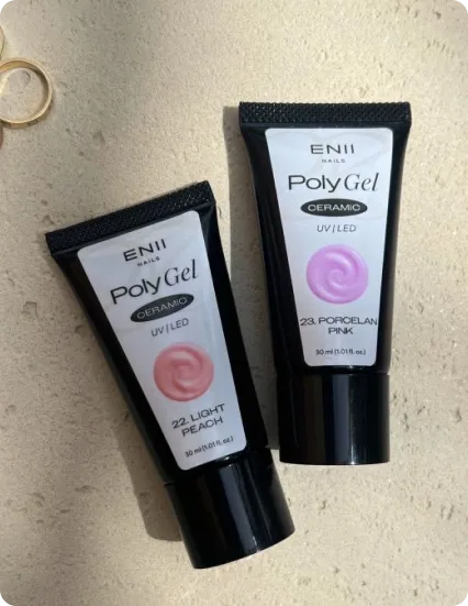
Product packaging System: Ceramic lines use light, airy labels that feel friendly for home users, while dark, richer labels signal salon-grade formulas; Gel Lac sits in between with bold, color-coded fronts for all users, making level, use-case, and shade instantly clear on shelf and at the nail table.
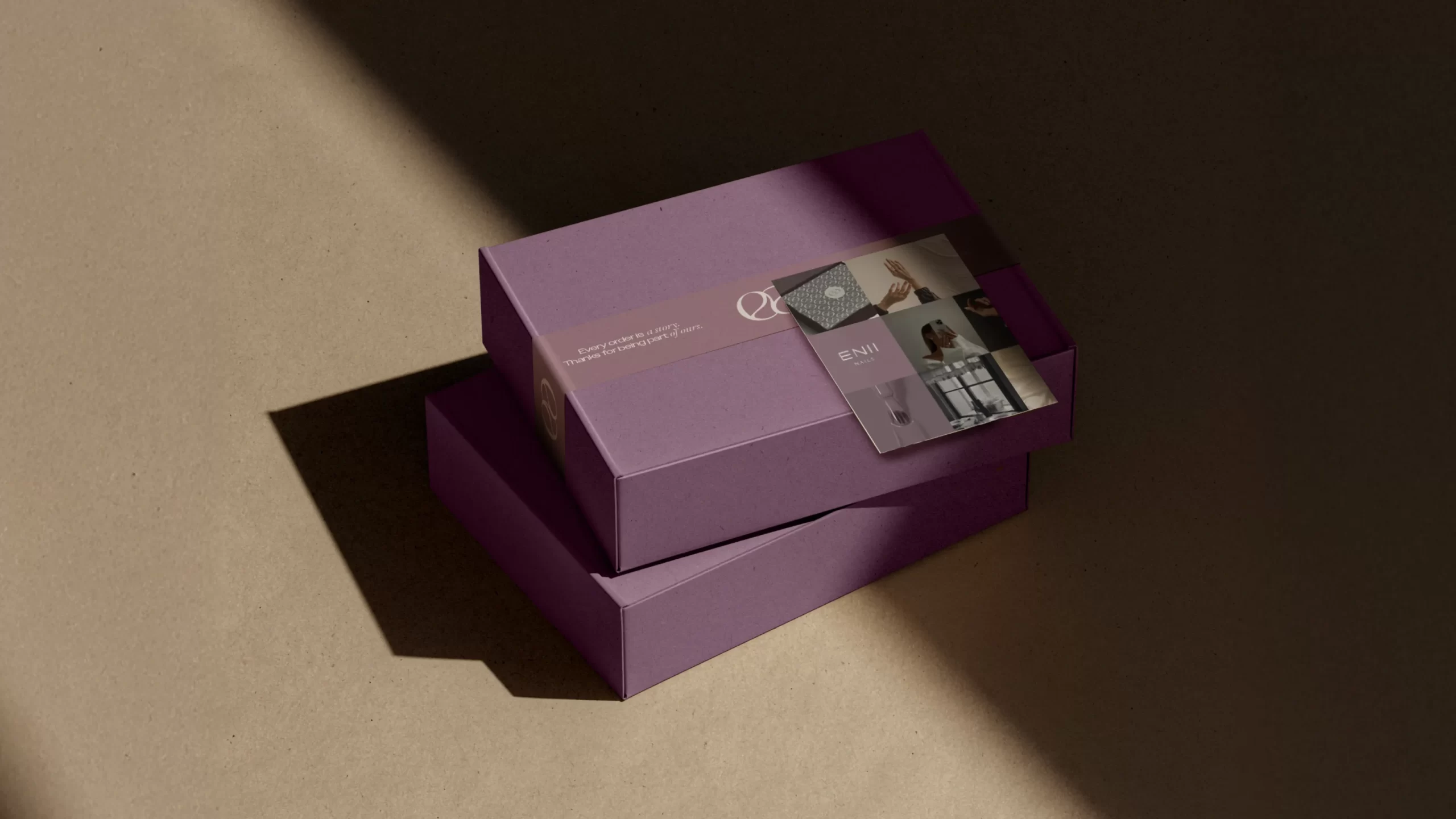
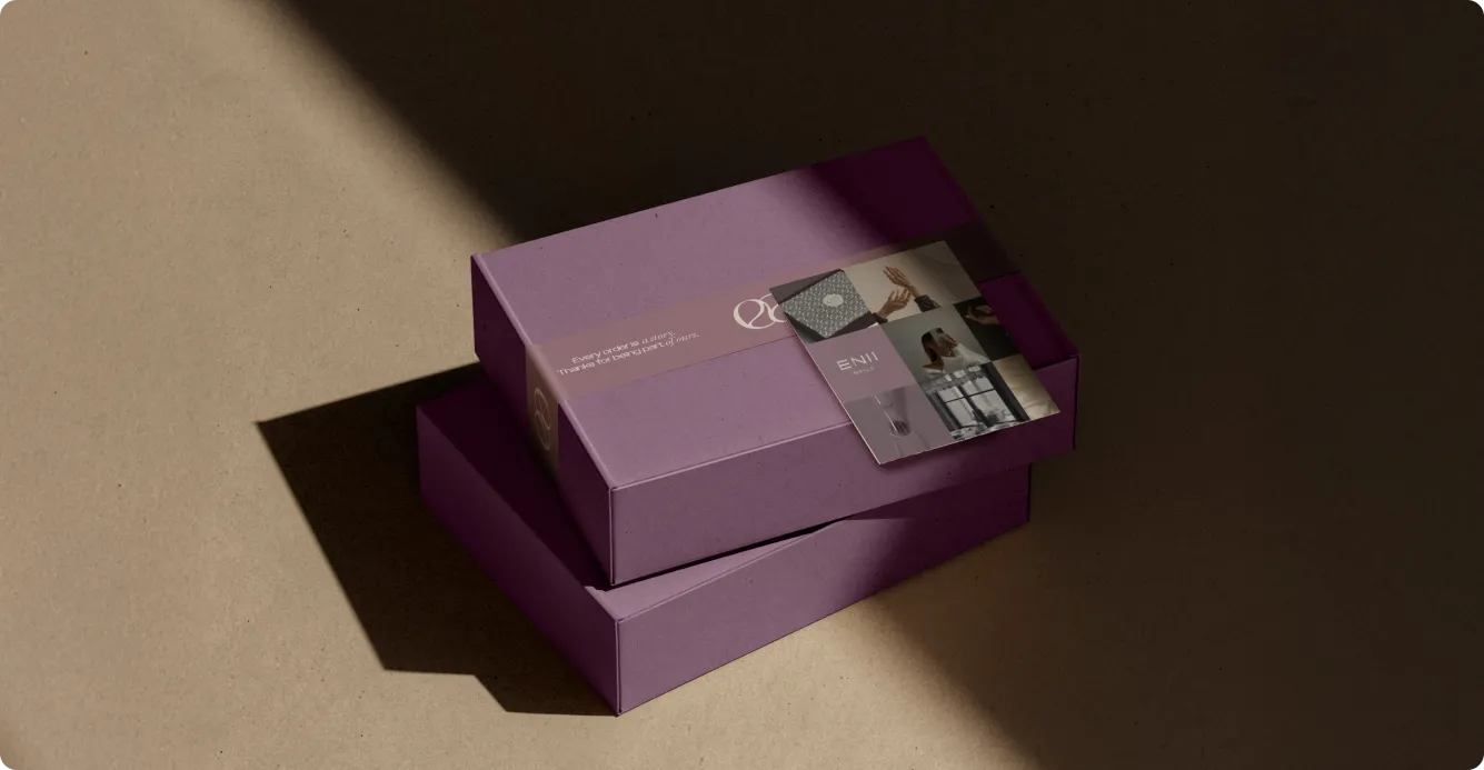
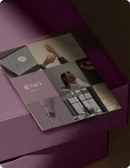
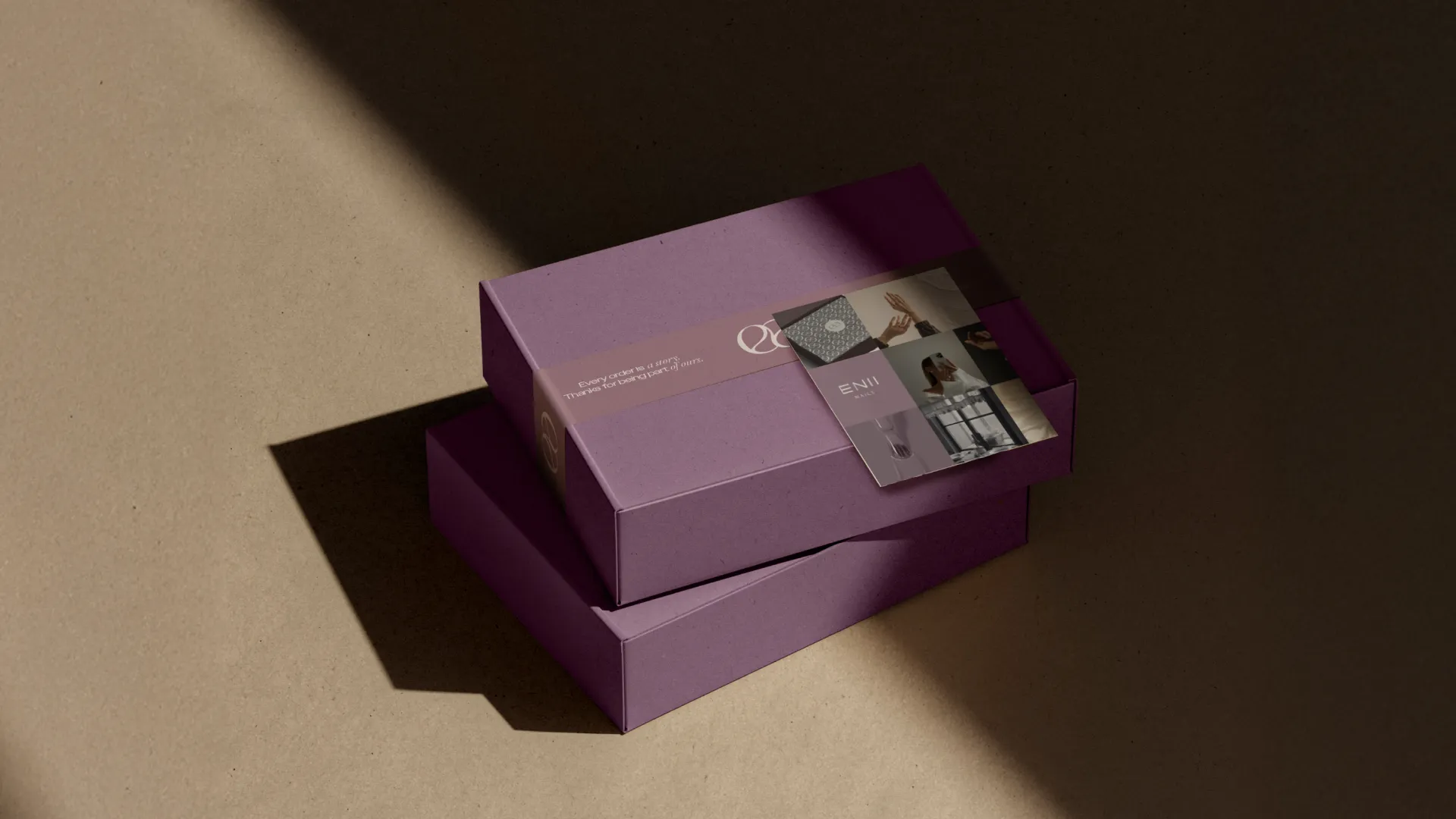
Unboxing Experience: From the moment a parcel arrives, everything is intentional. The box, the tape, the wrapping paper inside, the cards - all designed as one cohesive moment. Opening an ENII order feels like a small ritual, not just receiving a product.
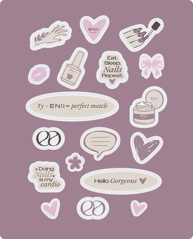
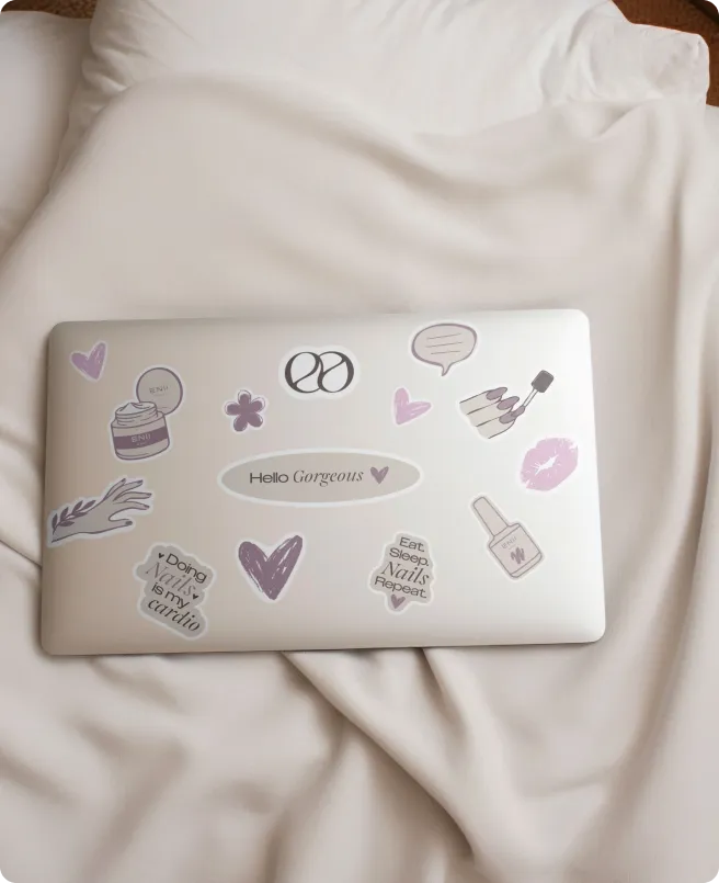
Sticker Pack: A playful ENII sticker pack turns the new identity into something fans can wear - on laptops, lamps, cases, or salon tools. Icons, mini phrases, and the double-“E” symbol extend the brand beyond packaging, building everyday affinity in a fun, collectible way.
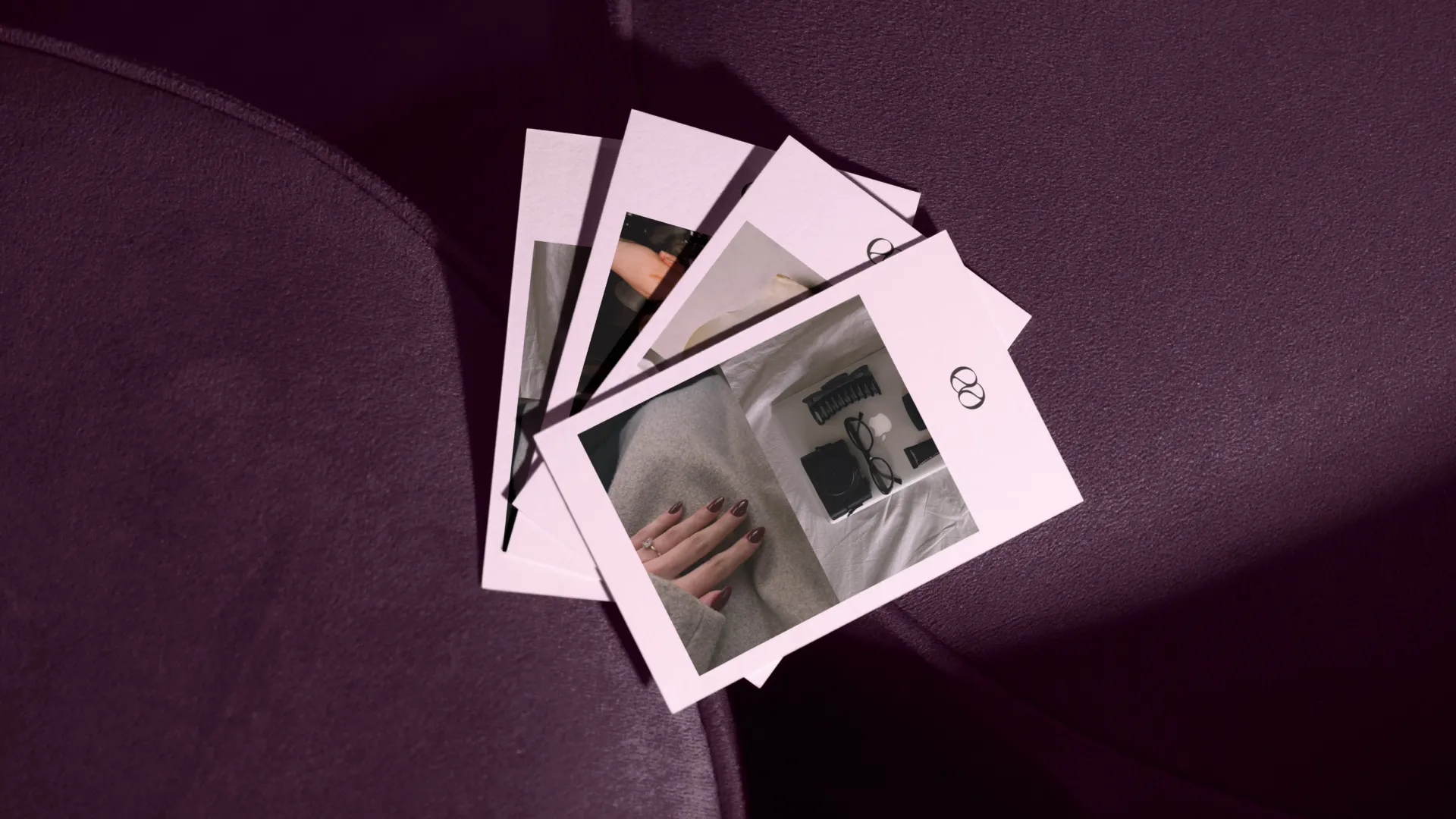
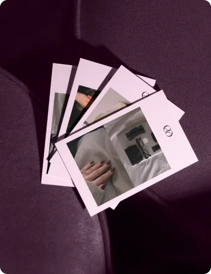
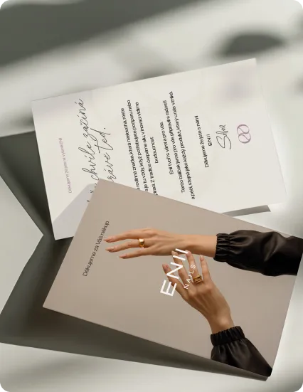
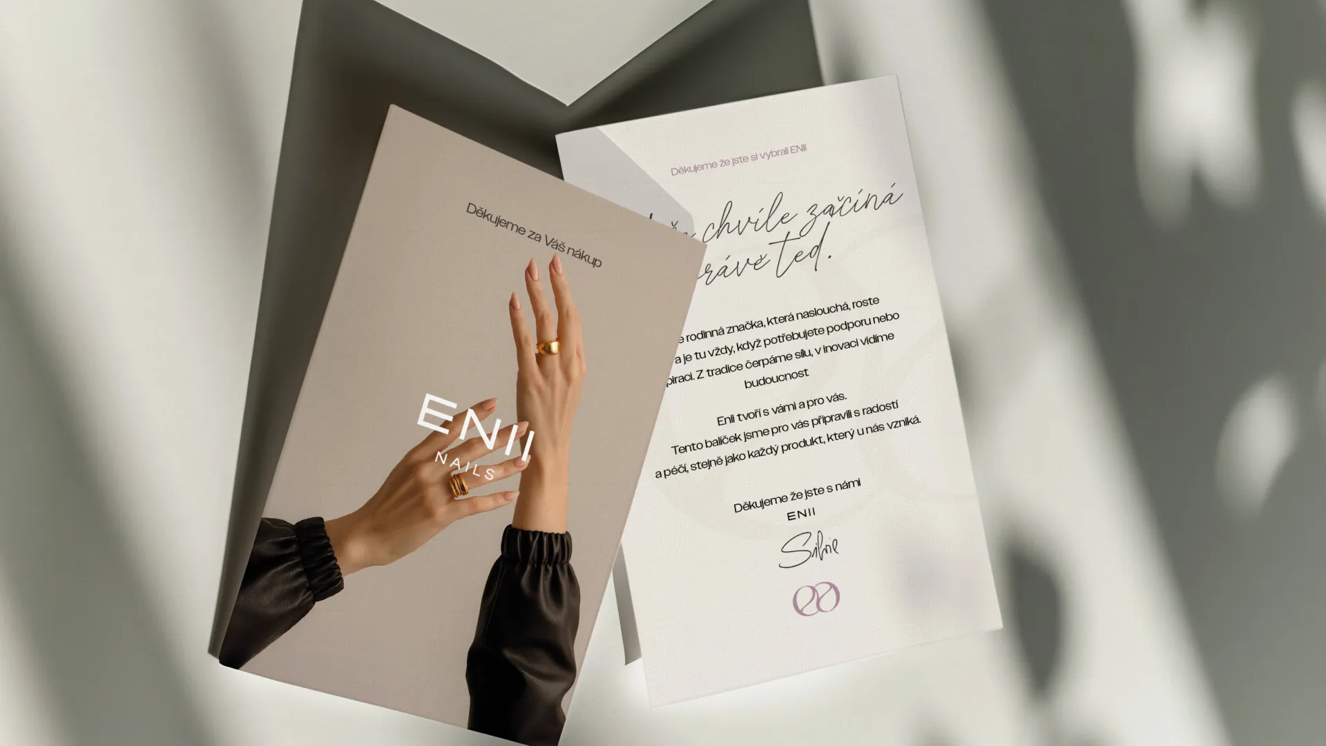
Cards: Each ENII box includes a simple thank-you card and a set of mini postcards featuring the new visuals. They add a small, personal moment to unboxing and give customers something beautiful they can keep, pin, or share beyond the products themselves.
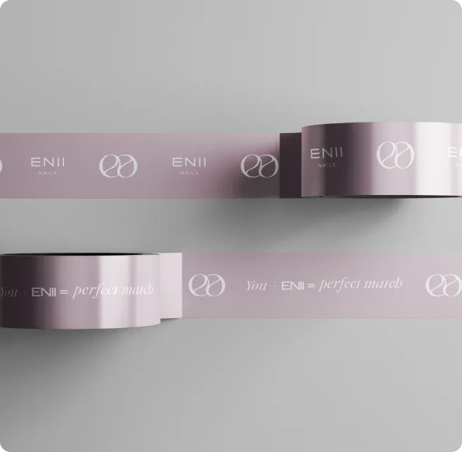
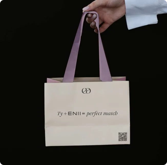
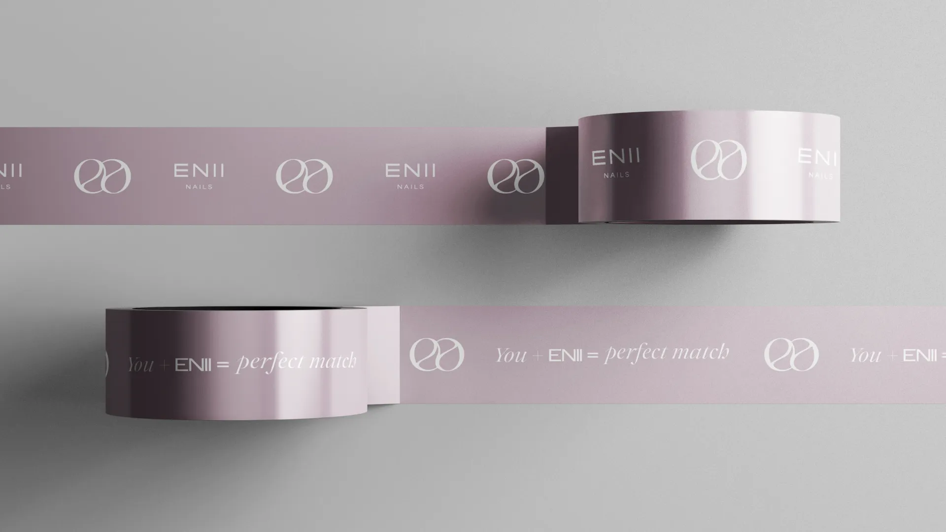
Tape & Bag: Branded blush tape with the ENII logo and “you + ENII = perfect match” turns even a simple cardboard box into a branded gift. Matching shopping bags extend the same message offline - soft colours, double-“E” mark, and a playful line that makes every purchase feel a little more special.
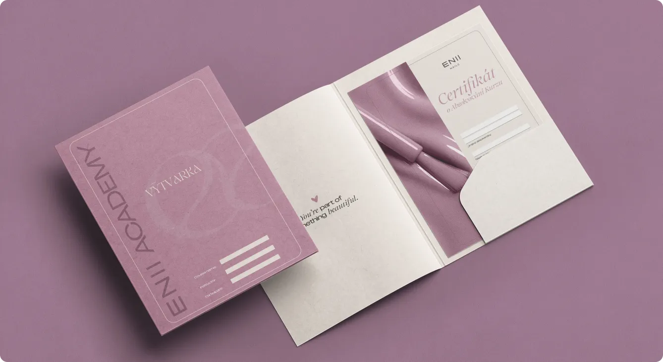
Academy Folder & Certificate: For ENII Academy, we created a soft, structured folder with matching certificates that feel collectible, not bureaucratic. The blush tones, monogram pattern, and gentle typography turn course completion into a proud, display-worthy moment for every new nail professional.
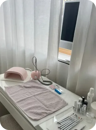
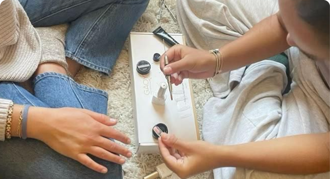
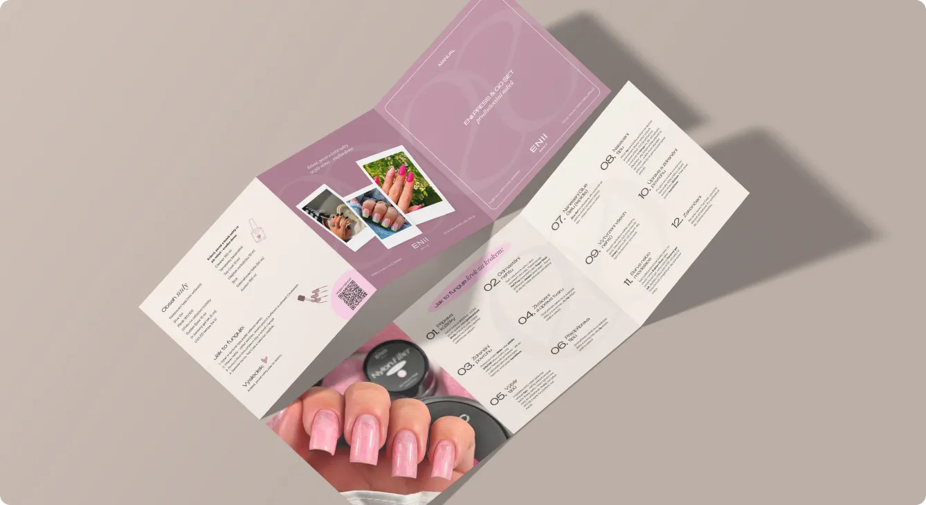
Application Manual: We designed a step-by-step trifold manual that walks customers through the product ritual in a clear, friendly way - combining how-to diagrams, photography, and simple icons. The calm layouts and soft brand colours make even technical instructions feel approachable, elevating the whole at-home salon experience.

Step 4:
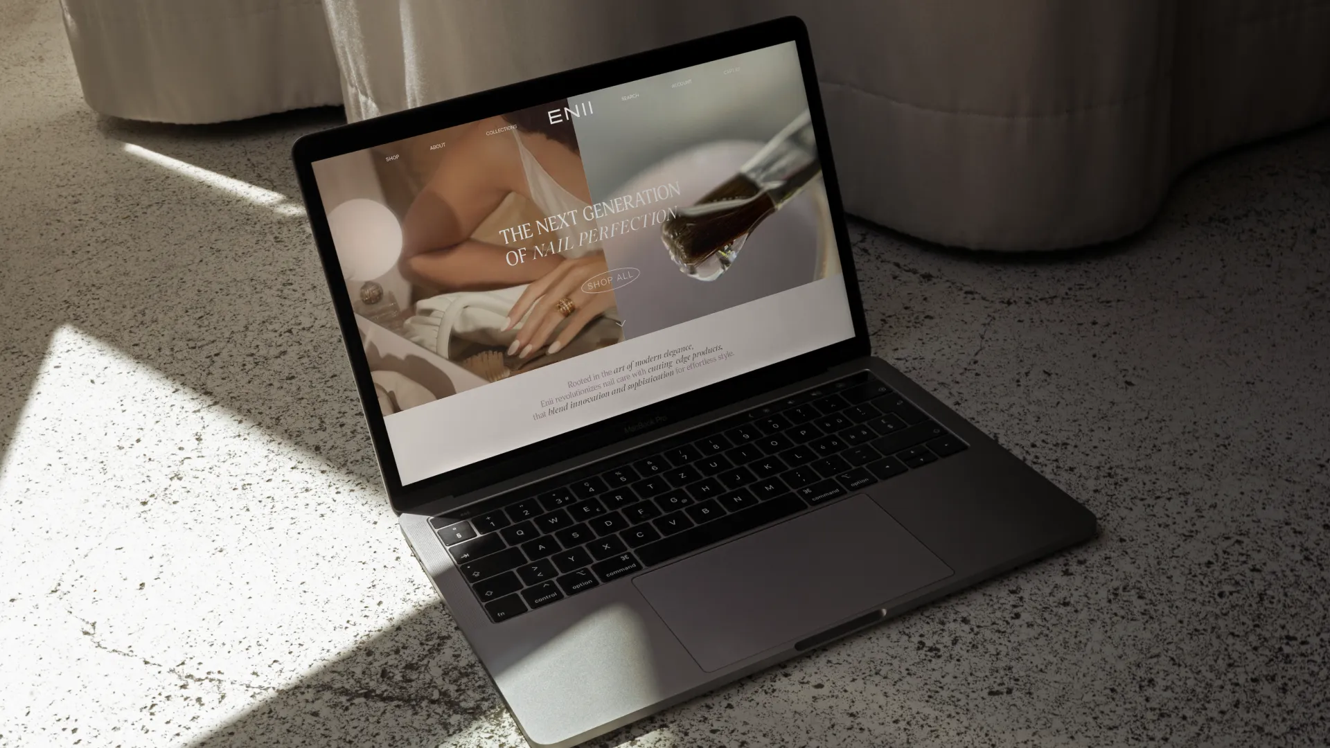
The ENII digital glow
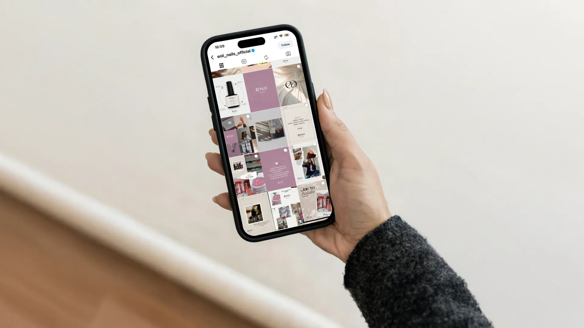
We extended the new ENII world into every screen: an aligned Instagram feed with reusable post and story templates, campaign banners, and a clean ENII Pro Club website concept. Together, they make the brand feel just as calm, modern, and professional online as it does on the bottle or in the salon.
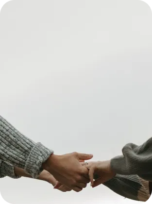
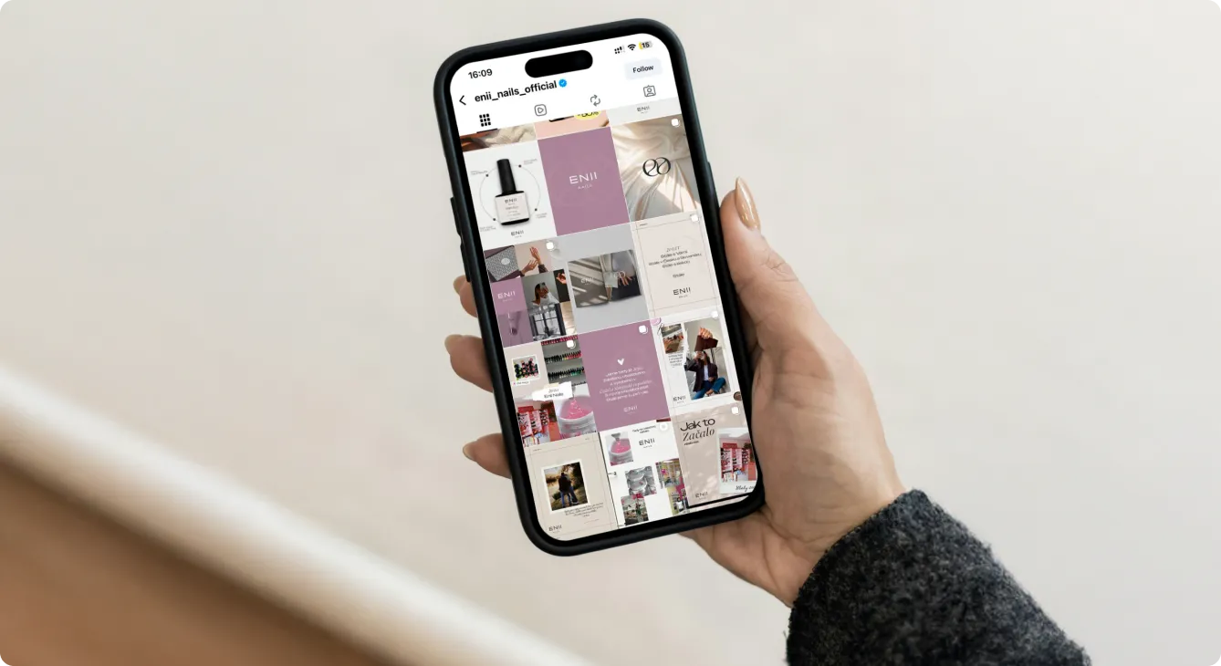
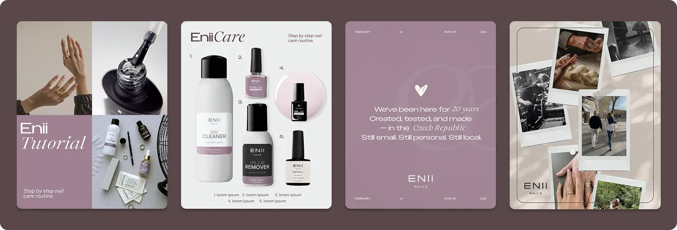
Instagram feed & templates
A calm, cohesive grid where product shots, hands, and quotes work together as one visual system. Reusable templates make it easy to mix education, launches, and community content while staying instantly recognisable in the scroll.
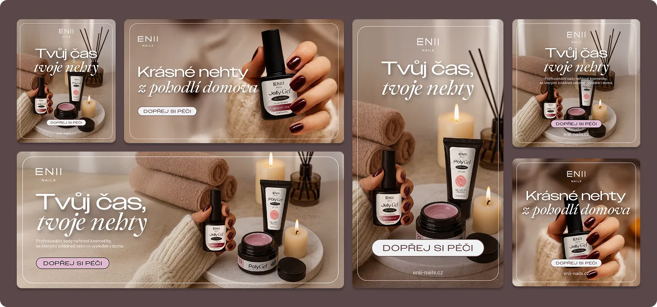
Winter campaign visuals
Time to run ads. We created a full set of seasonal banners and formats for the winter campaign - warm, at-home spa scenes, rich nail shades, and soft typography inviting her to “take a moment” for herself. The layouts were built to work across web and social placements, keeping the same cozy, premium look wherever the campaign appeared.
Step 5:
The ENII Pro club world
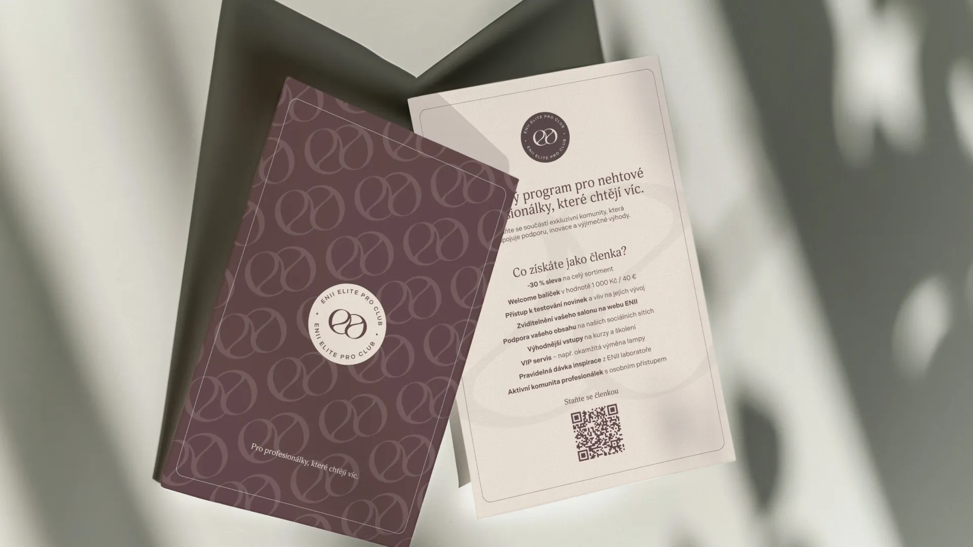
The next step of our journey together was designing a dedicated identity for ENII's inner circle of nail professionals. The Pro Club visuals sit on top of the core ENII system - same aesthetic, but with an extra layer of exclusivity that feels more like a membership than a marketing programme.
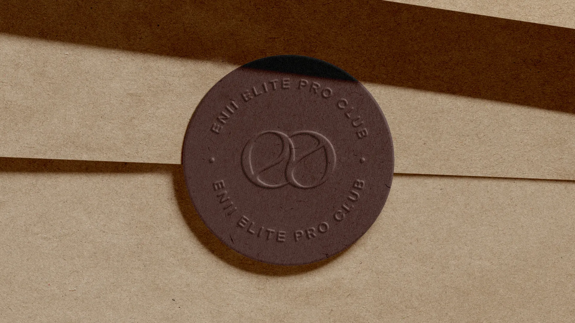
Logo
The Pro Club logo is designed as a seal of excellence: the double-“E” monogram placed inside a circular badge with “ENII Elite Pro Club” running around it. The round form works like a stamp on boxes, certificates, and the website - instantly signalling verified quality, professional know-how, and belonging to an expert community.
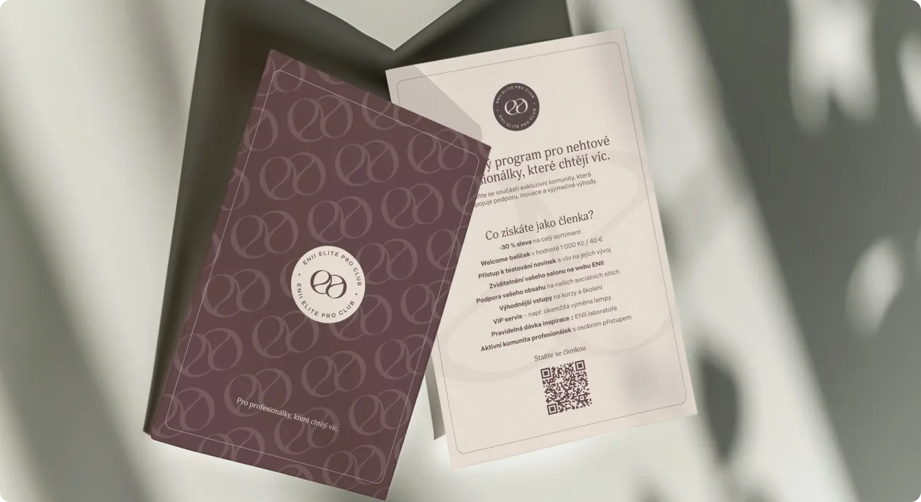
Flyer
A dedicated flyer introduces the professional loyalty program in a clear, elegant layout - benefits on one side, soft visuals and monogram pattern on the other. A prominent QR code and concise copy make it easy for nail techs to scan, learn more, and join straight from the salon table.
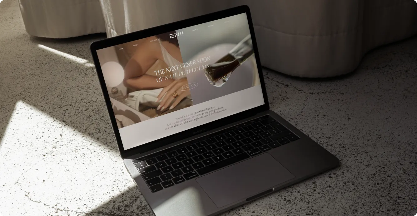
Website
We designed a Pro Club landing page that feels like a natural extension of the brand - soft tones, close-up hand photography, and the familiar monogram leading the way. Clear sections explain benefits, tiers, and how to join, while intuitive CTAs make sign-up easy on both desktop and mobile.


Visible impact: When a beauty brand finally looks like one
Stronger shelf & salon presence:
Unified packaging, a confident new monogram, and a consistent visual language made ENII instantly more recognisable - and more premium-looking next to competitors.
Closer connection with pros & fans:
Every parcel, every course, every touchpoint now feels considered. The kind of brand experience that makes both nail techs and home users think: this is for me.
Clear story across channels:
From Instagram to campaigns to the Pro Club microsite - one visual language, one tone. Wherever someone discovers ENII, it feels like the same brand.
Empowered team:
Templates, patterns, a flexible asset system. The internal team can now launch new content without reinventing the look each time. Less chaos, more consistency.
Ready for what's next:
A clear, ownable visual world means every future launch builds on what's already there - not from scratch.


Ready to turn your brand into the hell-yes choice?
Join 100+ brand leaders who stopped waiting for “someday” - and built brands people obsess about today.
Ready to turn your brand into the hell-yes choice?
Join 100+ brand leaders who stopped waiting for “someday” - and built brands people obsess about today.
Year: 2024-2025
Creative direction: Katerina Horka, Sabina Samuel
Designers: Polina Petryshyna, Tereza Kopečná, Přemysl Herka, Viktoriia Safonenko
Studio HEELS MAKE DEALS
Smart brand moves, straight to your inbox.

Smart brand moves, straight to your inbox.