LOGO DESIGN | BRAND IDENTITY | PACKAGING DESIGN | PRINT DESIGN
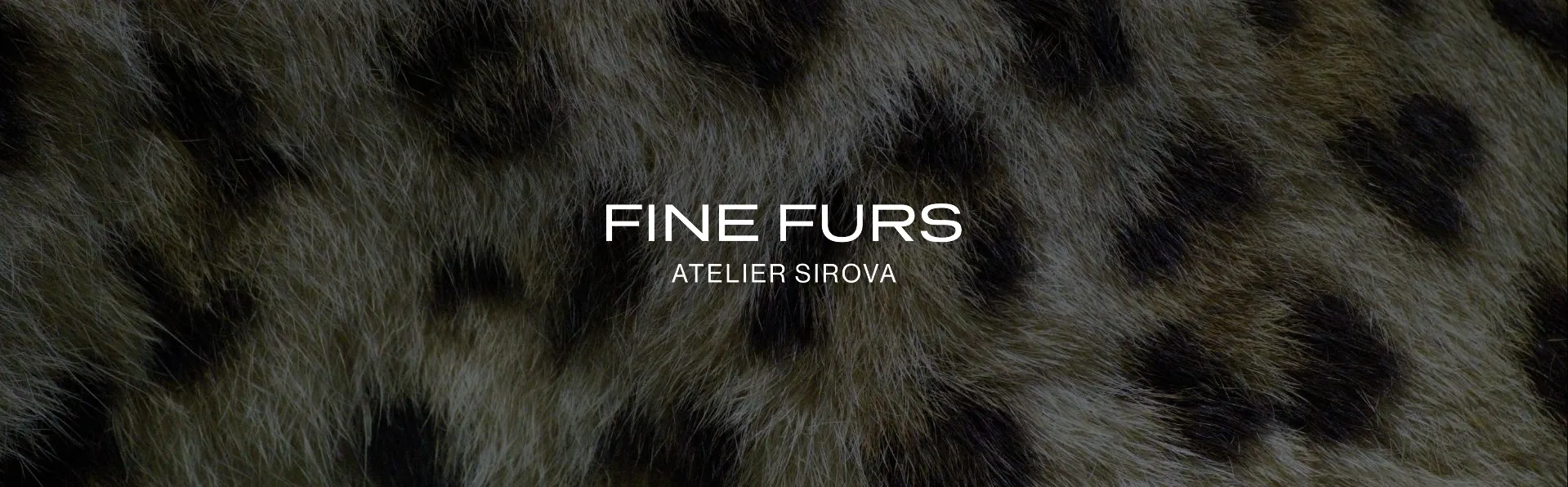
FINE FURS - ATELIER SIROVA: How a premium leather and shearling brand evolved into a modern atelier
Brand strategy, visual identity, and packaging for a premium leather and shearling atelier.
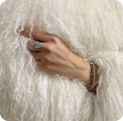
Fine Furs has been dressing women in exceptional leather and shearling since 2015. Not mass produced. Not trend-driven. Small series, premium natural materials, and a founder who will spend hours with you - on a call, over WhatsApp, in the showroom - making sure the piece is exactly right. Over ten years, that approach built something real: a loyal following, 31K fans, and customers who come back not just for the coat, but for the experience of buying it. The kind of brand where the person behind it is as much the product as the piece itself.
The Challenge
Fine Furs was ready for the next chapter - stronger positioning, international ambitions, and a brand architecture built to grow. Part of that meant bringing the founder, Alexandra Sirova, into the brand more visibly. Her name became part of the identity: FINE FURS - ATELIER SIROVA. More personal, more protectable, and more honest about what the brand has always been - one person's standard for how this should be done.
Step 1:
Defining What Fine Furs Stands For
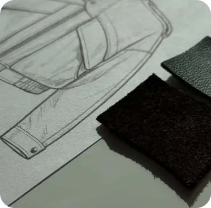
Before designing the identity, we first had to define the strategic core of the brand. That meant clarifying what Fine Furs truly stands for, what makes it different, and what position it should own as it evolves into FINE FURS - ATELIER SIROVA.
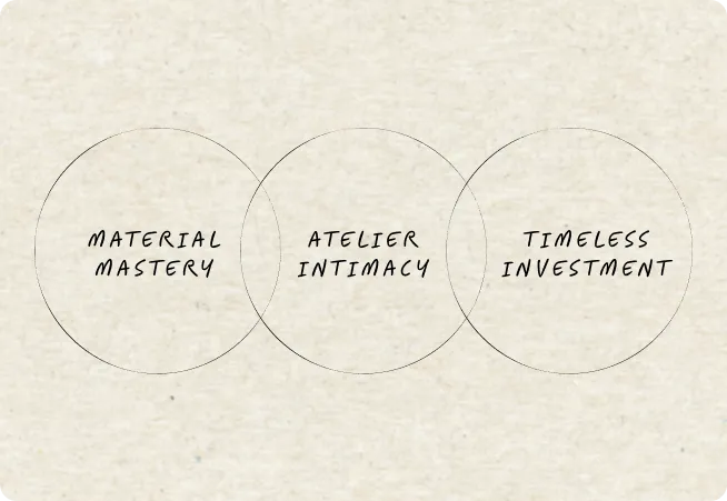
Fine Furs Brand DNA
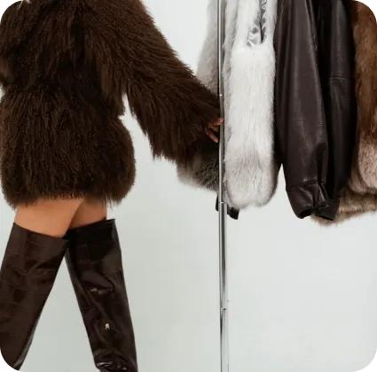
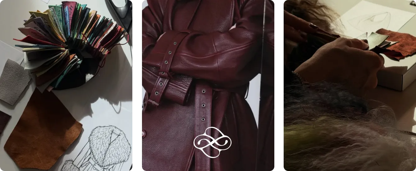
MATERIAL MASTERY:
Fine Furs begins with exceptional natural materials - premium leather and shearling that define the look, feel, and longevity of every piece. Luxury starts with the material itself.
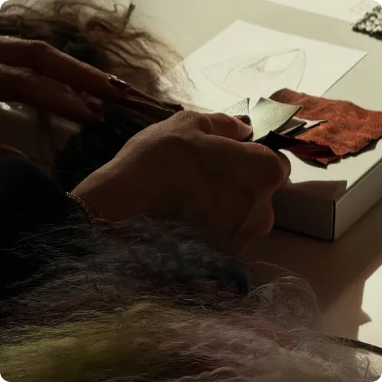
ATELIER INTIMACY:
Fine Furs works like a modern atelier, where personal guidance, fit, and attention to detail are part of every purchase. Each piece is chosen with the customer in mind.
TIMELESS INVESTMENT:
Fine Furs is built around timeless pieces designed to be worn for years, not just a season. The value lies in long-term wear, quality, and lasting style.
Differentiation: Where Fine Furs Stands Apart
Most brands in this space make a choice: fashion image or quiet luxury. Fine Furs doesn't. It combines material authority with personal atelier-level care - and does it at a price point that international luxury houses simply don't offer. That's the space worth owning.
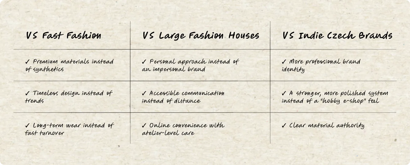
Our sweet spot: premium quality rooted in traditional atelier craftsmanship, combined with a modern customer experience and the kind of personal approach larger brands simply cannot offer.
Positioning: A New-Generation Atelier
Fine Furs sits in a space most competitors miss entirely. Too personal and material-focused for fashion image brands. Too warm and accessible for cold quiet luxury. And a different league entirely from the smaller local labels that sell similar products without the brand system to back them up. A new-generation luxury atelier: refined, timeless outerwear, backed by real guidance and a founder who puts her name on every piece.
Three pillars anchor the whole system: Material Mastery, Atelier Intimacy, and Timeless Investment. Together they define what every Fine Furs customer actually receives - uncompromising quality, personal attention, and a piece made to stay with her for years.
Step 2:
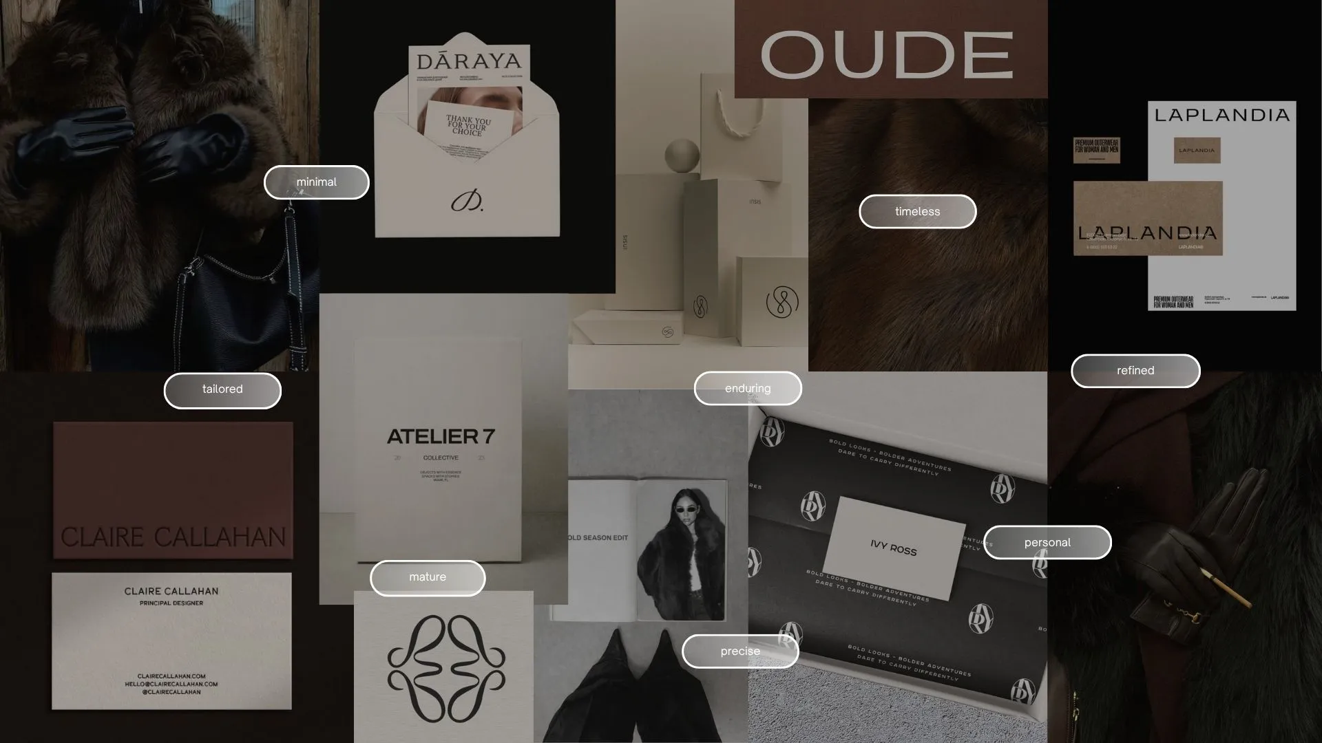
Translating Strategy into Identity
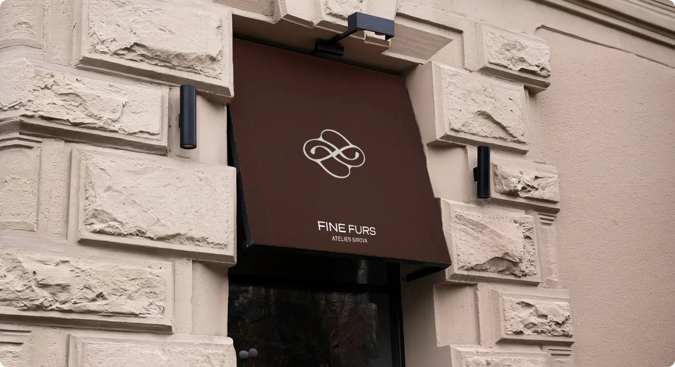
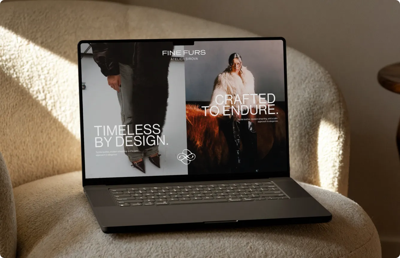
With the strategy in place, the next step was turning Fine Furs into a visual system that feels as refined as the brand itself. Every element - logo, symbol, color palette, typography, signature layouts - had one job: to express modern luxury, material quality, and quiet confidence, consistently, across every touchpoint.
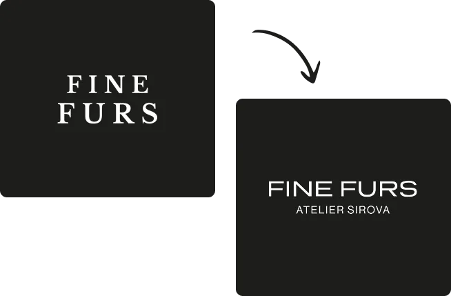
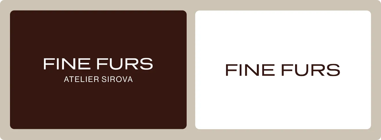
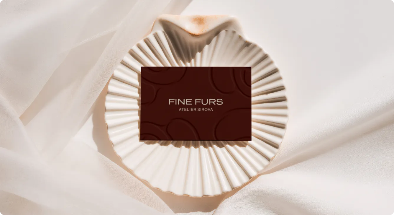
Logotype
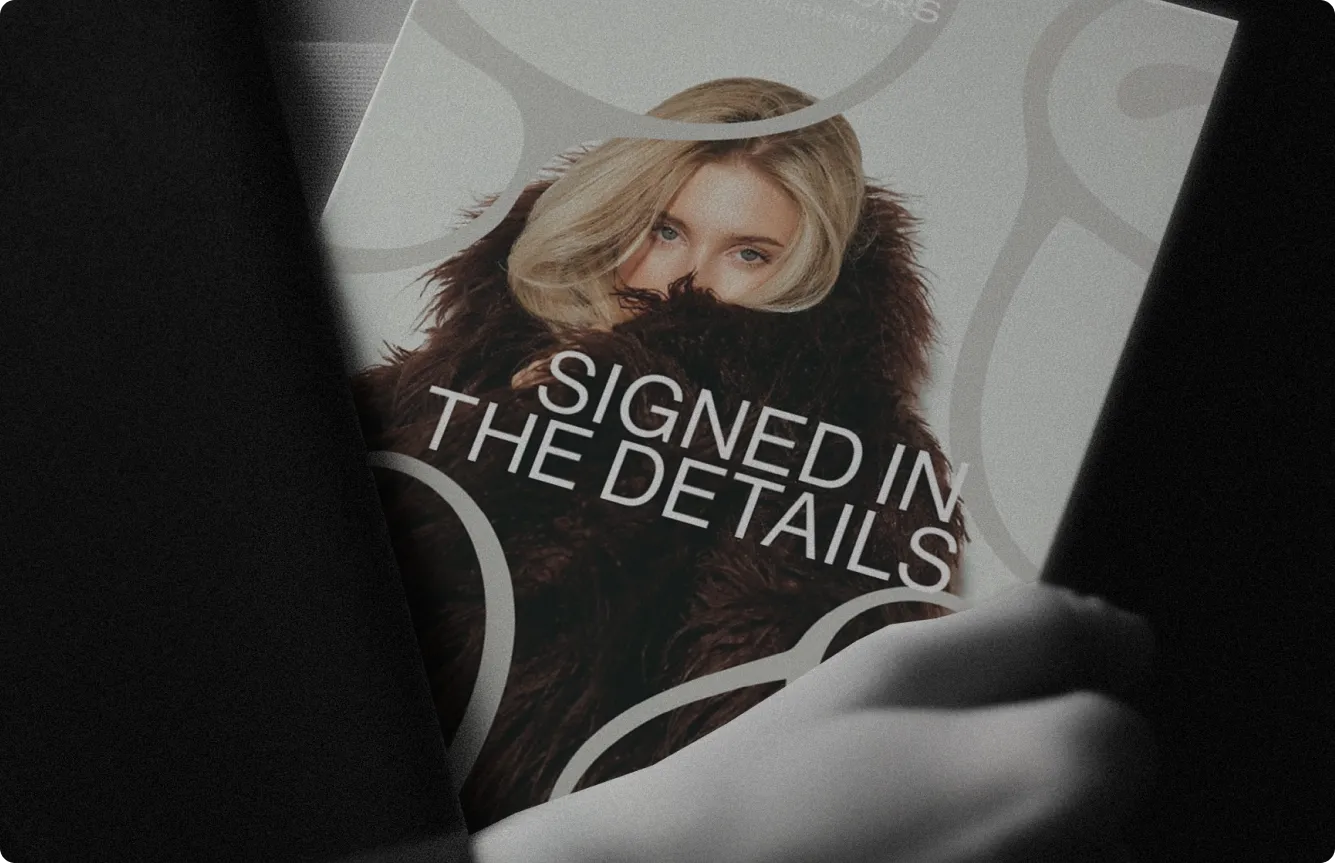
The new wordmark takes Fine Furs in a cleaner, more minimal direction - moving away from decorative detail toward something more timeless and precise. ATELIER SIROVA sits below, completing an architecture that's both ownable and personal. The result is a mark that shifted Fine Furs from a product label into something that reads immediately as a modern luxury atelier.
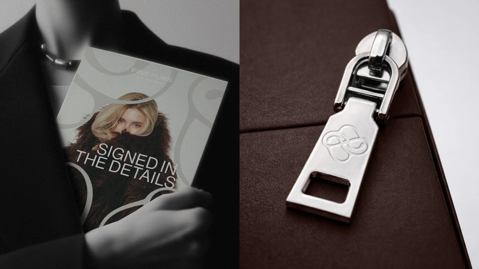
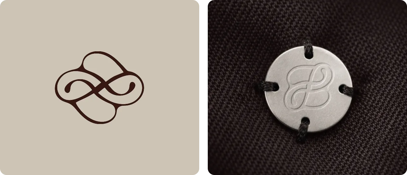
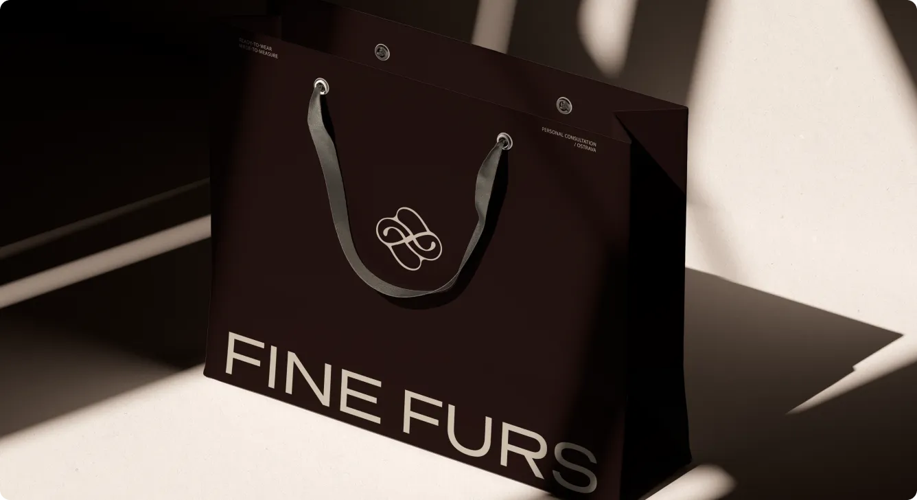
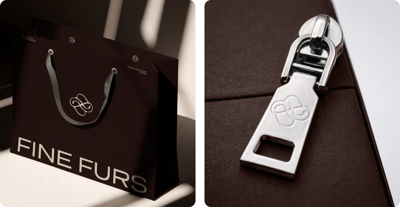
Logo Symbol
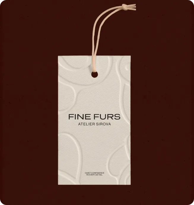
A calligraphic FS monogram, designed to work as a quiet seal. Precise, but with a handmade quality that references craft and personal authorship. It lives on interior labels, metal zipper pulls, embossed hang tags - the small moments where a brand either earns its premium or gives it away.
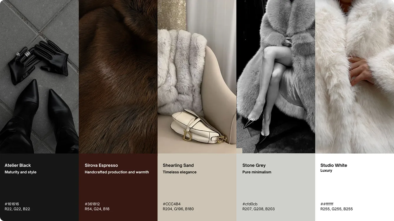
Color Palette
The signature shade is what we named Sirova Espresso - a deep, warm brown that references leather and shearling directly. Mature, distinctive, and largely absent from how other brands in this space present themselves. The rest of the palette builds around it: softer neutrals and near-whites that give the brand room to breathe, anchored by a near-black that holds everything together.
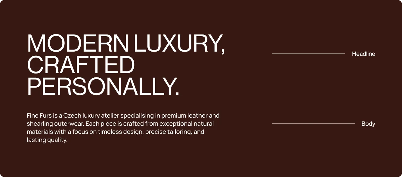
Typography
A bold, clean sans-serif for headlines paired with a lighter weight for body copy. Wide, structured, and confident enough to hold its own against strong photography - refined without disappearing into the background.
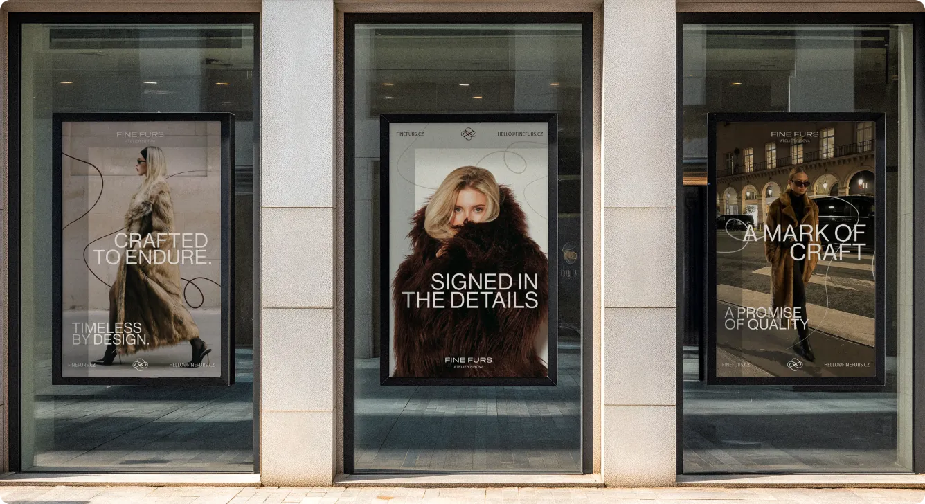
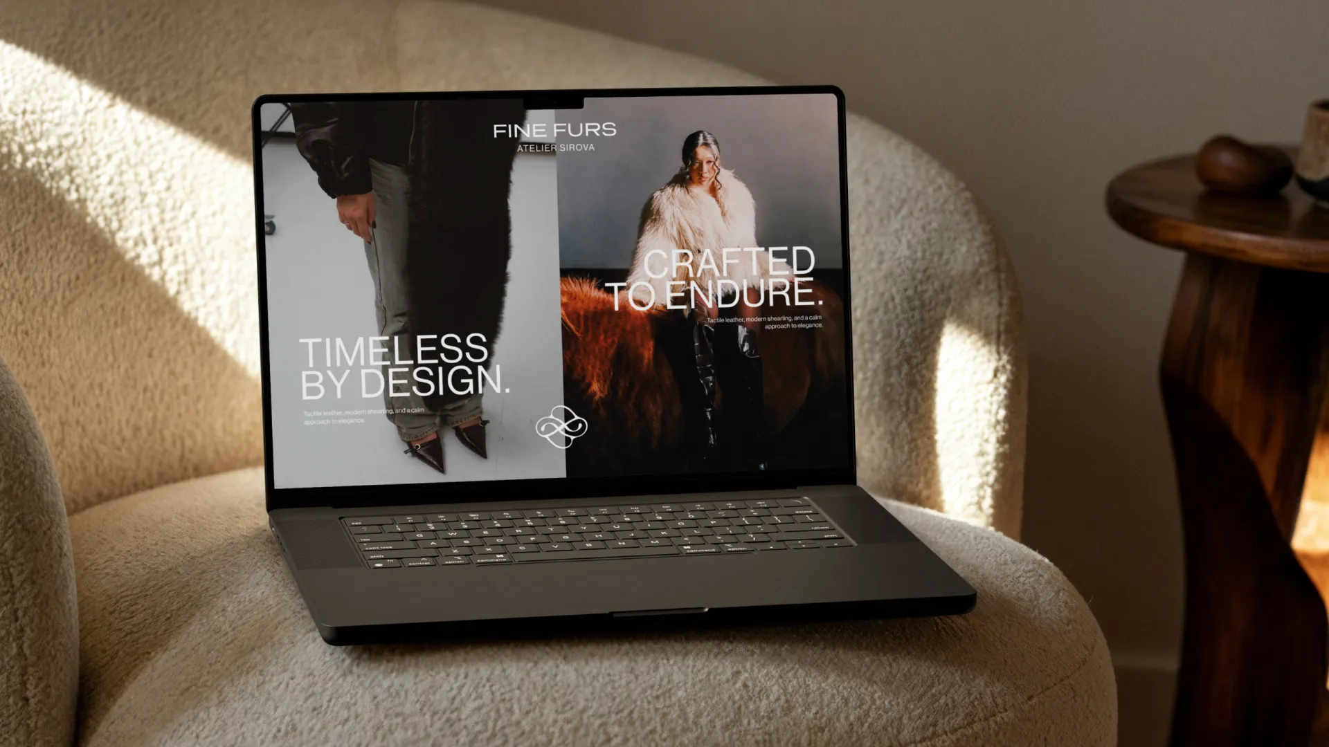
Signature Layouts
The signature layouts are built around soft rounded lines that bring a subtle sense of movement and humanity into the system. They reference the feeling of hand stitching and craftsmanship, adding a gentle tactile layer to otherwise clean, minimal compositions. This detail helps the identity feel more personal and atelier-led, while keeping the overall look refined and modern.
Step 3:
Building the Fine Furs Brand Experience
With the visual system defined, the next step was applying it across every touchpoint - turning the identity into something tangible and lived-in. Each application was designed to make Fine Furs feel like one cohesive modern luxury atelier at every moment of contact.
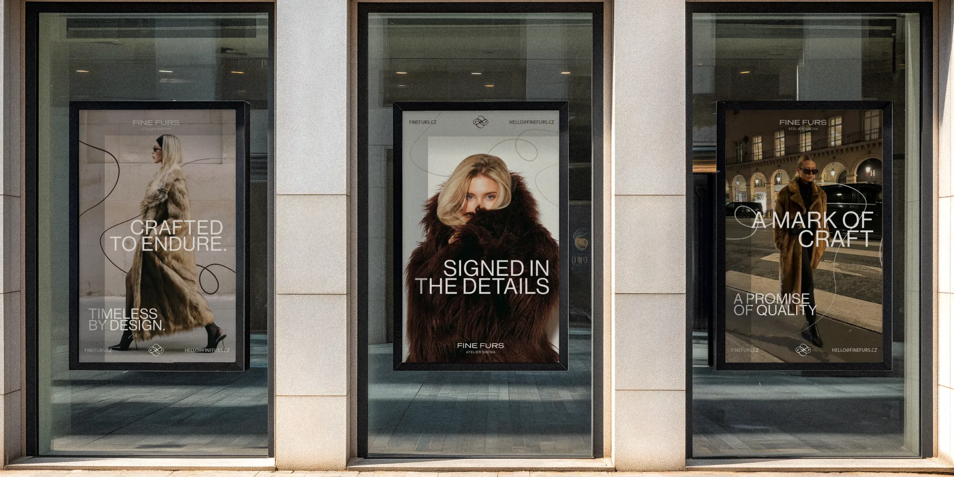
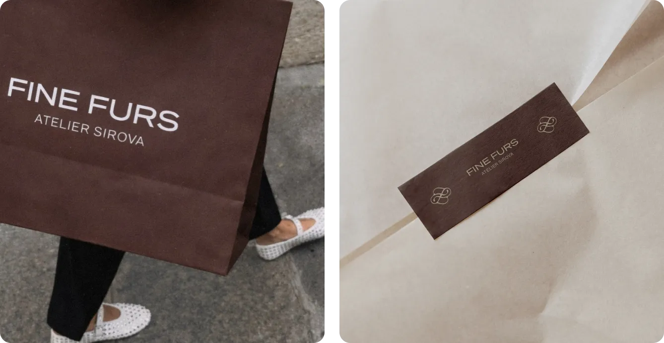
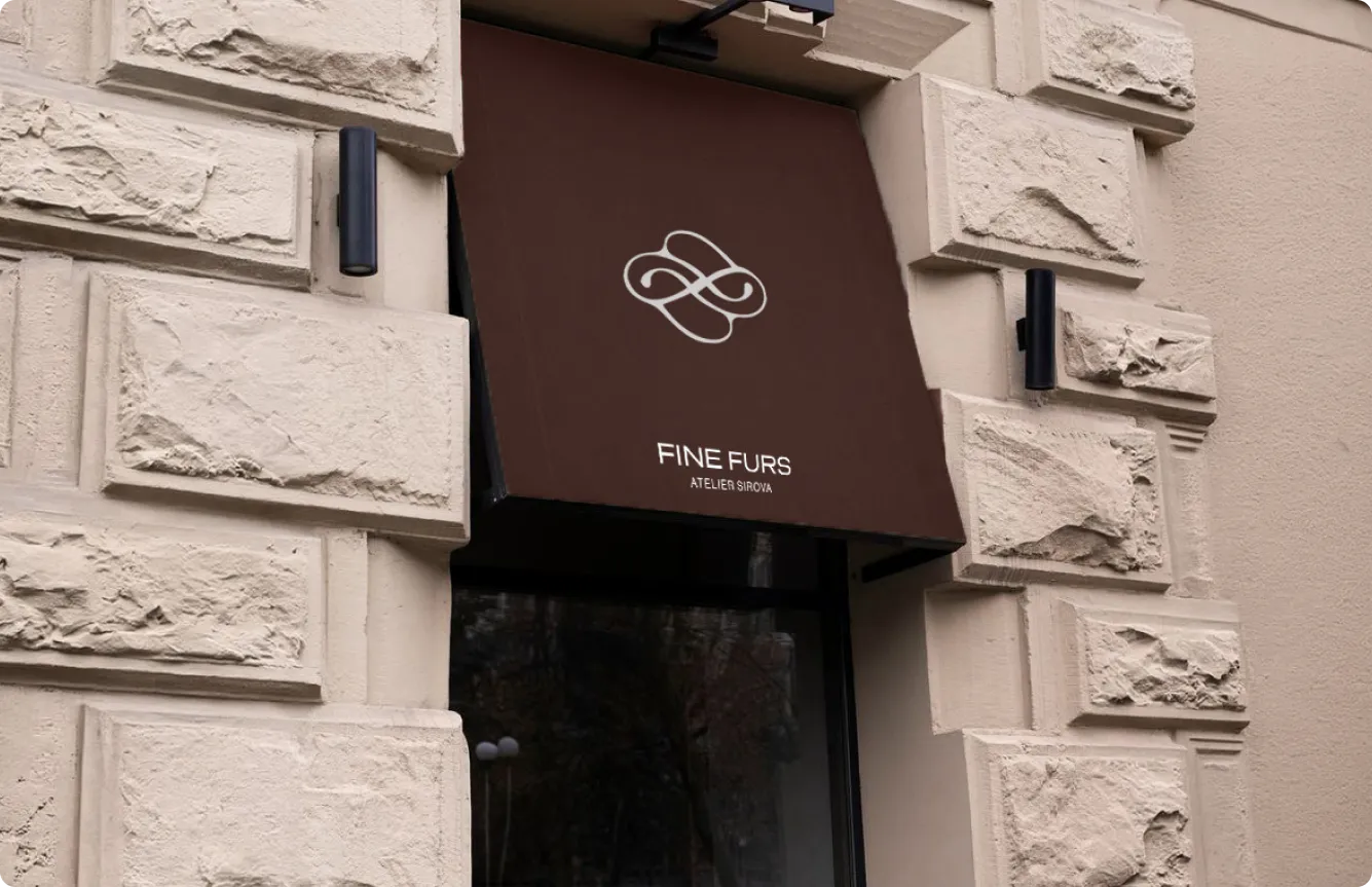
Bag Design: A Fine Furs bag carried through the city is a brand moment. Clean, minimal, and confident enough to be recognised.
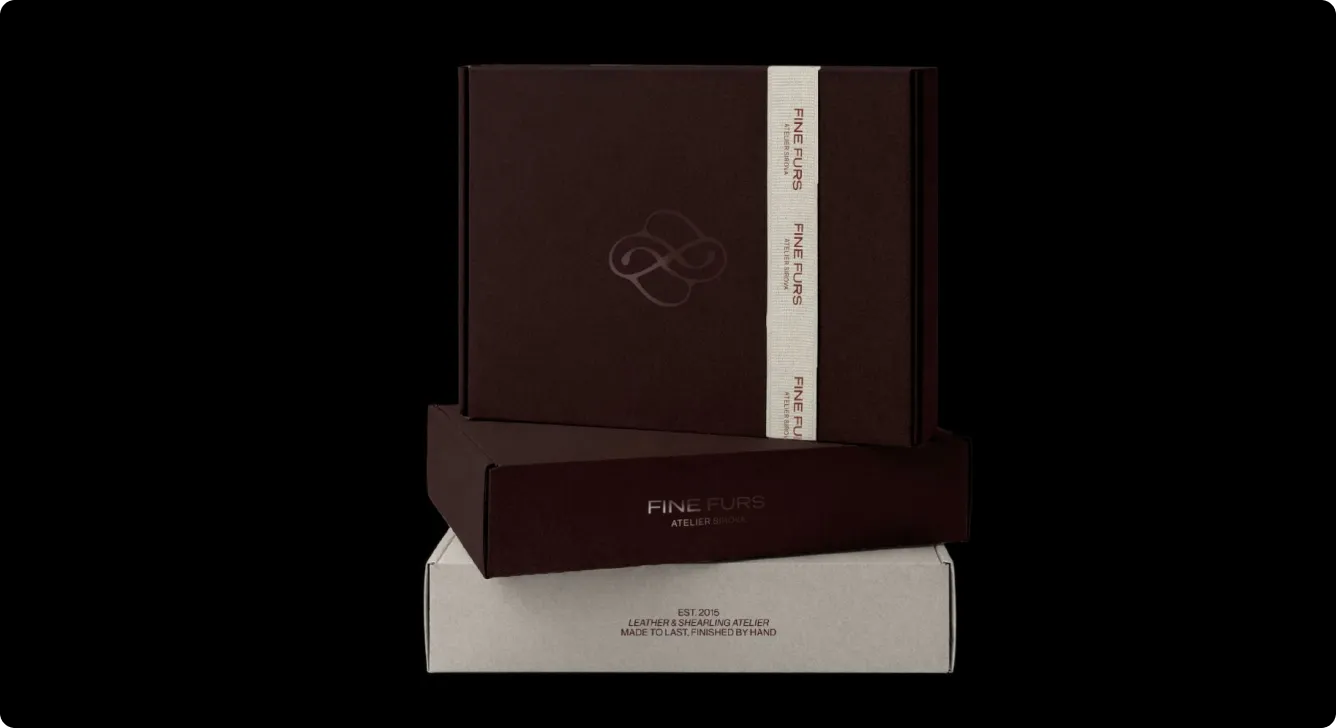
Box Design: The first physical touchpoint for most online customers. Calm and restrained on the outside, it sets the tone before anything is unwrapped - turning a delivery into the beginning of the atelier experience.
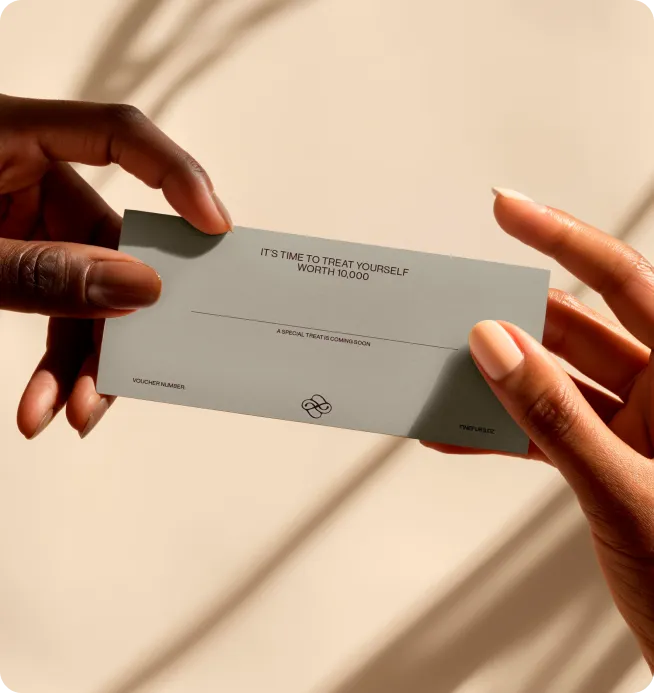
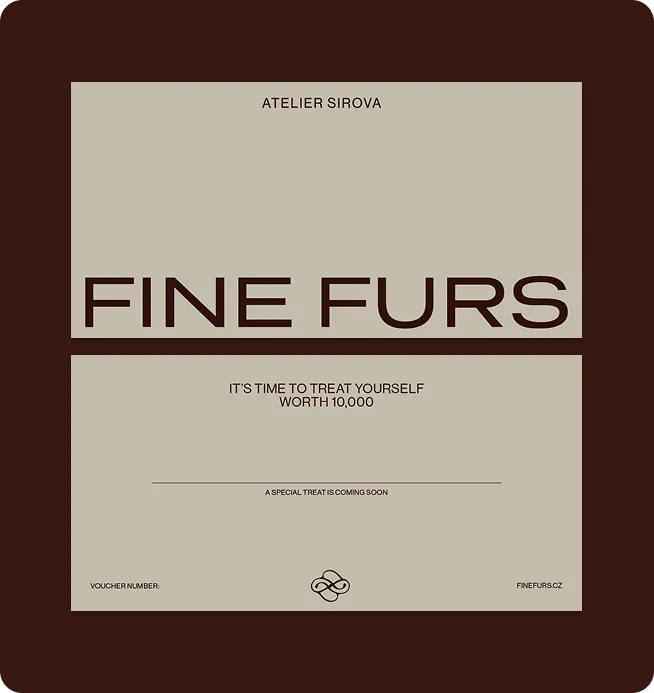
Gift Card Design: Designed for the customer who wants to share the Fine Furs experience. Refined enough to feel like a gift in itself - not an afterthought tucked into an envelope.
Thank You Card Design: A small detail that does something specific: it makes the customer feel like she bought from a person, not a brand. That's the Fine Furs relationship, made tangible.
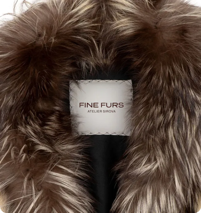
Labels Design: We designed both an exterior hang tag and an interior sewn-in label. One shapes the first impression, the other becomes the atelier’s quiet signature inside the garment.
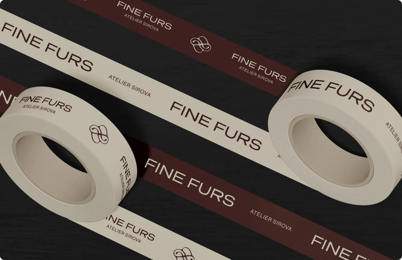
Tape Design: The identity reaches the customer before the box does. For a brand built on personal care, even the seal on a parcel is a signal - this was packed with intention.
The Result
Fine Furs launched the new identity and the response was immediate. The brand that had always delivered an exceptional experience now looks like it too - on every surface, at every touchpoint, from the first Instagram scroll to the label sewn inside the coat.
Alexandra now has a brand that carries her name with the confidence it deserves. A system that can scale, attract international customers, and hold together across every new collection and every new market she enters. What was always a premium product now reads as a premium brand - and that changes what's possible.


Ready to turn your brand into the hell-yes choice?
Join 100+ brand leaders who stopped waiting for “someday” - and built brands people obsess about today.
Ready to turn your brand into the hell-yes choice?
Join 100+ brand leaders who stopped waiting for “someday” - and built brands people obsess about today.
Year: 2025
Creative direction: Katerina Horka, Sabina Samuel
Designers: Polina Petryshyna, Přemysl Herka, Viktoriia Safonenko
Studio HEELS MAKE DEALS
Smart brand moves, straight to your inbox.

Smart brand moves, straight to your inbox.