BRAND IDENTITY | HOSPITALITY | FOOD&BEVERAGE | PACKAGING DESIGN | PRINT DESIGN | WEBDESIGN
Designing Terra’s Brand to Become America’s Go-To Spot for Fresh Meals
From NYC across the USA
Terra is a modern quick-service restaurant redefining fresh, healthy, and convenient meals. After the success of its first location in Chelsea, NYC, Terra is setting its sights on becoming a nationwide chain, poised to innovate the dining experience across the United States.
A vision calling for a standout brand
With bold ambition comes the need for an exceptional brand—so Terra partnered with Heels Make Deals studio to bring their vision to life. Here's how we made it happen. 👇
🔘 Create a brand identity that embodies freshness, trust, and innovation.
🔘 Develop a distinct color palette and a compact, iconic logo.
🔘 Position Terra as the synonym for fresh, standing out from competitors.
🔘 Target urban professionals seeking nutritious, quick, and reliable meals.
🔘 Build trust and support Terra's nationwide expansion
Step 1:
Defining the Brand DNA
1
Emphasizing freshness and quality
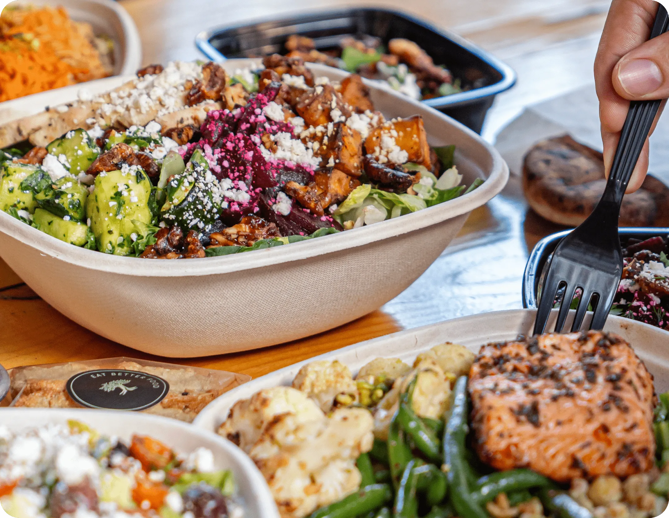
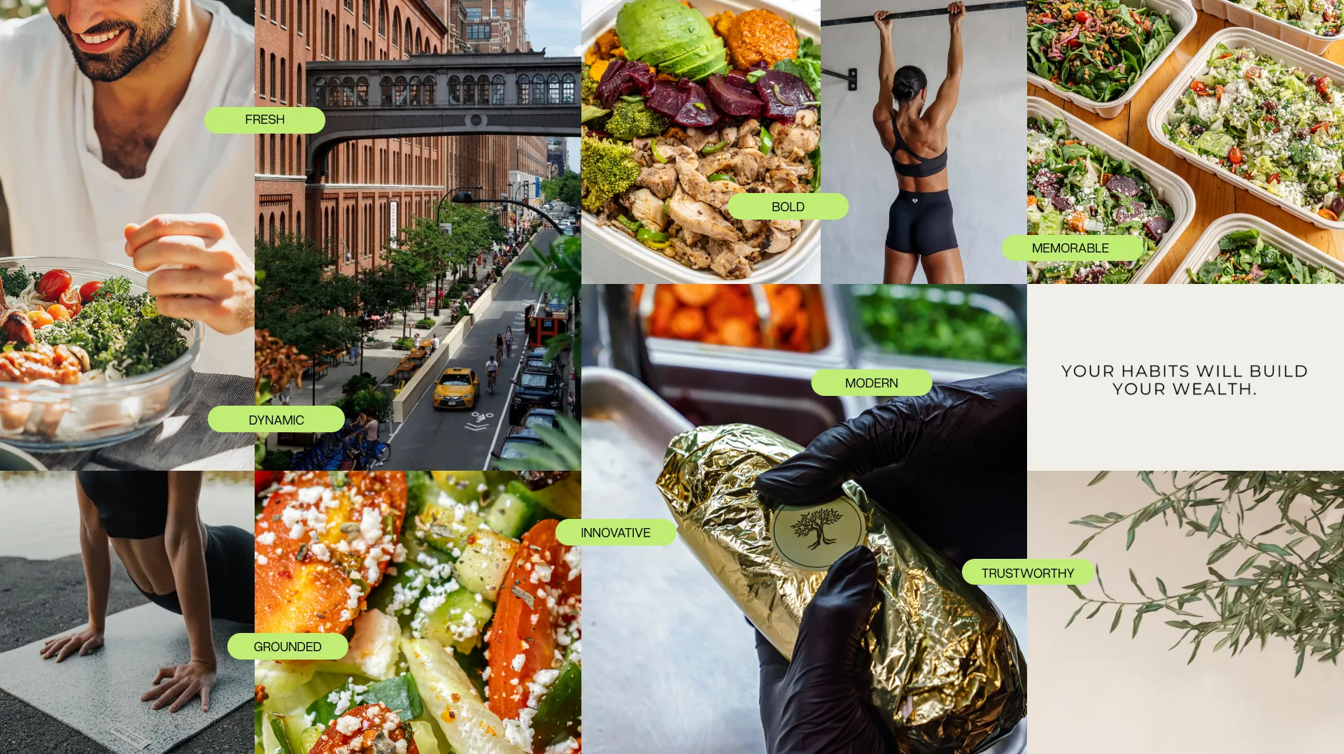
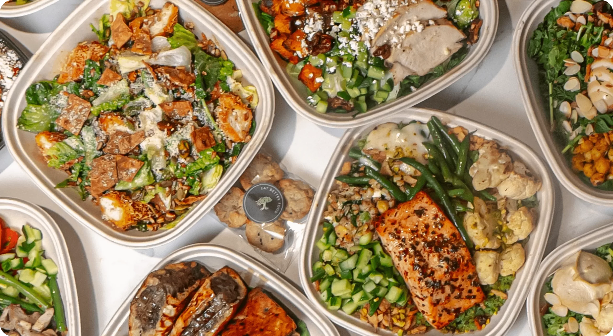
The visual identity of Terra should communicate freshness and high-quality ingredients from the first sight. It works with vibrant, natural colors and high-resolution images of fresh, colorful dishes which visually reinforce Terra's commitment to nutritious, wholesome meals and enhance the brand's overall appeal.

2
The value of feeling grounded
Customers seek reliability and stability in their daily lives, along with shared values of health and sustainability. Terra’s visual identity should evoke a sense of trust and consistency. By reflecting these values in the brand design, we create a dependable and reassuring experience that aligns with the customer's desire for a grounded, healthy lifestyle.
3
Guaranteeing seamless convenience
Terra is a chain, and the brand should embody the essence of ease and simplicity. It should give people across the states the assurance that they can come, receive seamless service, and leave with a nutritionally packed meal. The visual identity needs to reflect this by creating a sense of effortless efficiency.
4
Innovating the dining experience
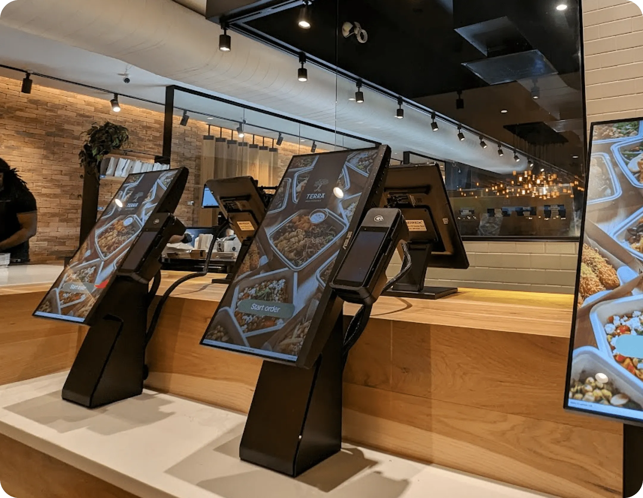
Terra aims to revolutionize dining, integrating cutting-edge technology to ensure a seamless ordering process. The branding should highlight innovation, reflecting a modern, tech-forward approach to dining. Terra is committed to clean energy and diverse dietary options. This vision positions Terra as a leader in premium fast-casual dining, combining efficiency with sustainability.
4
Innovating the dining experience
Terra aims to revolutionize dining, integrating cutting-edge technology to ensure a seamless ordering process. The branding should highlight innovation, reflecting a modern, tech-forward approach to dining. Terra is committed to clean energy and diverse dietary options. This vision positions Terra as a leader in premium fast-casual dining, combining efficiency with sustainability.
Step 2:
Building a bold, versatile brand
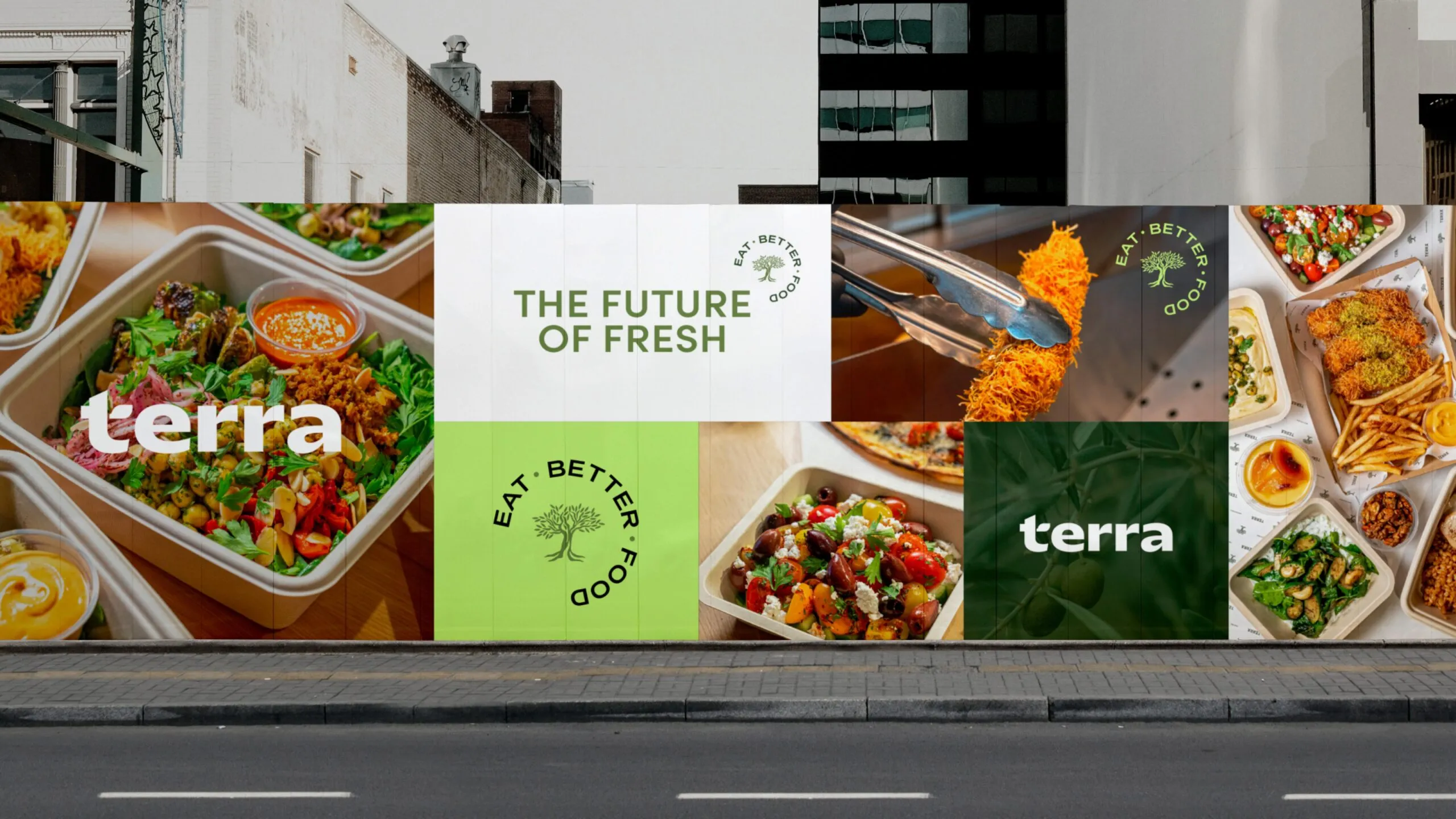
A Logo Built to Stand Out
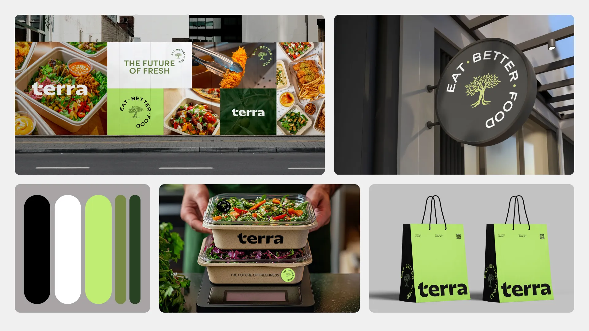
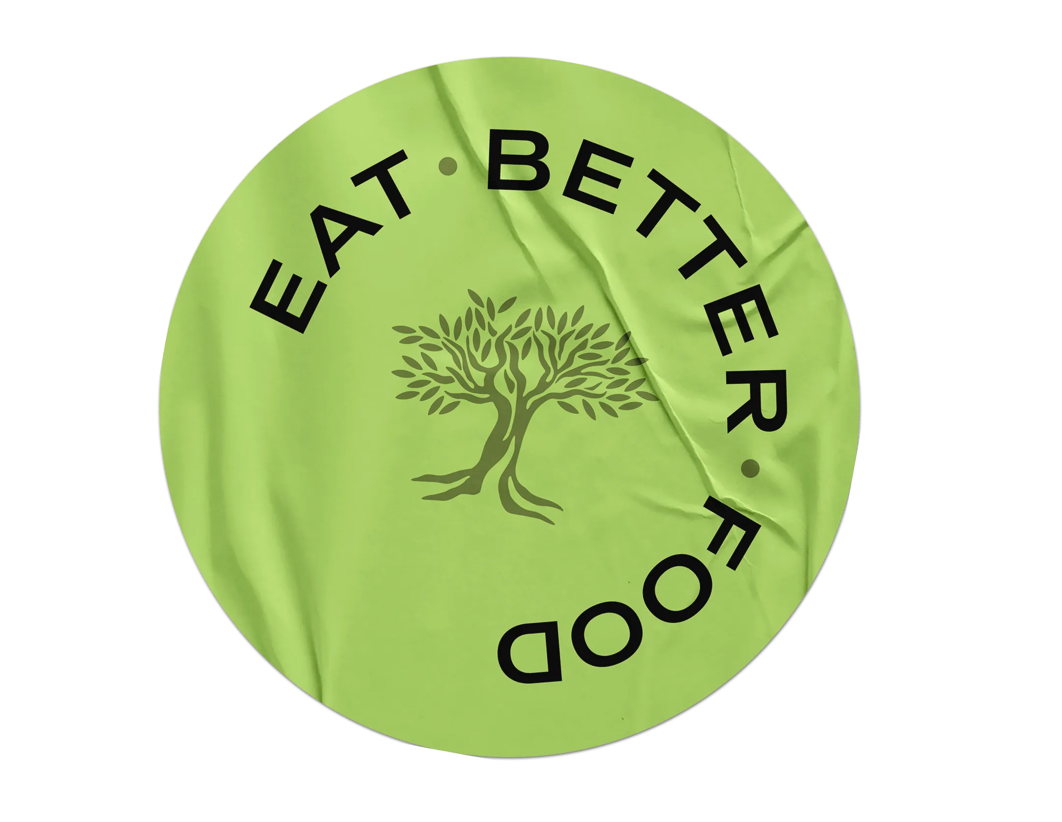
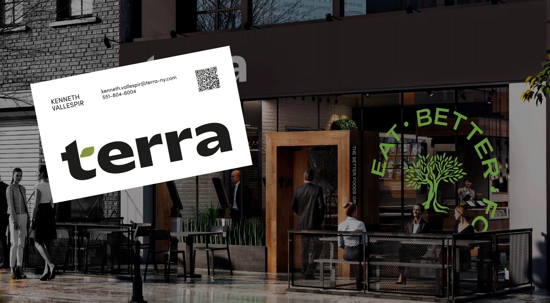
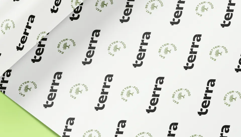
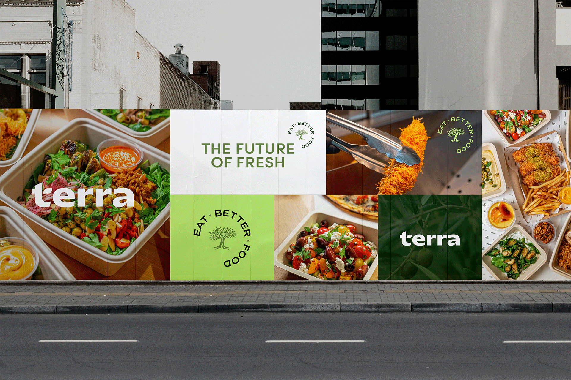
We crafted a logo system designed to be fresh, flexible, and instantly recognizable. With a bold logotype, a signature emblem featuring the “Eat Better Food” tagline, and a versatile secondary mark, every version reinforces Terra’s promise of quality and trust. Whether on packaging, digital platforms, or in-store, the logo guarantees a consistent, standout brand presence wherever customers see it.
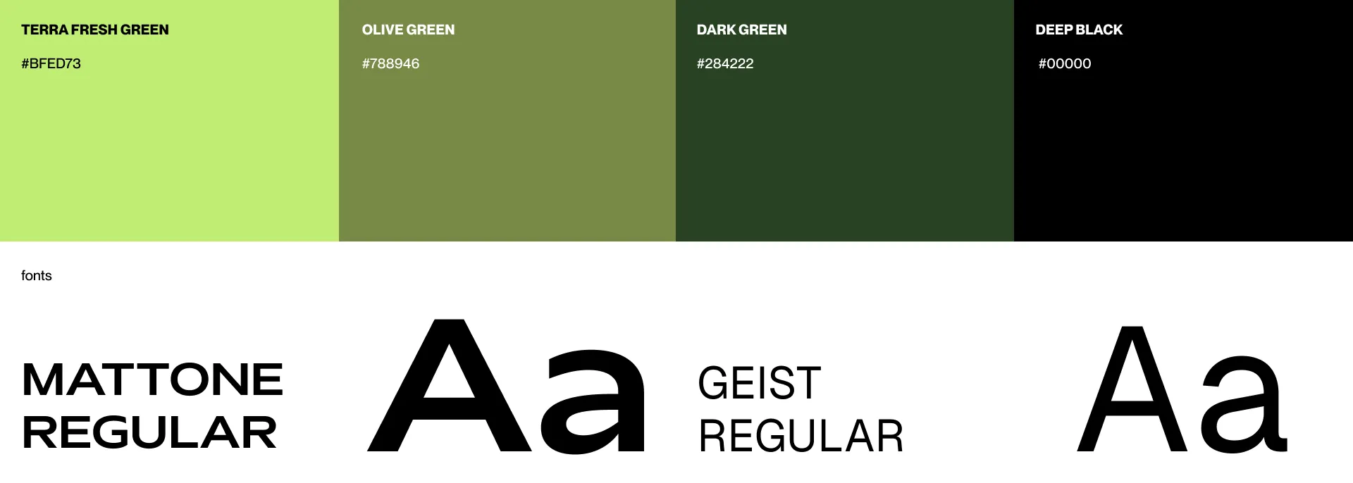
A Color That Owns Fresh
We chose “Terra Fresh Green” as the brand’s signature shade—a bold, vibrant color that connects directly with the idea of fresh. This strategic choice ensures Terra stands out from competitors and stays unforgettable in the minds of customers. Simple, powerful, and 100% Terra.
A Logo Built to Stand Out
We crafted a logo system designed to be fresh, flexible, and instantly recognizable. With a bold logotype, a signature emblem featuring the “Eat Better Food” tagline, and a versatile secondary mark, every version reinforces Terra’s promise of quality and trust. Whether on packaging, digital platforms, or in-store, the logo guarantees a consistent, standout brand presence wherever customers see it.
A Color That Owns Fresh
We chose “Terra Fresh Green” as the brand’s signature shade—a bold, vibrant color that connects directly with the idea of fresh. This strategic choice ensures Terra stands out from competitors and stays unforgettable in the minds of customers. Simple, powerful, and 100% Terra.

Leaf as a key element
The leaf integrated into the "t" is a signature detail of Terra's identity. Representing growth, freshness, and care, this subtle yet powerful element ties the brand's values to its design. It’s a recognizable symbol across platforms, reinforcing Terra’s promise of nutritious, wholesome meals and a fresh perspective.
Step 3:
Taking Terra Into
the Real World
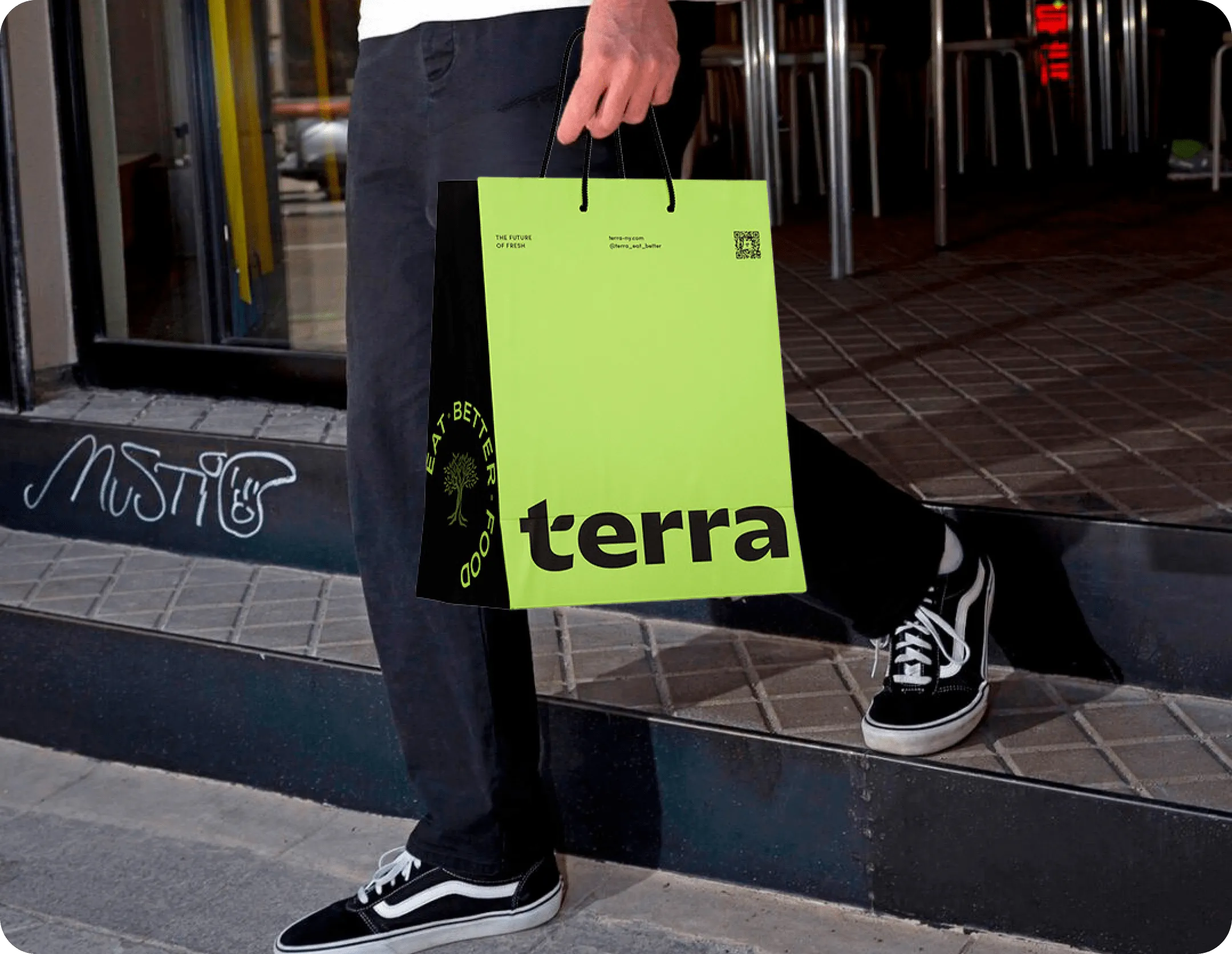
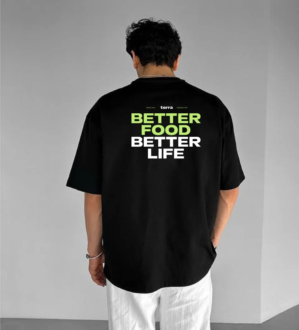
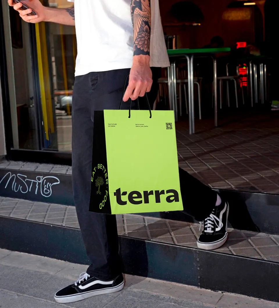
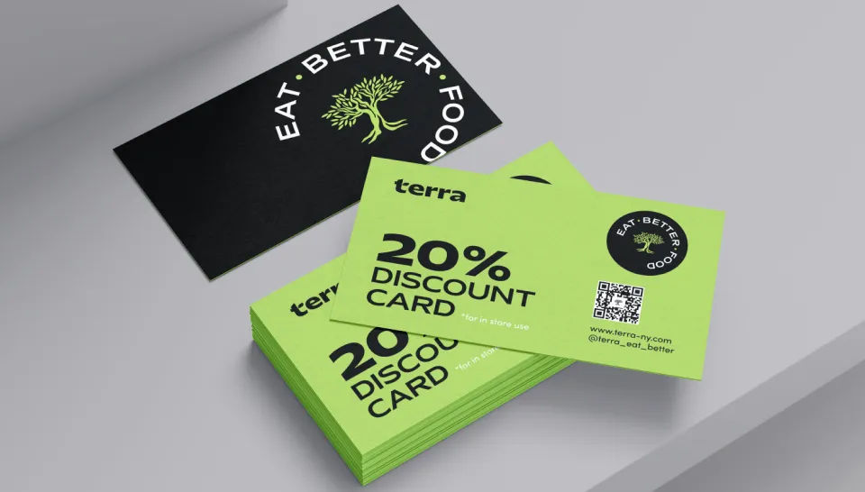
Bringing the Mission to Life
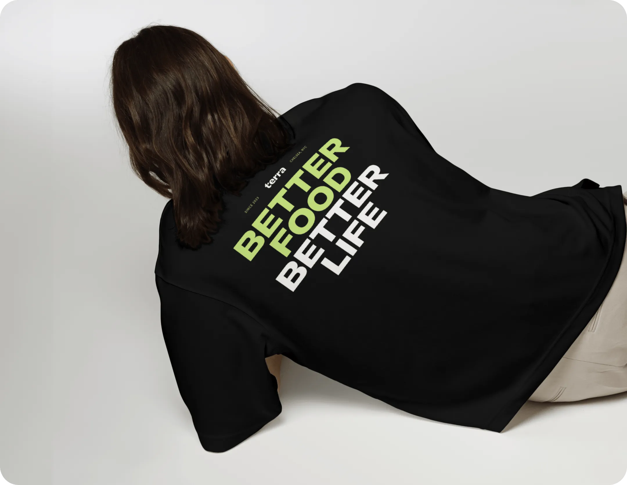
Every piece of Terra’s branding serves a purpose, turning the mission to help America eat better food into a reality. From takeaway bags to stickers and merchandise, each item promotes the brand while enhancing the customer experience. A Terra bag carried through the city becomes a walking ad for freshness, while stickers add a playful, memorable touch. The Chelsea location’s signage and interiors tie it all together, creating a bold and unified presence.
Guaranteeing seamless convenience
Terra is a chain, and the brand should embody the essence of ease and simplicity. It should give people across the states the assurance that they can come, receive seamless service, and leave with a nutritionally packed meal. The visual identity needs to reflect this by creating a sense of effortless efficiency.
Step 4:
A Seamless Digital
Experience
Freshness at Your
Fingertips
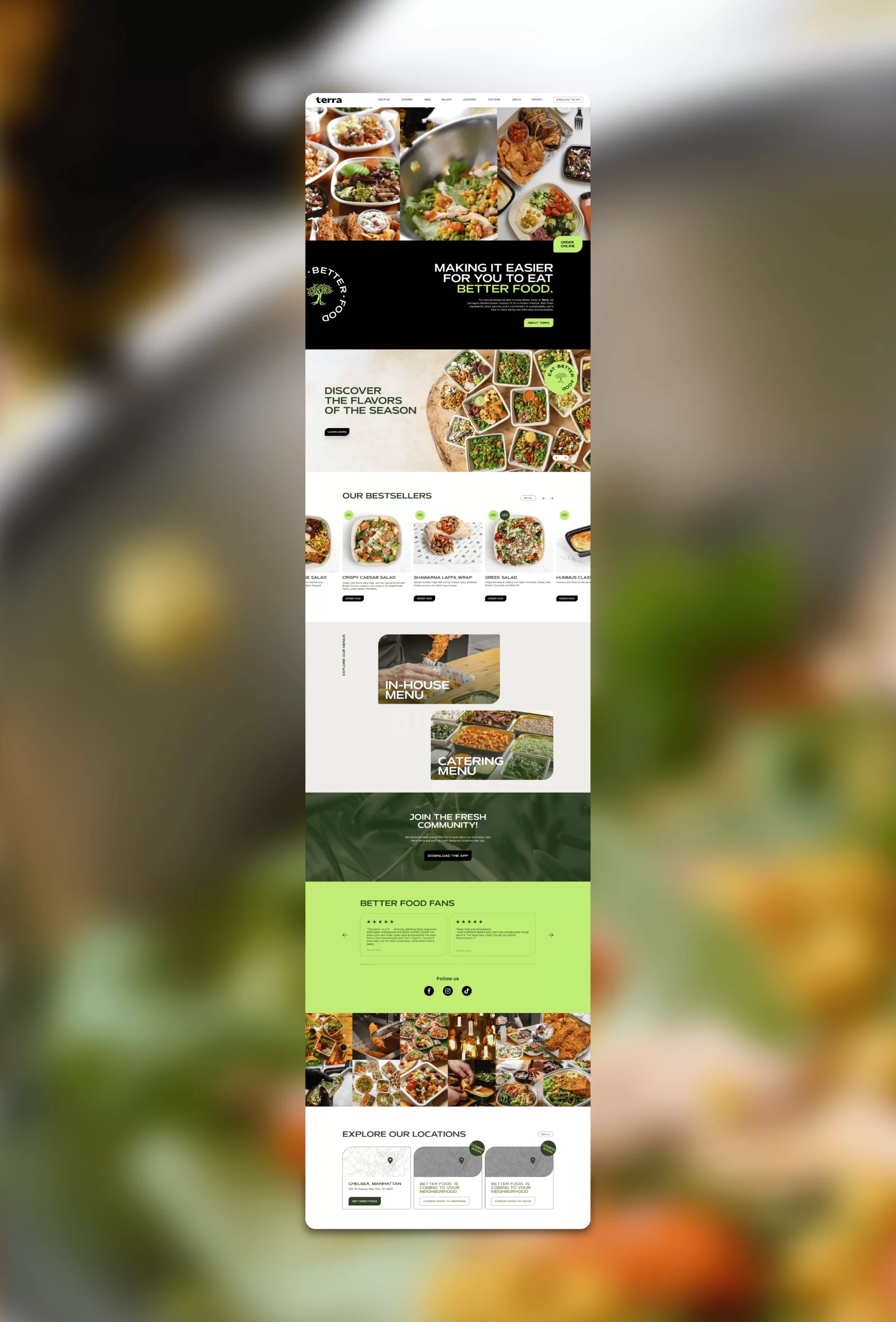
Terra’s website was designed to reflect the brand’s core values of health, freshness, and convenience. Vibrant visuals of colorful, wholesome meals bring the brand to life, while a clean, modern layout ensures effortless navigation. The responsive design caters to on-the-go customers, delivering a seamless experience on any device, from desktop to mobile.
Connecting Every Customer Touchpoint
The website connects in-store and digital experiences with features like an easy-to-browse menu, integrated online ordering, and storytelling that highlights Terra’s commitment to quality and sustainability. It’s more than a tool—it’s a seamless extension of the brand, reinforcing Terra’s promise of fresh, healthy, and innovative dining.
Results and Success
✅ Increased Recognition: A bold new identity made Terra memorable and recognizable in the quick-service market.
✅ Stronger Engagement: A cohesive brand across all touchpoints deepened customer connections.
✅ Scalable Design: A flexible identity system supports seamless expansion to new locations.
✅ Optimized Online Experience: The website drove higher engagement and streamlined ordering.
✅ Reinforced Trust: Consistent visuals and messaging built confidence in Terra’s promise of quality.
✅ Market Differentiation: The distinct brand and “Terra Fresh Green” set Terra apart from competitors.
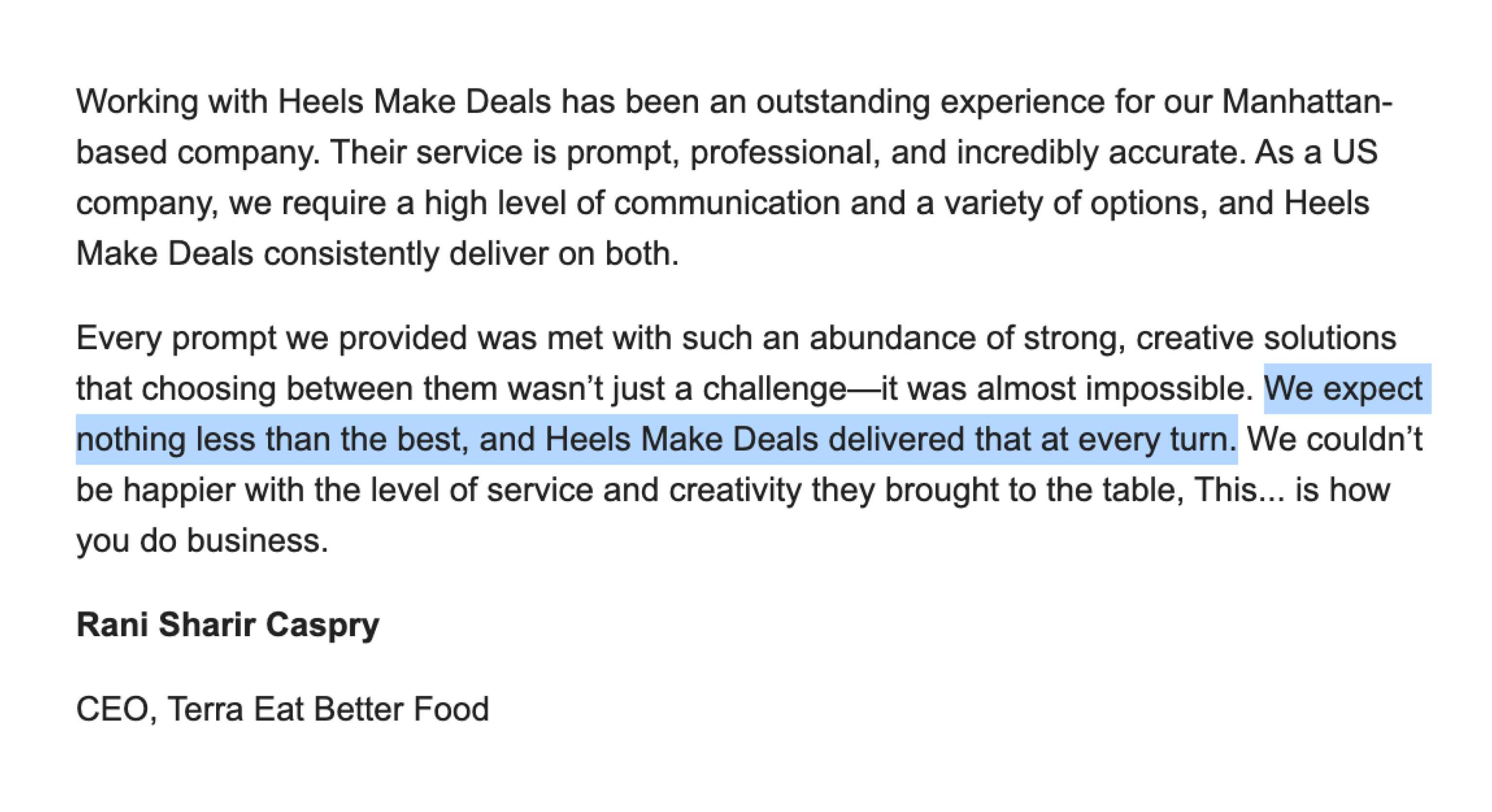
What Terra Thinks About Working With Us
Ready to turn your brand into the hell-yes choice?
Join 100+ brand leaders who stopped waiting for “someday” - and built brands people obsess about today.
Ready to turn your brand into the hell-yes choice?
Join 100+ brand leaders who stopped waiting for “someday” - and built brands people obsess about today.
Year: 2023-2025
Creative direction: Katerina Horka, Sabina Samuel
Designers: Tereza Kopečná, Viktoriia Safonenko, Polina Petryshyna
Studio HEELS MAKE DEALS
Smart brand moves, straight to your inbox.

Smart brand moves, straight to your inbox.