HOSPITALITY | LOGO DESIGN | PACKAGING DESING | PRINT DESIGN | EVENT
Unifying the visual language, signage and wayfinding in the largest food hub in Europe
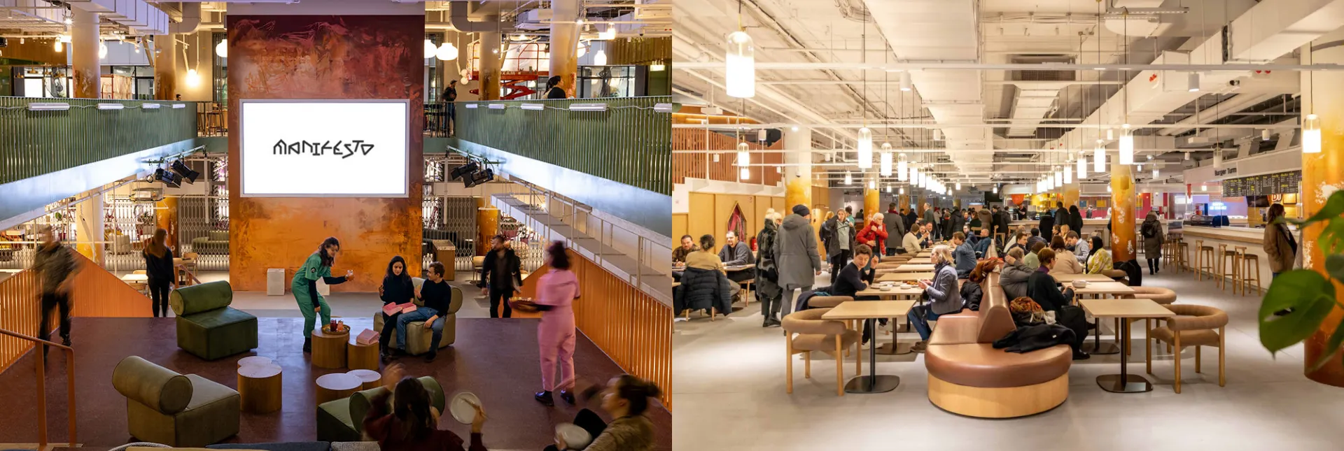
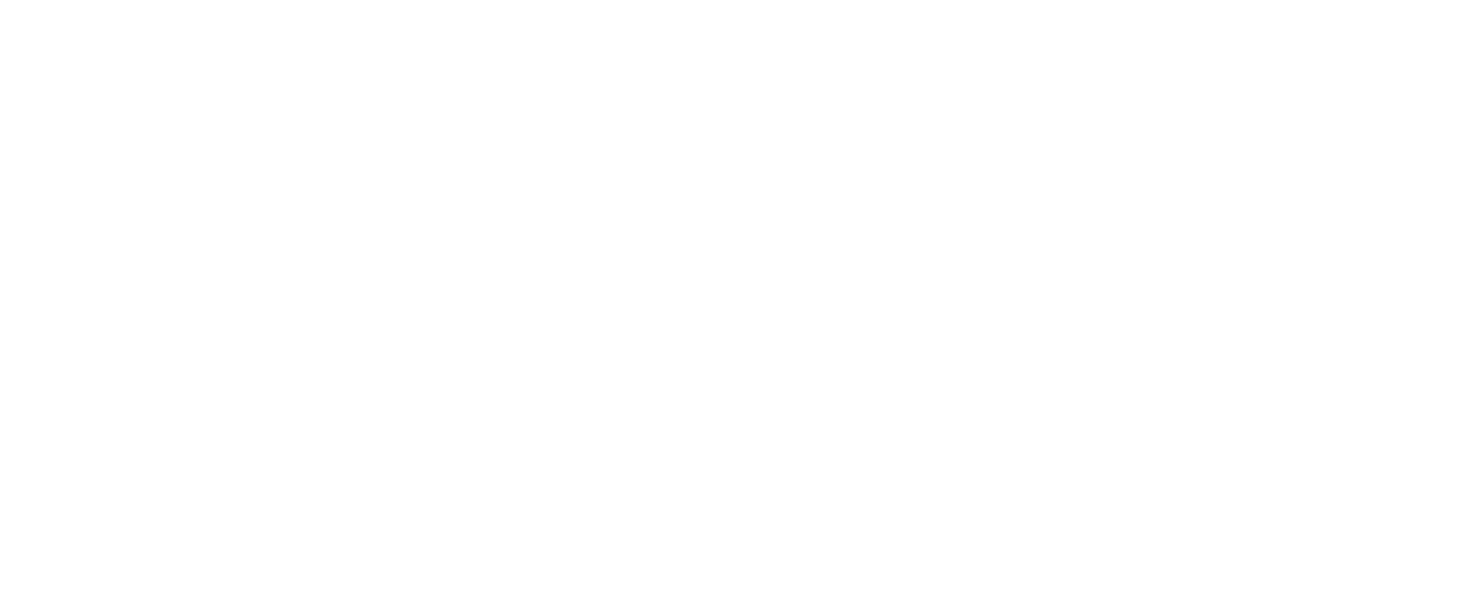
A culinary revolution in the heart of Berlin — Manifesto Market. As a creative studio tasked with the challenge of creating a dynamic visual identity for the Europe’s largest food hub, we wanted to infuse, contemporary appeal, scalability, clarity, and recognizability into every aspect of its signage and wayfinding system, and at the same time ensuring that visitors can effortlessly navigate through the space. Our mission was not only to create an exceptional visual language for Manifesto Market Berlin but to pave the way for future branches, ensuring consistency and cohesion throughout.
About Manifesto Market
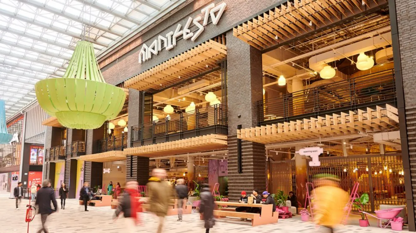
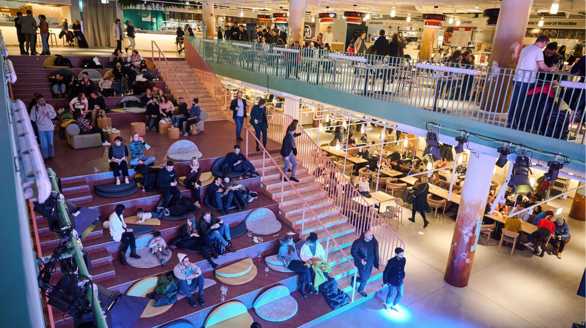
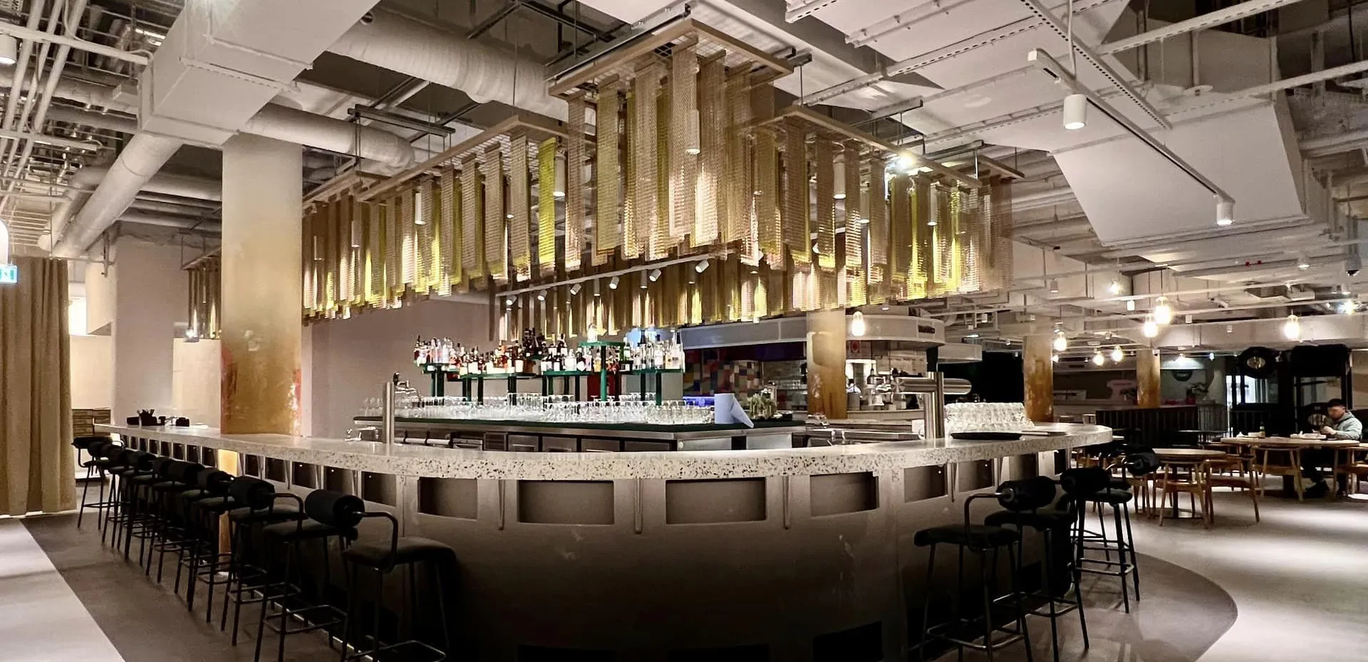
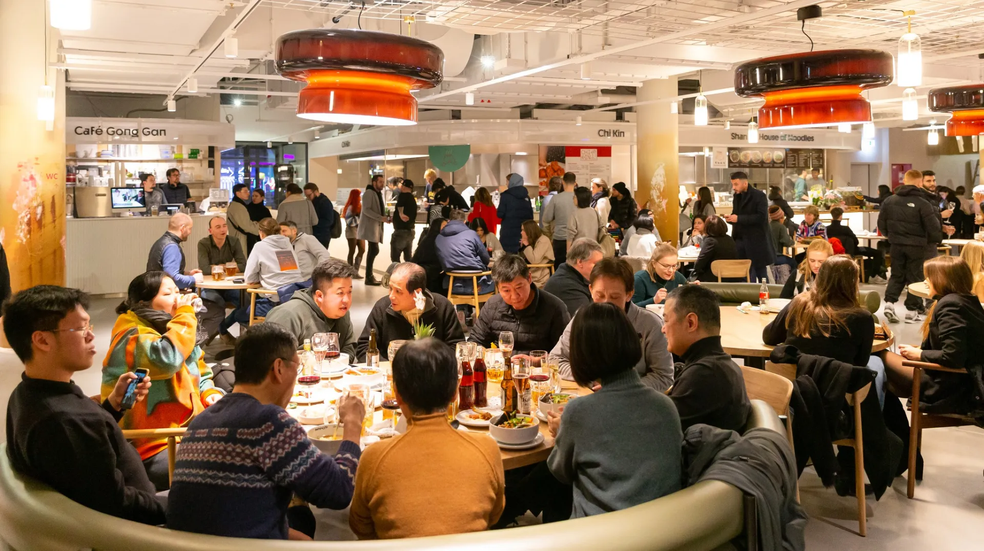
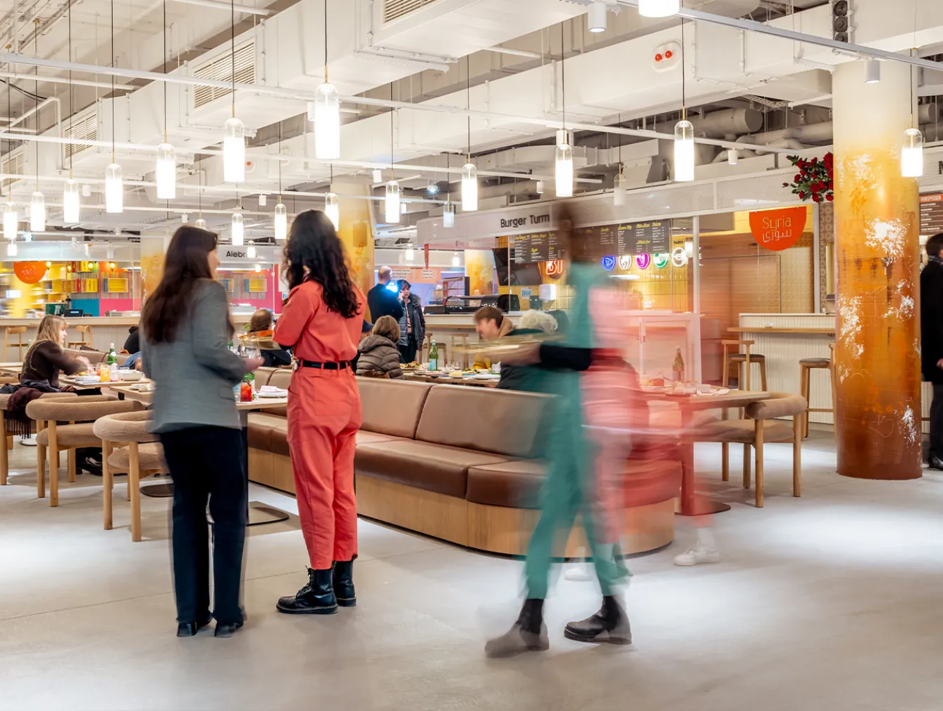
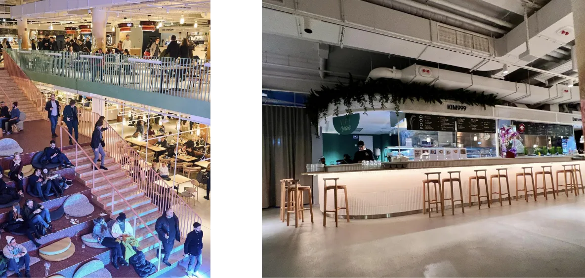
Manifesto Market is a must-visit cultural experience in the heart of Berlin. It’s a cashless food hub — a two-story space with an area of 4,400 square meters, in which we can find up to 25 restaurants, 2 bars and other vendors. Manifesto was founded in 2018 in Prague and in 2022 began the announced expansion to Western Europe — Berlin, Germany.


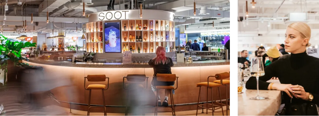
By the way, did you know that this is not our first time collaborating with Manifesto Market? Check out our case study for Manifesto Market’s website, where we enhanced their online presence and Manifesto Market’s signature cocktail bar Soot, where we established a unique identity for their iconic cocktail bar.
Wayfinding: visual concept
Challenges
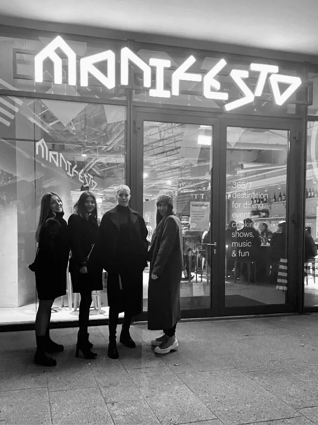
One of the primary challenges was to seamlessly integrate our designs with the existing logo and visual identity used in Manifesto Market’s Prague locations. Ensuring that our design not only coexisted with a distinctive angular logotype but also complemented it was a delicate task. We needed to strike a balance between preserving the brand’s heritage and introducing fresh elements specific to Manifesto Market Berlin.
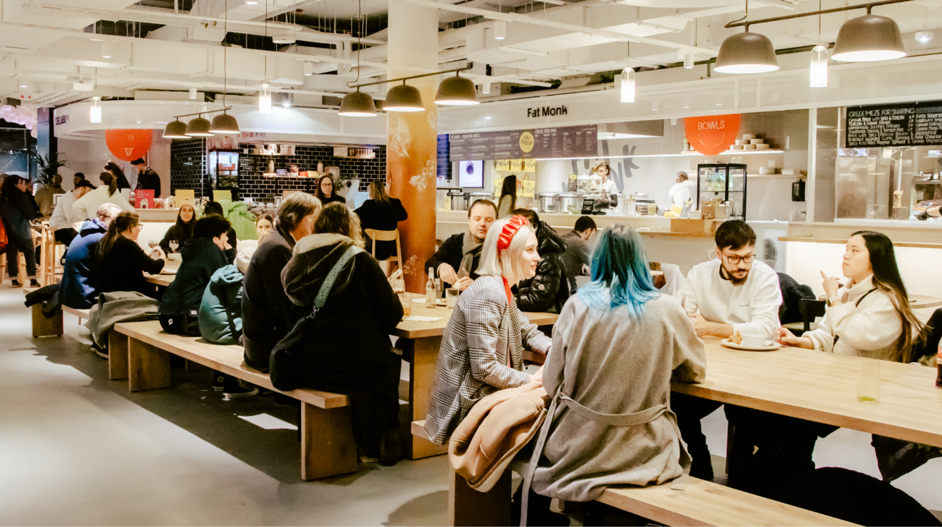
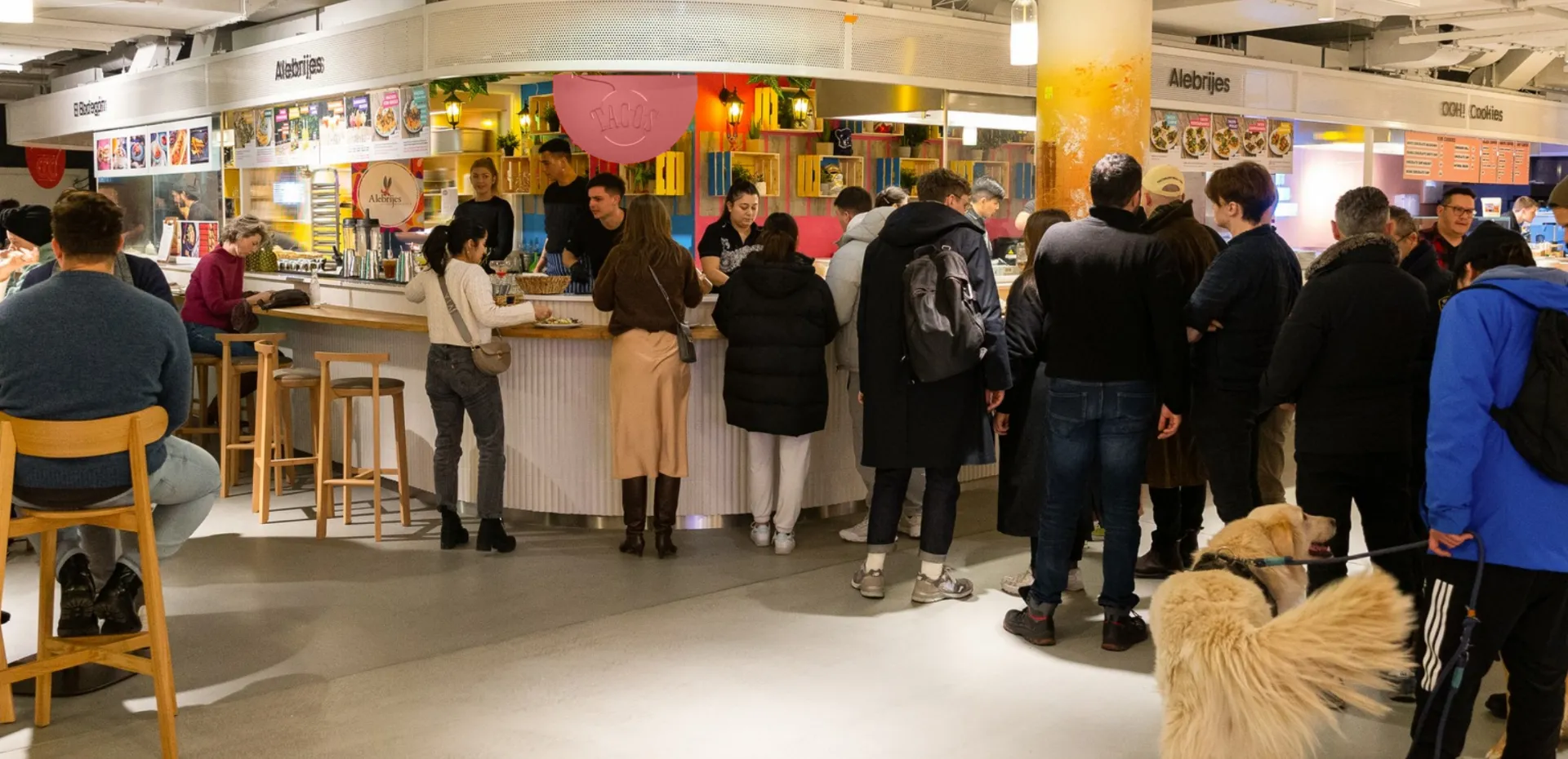
With numerous vendors offering diverse cuisines, we encountered the challenge of distinguishing each vendor, all while preserving a unified visual identity. Our design had to create a sense of unity while also highlighting the unique personalities, flavors and brand identity of each vendor.
While designing a visual language for Manifesto Market Berlin, we should also ensure that it can be easily modified for any potential future locations, maintaining brand recognition and consistency.
Solution
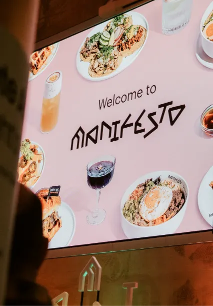
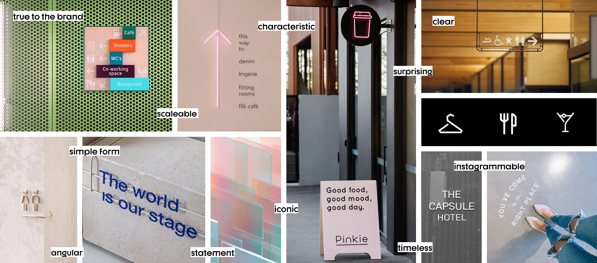
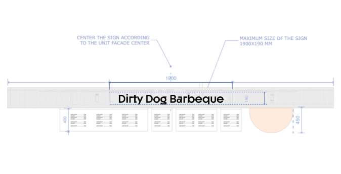
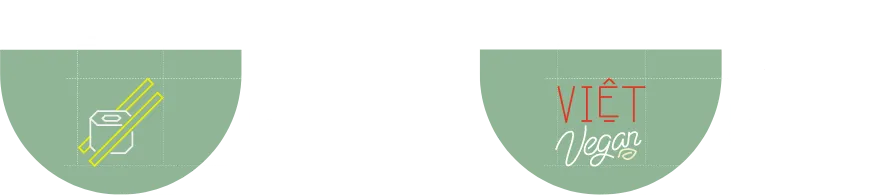
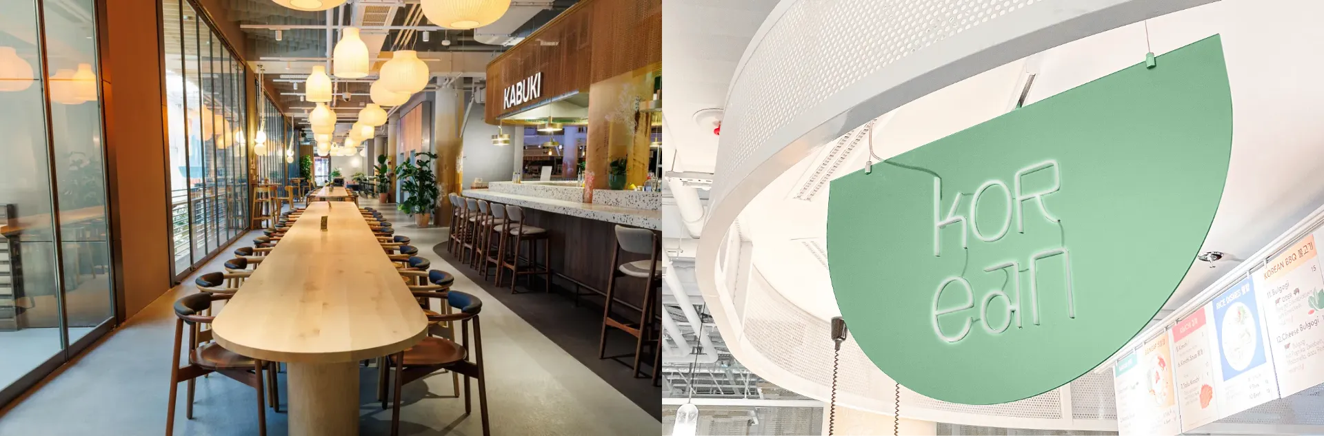
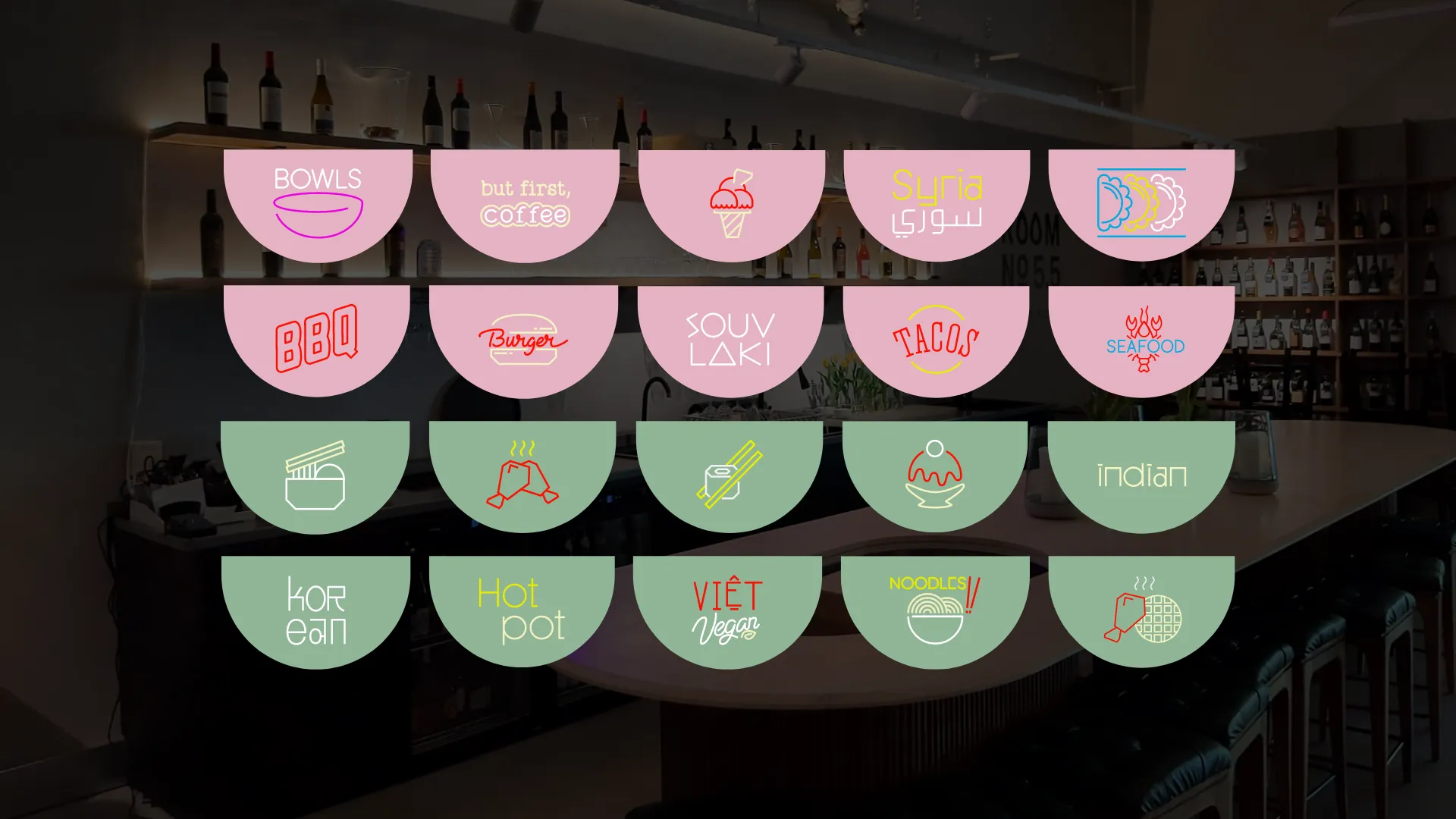
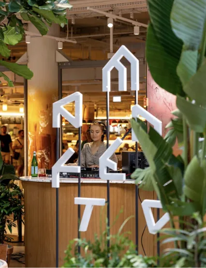
To differentiate vendors and communicate their culinary specialties, we designed custom neon icons. These icons are the visual base of the signage system’s visual concept & simplify the navigation in the wide range of restaurants. The pictograms use geometric shapes inspired by the Manifesto logo and letterforms.
We selected a distinctive brand font set with angular shapes that became another unifying element that connects all vendors.
Result and evaluation
Our approach successfully enhanced the visual identity of Manifesto Market Berlin. The typography and custom neon icons gave the space a modern and cohesive feel. Our signage and wayfinding system achieved a delicate balance between individuality and brand consistency.
The introduction of distinctive typography and custom neon icons simplified navigation within the food hub. Visitors found it easier to locate their preferred vendors, enhancing their overall experience. This improved functionality contributed to higher visitor satisfaction and increased foot traffic.
The positive reception from visitors, vendors, and management confirmed the project’s success in enhancing the visual identity and visitor experience of Manifesto Market Berlin while setting the stage for future growth and expansion.
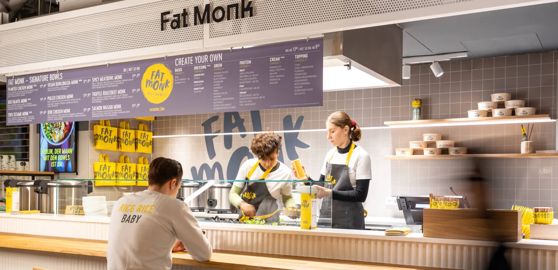
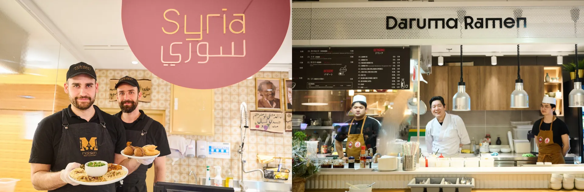
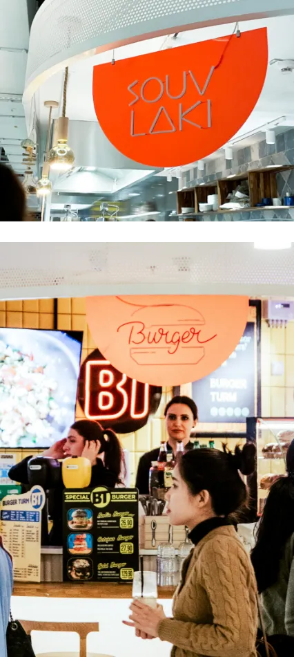
Unifying Vendors Through Distinctive Typography
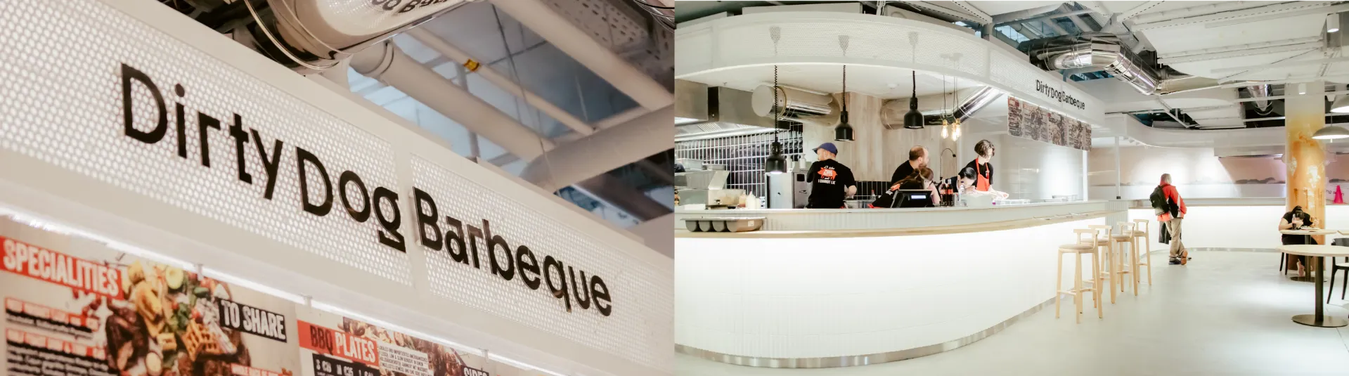
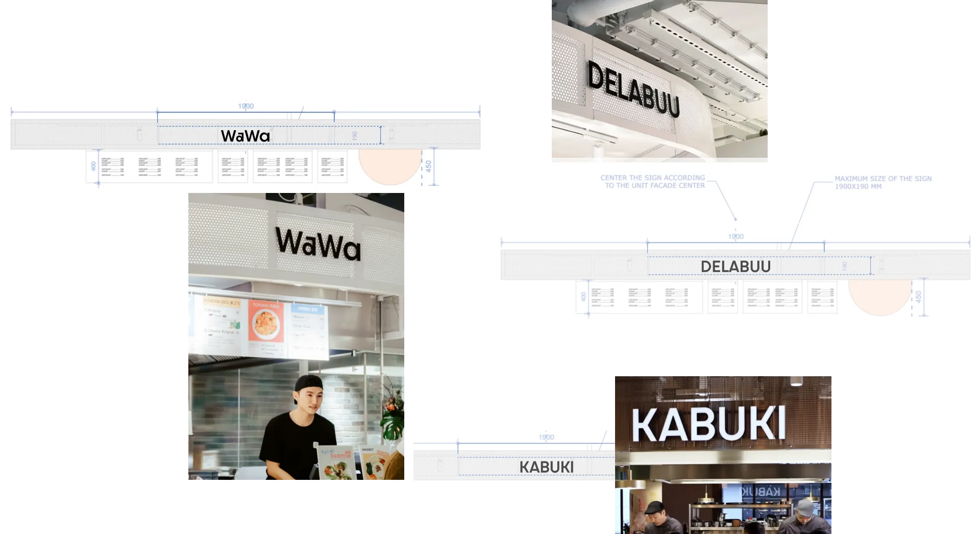
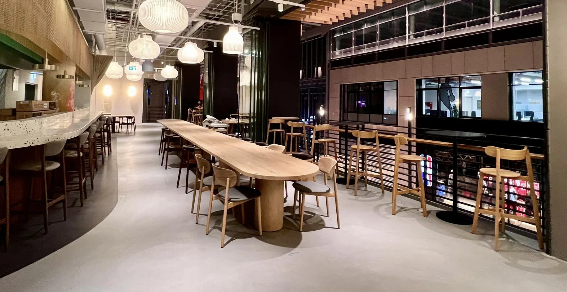
The core of our strategy lay the desire to bring cohesion and brand recognition to the wide range of vendors within Manifesto Market Berlin. To achieve this, we chose a bold and distinctive brand font set — that became the backbone of our signage system. Gastro units use white metal mesh with 3D black metal lettering. The carefully chosen typography seamlessly unites the names of each vendor, creating a visual thread that connects the entire food hub.
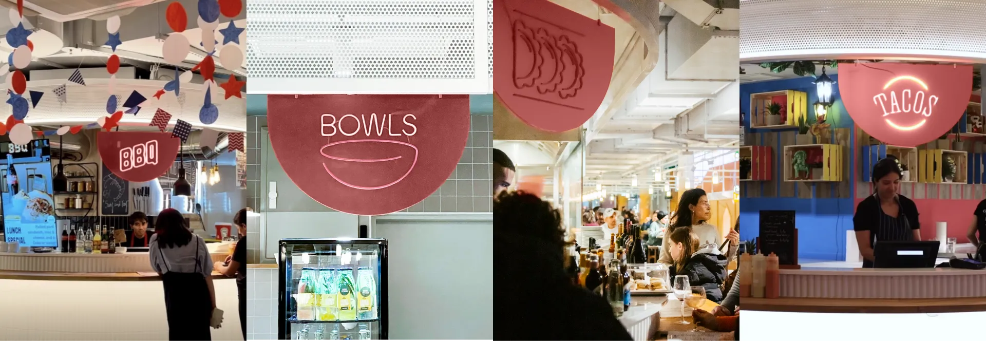
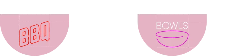
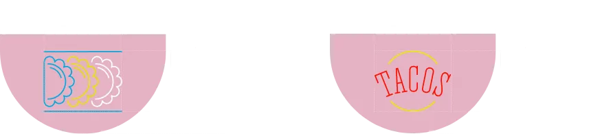
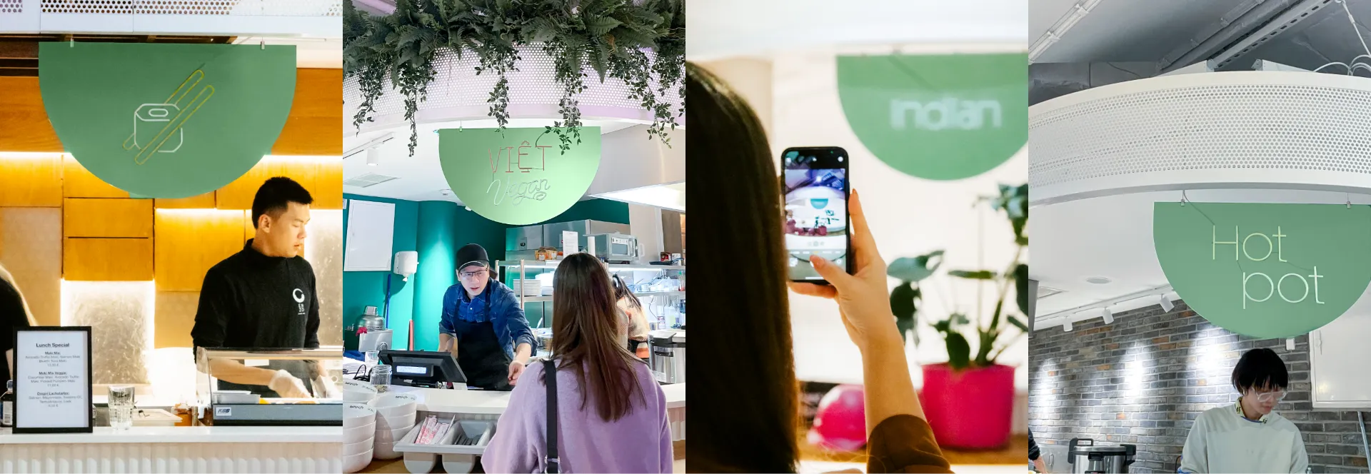
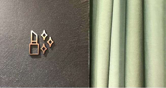
Custom set of culinary icons & neon signage
Apart from typography, we saw the need for a versatile visual cue to represent the varied cuisines of each vendor. Our solution was the creation of custom neon icons. These pictograms should give quick hints about the type of cuisine made in each restaurant. We collaborated closely with each restaurant to ensure that their individual preferences and culinary identities were represented accurately.
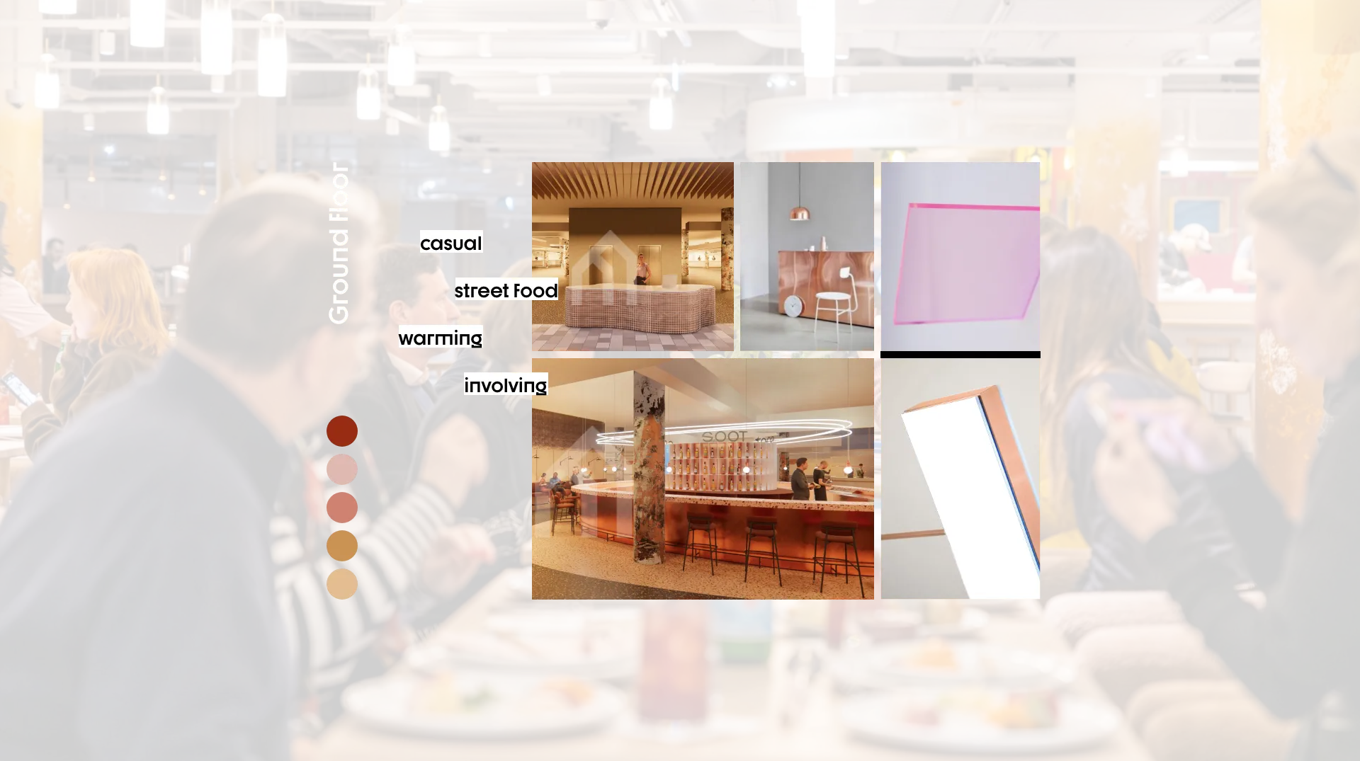
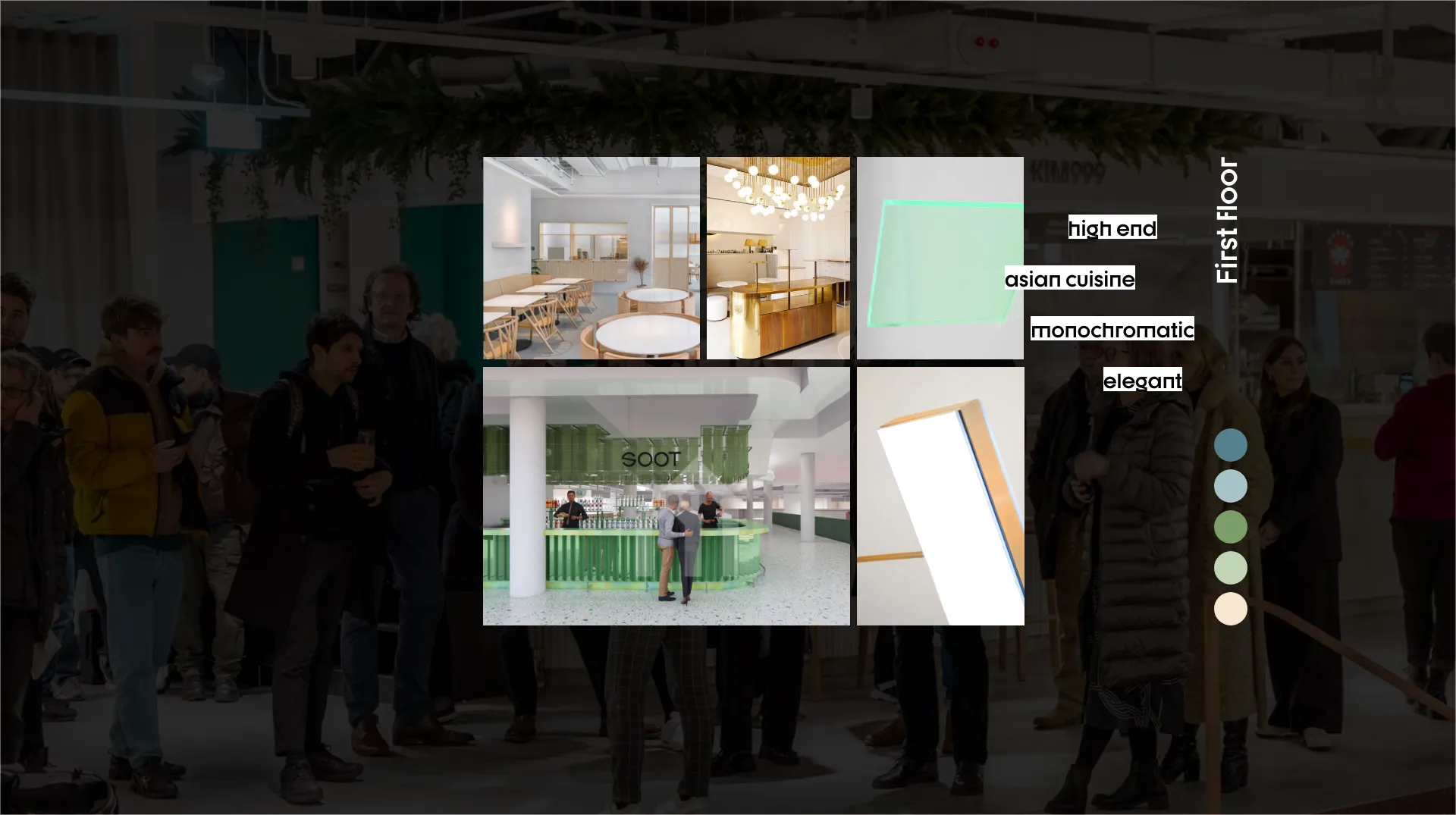
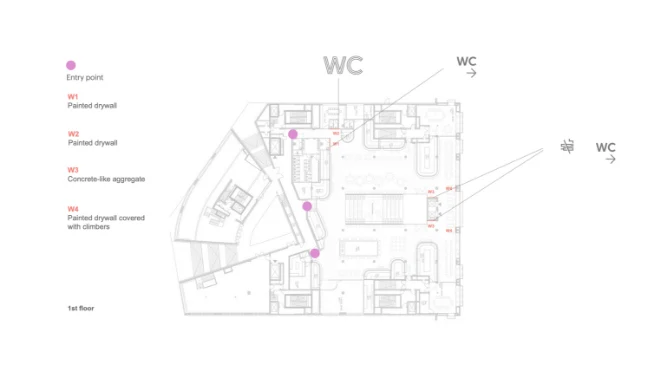
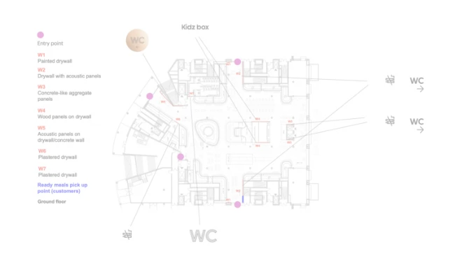
Manifesto Market Berlin offers two distinct atmospheres on its two floors. The ground floor boasts warm colors and a relaxed street food vibe, while the first floor exudes elegance, housing high-end Asian cuisine.
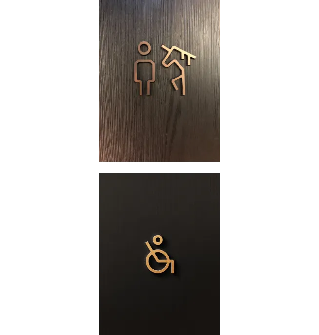
Function Meets Aesthetics
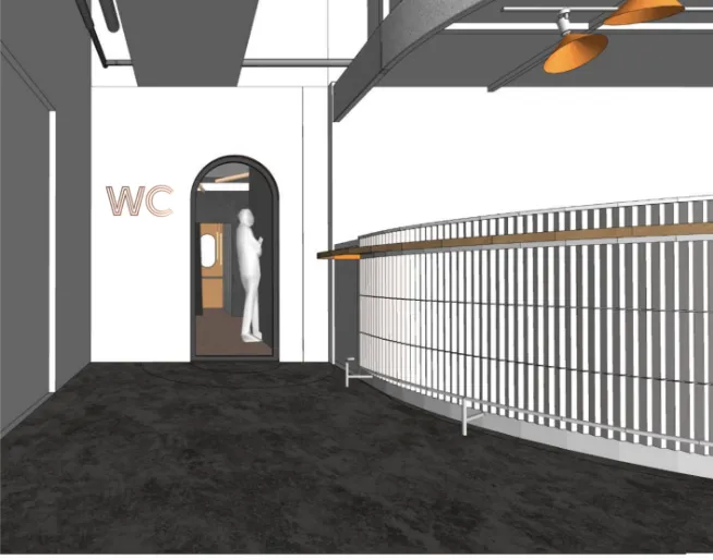
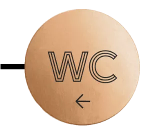
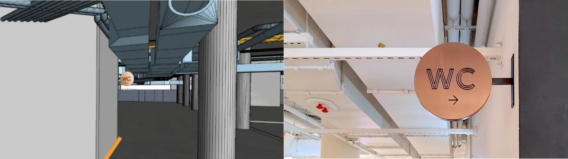
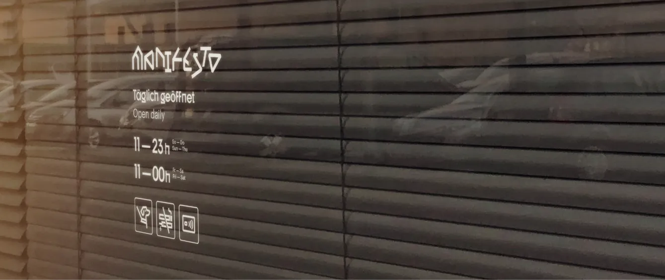
We created icons to symbolize restrooms for men, women, disabled or gender-neutral people. These icons not only served their practical purpose, but also enhanced the overall atmosphere of the space thanks to the 3D copper design or as bold pink elements on concrete walls.
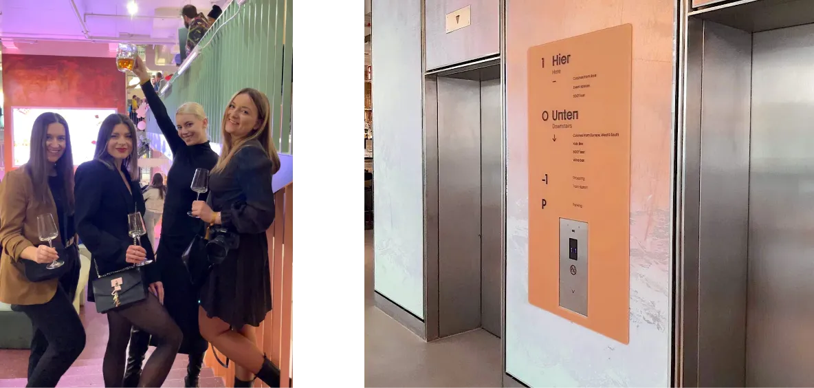
Our task was also to strategically place these signage elements throughout the market to ensure clear orientation for customers. By carefully planning the location of these icons, we aimed to enhance the overall customer experience, guiding them seamlessly through the space while maintaining the aesthetic appeal of our design.
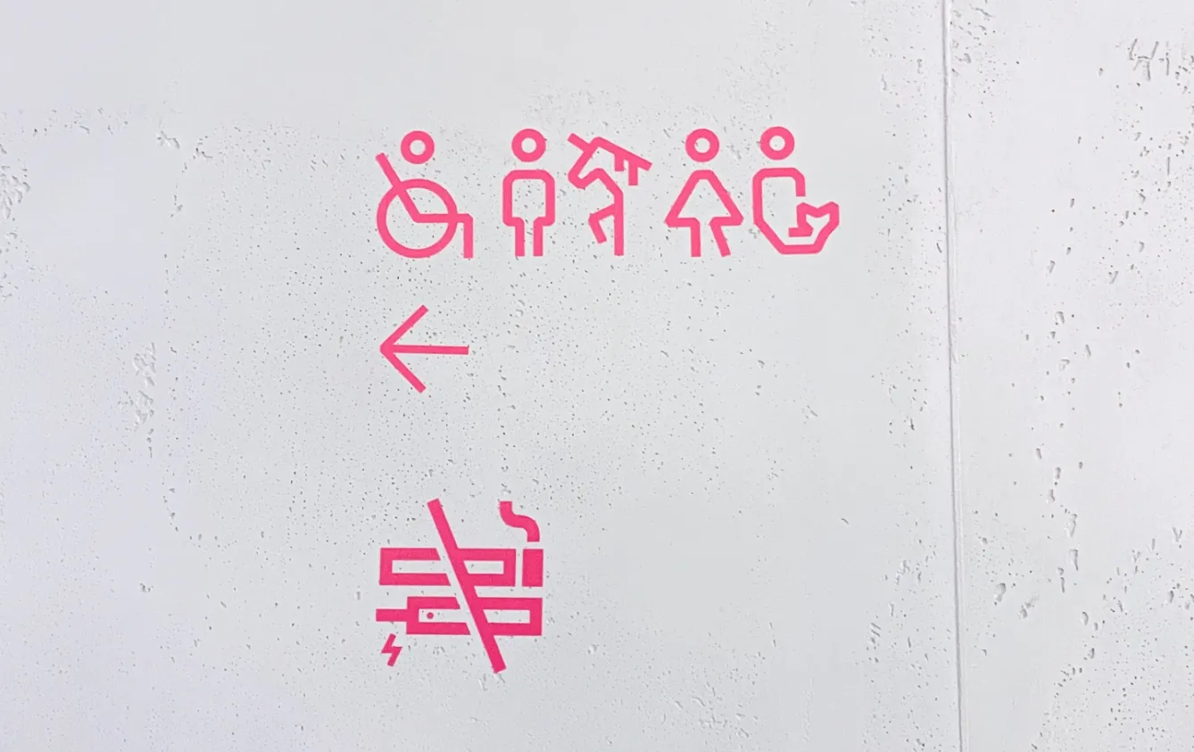
Beyond restroom icons, our design extended to other critical areas of the market. We also designed more general icons like no smoking zones, dogs on a leash, delivery points, beauty booth, changing tables or contactless payment option.
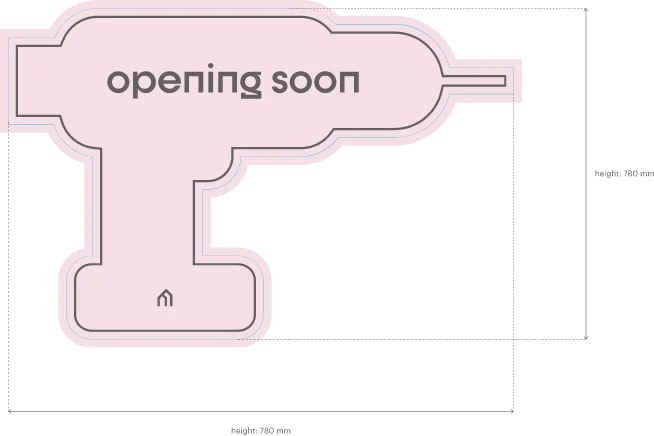
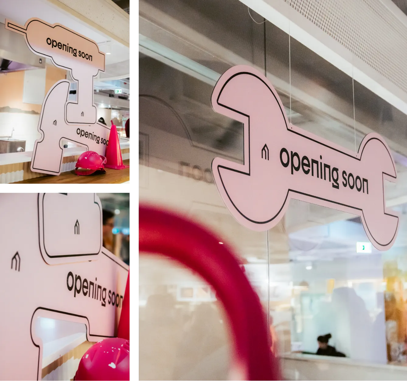
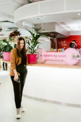
Original opening soon signs
We've transformed the concept of 'Opening Soon' signage into an exciting visual experience. The signs have been carefully designed to resemble oversized tools, creating a playful and engaging connection between the space of Manifesto Market and each of the forthcoming restaurants.

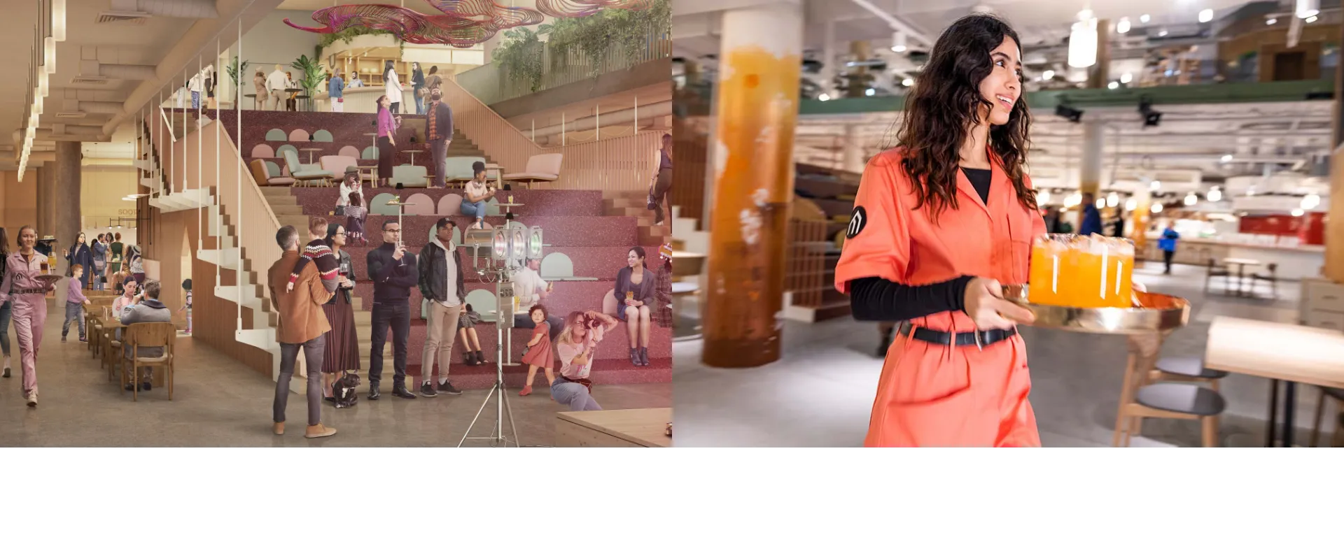
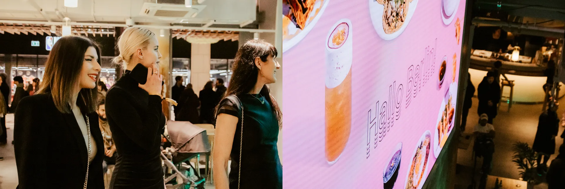
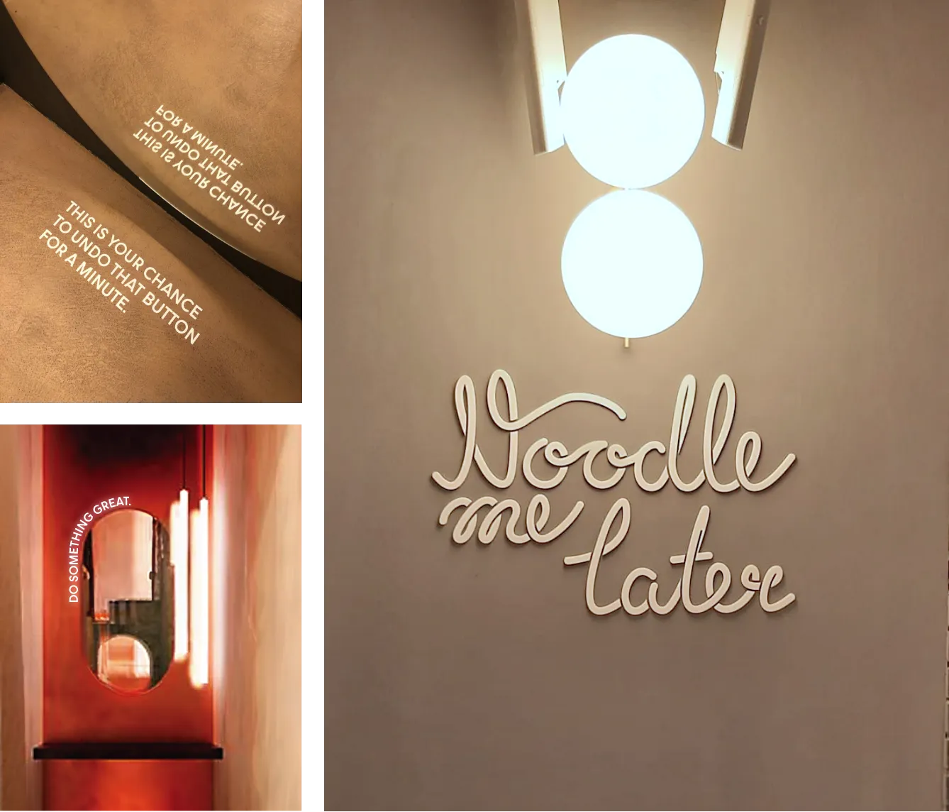
Complementary instagrammable points
We created a set of visually captivating spots strategically placed within the Manifesto food hub. The intention behind these Instagrammable points was to entice visitors to pull out their smartphones, snap photos, and share their experiences on Instagram. We understood the power of social media in today’s world and wanted to give visitors the opportunity to become part of the Manifesto story.
Ready to turn your brand into the hell-yes choice?
Join 100+ brand leaders who stopped waiting for “someday” - and built brands people obsess about today.
Ready to turn your brand into the hell-yes choice?
Join 100+ brand leaders who stopped waiting for “someday” - and built brands people obsess about today.
Smart brand moves, straight to your inbox.

Smart brand moves, straight to your inbox.